<AutoForm /> for @shadcn/ui
AutoForm is a React component that automatically creates a @shadcn/ui form based on a zod schema.
A live demo can be found at https://vantezzen.github.io/auto-form/.

Installation
The component depends on the following components from shadcn/ui:
- accordion
- button
- calendar
- card
- checkbox
- form
- input
- label
- popover
- radio-group
- select
- separator
- switch
- textarea
- toggle
You can install them all at once with:
npx shadcn-ui@latest add accordion button calendar card checkbox form input label popover radio-group select separator switch textarea toggle
To install the component itself, copy auto-form.tsx and date-picker.tsx from src/components/ui to your project’s ui folder.
Field types
Currently, these field types are supported out of the box:
- boolean (checkbox, switch)
- date (date picker)
- enum (select, radio group)
- number (input)
- string (input, textfield)
You can add support for other field types by adding them to the INPUT_COMPONENTS object in auto-form.tsx.
Usage
Basic usage:
import AutoForm, { AutoFormSubmit } from "./components/ui/auto-form";
import * as z from "zod";
// Define your form schema using zod
const formSchema = z.object({
username: z
.string({
required_error: "Username is required.",
})
// You can use zod's built-in validation as normal
.min(2, {
message: "Username must be at least 2 characters.",
}),
password: z
.string({
required_error: "Password is required.",
})
// Use the "describe" method to set the label
// If no label is set, the field name will be used
// and un-camel-cased
.describe("Your secure password")
.min(8, {
message: "Password must be at least 8 characters.",
}),
favouriteNumber: z.coerce // When using numbers and dates, you must use coerce
.number({
invalid_type_error: "Favourite number must be a number.",
})
.min(1, {
message: "Favourite number must be at least 1.",
})
.max(10, {
message: "Favourite number must be at most 10.",
})
.default(5) // You can set a default value
.optional(),
acceptTerms: z
.boolean()
.describe("Accept terms and conditions.")
.refine((value) => value, {
message: "You must accept the terms and conditions.",
path: ["acceptTerms"],
}),
// Date will show a date picker
birthday: z.coerce.date().optional(),
sendMeMails: z.boolean().optional(),
// Enum will show a select
color: z.enum(["red", "green", "blue"]),
// Create sub-objects to create accordion sections
address: z.object({
street: z.string(),
city: z.string(),
zip: z.string(),
}),
});
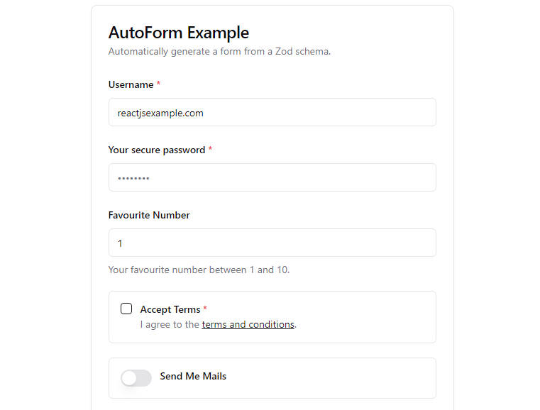
function App() {
return (
<AutoForm
// Pass the schema to the form
formSchema={formSchema}
// You can add additional config for each field
// to customize the UI
fieldConfig={{
password: {
// Use "inputProps" to pass props to the input component
// You can use any props that the component accepts
inputProps: {
type: "password",
placeholder: "••••••••",
},
},
favouriteNumber: {
// Set a "description" that will be shown below the field
description: "Your favourite number between 1 and 10.",
inputProps: {
type: "number",
},
},
acceptTerms: {
inputProps: {
required: true,
},
// You can use JSX in the description
description: (
<>
I agree to the{" "}
<a
href="#"
className="text-primary underline"
onClick={(e) => {
e.preventDefault();
alert("Terms and conditions clicked.");
}}
>
terms and conditions
</a>
.
</>
),
},
birthday: {
description: "We need your birthday to send you a gift.",
},
sendMeMails: {
// Booleans use a checkbox by default, you can use a switch instead
fieldType: "switch",
},
}}
>
{/*
Pass in a AutoFormSubmit or a button with type="submit".
Alternatively, you can not pass a submit button
to create auto-saving forms etc.
*/}
<AutoFormSubmit>Send now</AutoFormSubmit>
{/*
All children passed to the form will be rendered below the form.
*/}
<p className="text-gray-500 text-sm">
By submitting this form, you agree to our{" "}
<a href="#" className="text-primary underline">
terms and conditions
</a>
.
</p>
</AutoForm>
);
}
Zod configuration
Validations
Your form schema can use any of zod’s validation methods including refine.
Autoform is able to automatically transform some of zod’s validation elements into HTML attributes. For example, if you use zod.string().min(8), the input will automatically have a minlength="8" attribute.
Validation methods that are not supported by HTML will automatically be checked when the form is submitted.
Descriptions
You can use the describe method to set a label and description for each field. If no label is set, the field name will be used and un-camel-cased.
const formSchema = z.object({
  username: z.string().describe("Your username"),
  someValue: z.string(), // Will be "Some Value"
});
Coercion
When using numbers and dates, you should use coerce. This is because input elements may return a string that should automatically be converted.
const formSchema = z.object({
  favouriteNumber: z.coerce.number(),
  birthday: z.coerce.date(),
});
Optional fields
By default, all fields are required. You can make a field optional by using the optional method.
const formSchema = z.object({
  username: z.string().optional(),
});
Default values
You can set a default value for a field using the default method.
const formSchema = z.object({
  favouriteNumber: z.number().default(5),
});
Sub-objects
You can nest objects to create accordion sections.
const formSchema = z.object({
  address: z.object({
    street: z.string(),
    city: z.string(),
    zip: z.string(),

    // You can nest objects as deep as you want
    nested: z.object({
      foo: z.string(),
      bar: z.string(),

      nested: z.object({
        foo: z.string(),
        bar: z.string(),
      }),
    }),
  }),
});
Like with normal objects, you can use the describe method to set a label and description for the section:
const formSchema = z.object({
  address: z
    .object({
      street: z.string(),
      city: z.string(),
      zip: z.string(),
    })
    .describe("Your address"),
});
Field configuration
As zod doesn’t allow adding other properties to the schema, you can use the fieldConfig prop to add additional configuration for the UI of each field.
<AutoForm
  fieldConfig={{
    // Add config for each field here - don't add the field name to keep all defaults
    username: {
      // Configuration here
    },
  }}
/>
Input props
You can use the inputProps property to pass props to the input component. You can use any props that the HTML component accepts.
<AutoForm
  fieldConfig={{
    username: {
      inputProps: {
        type: "text",
        placeholder: "Username",
      },
    },
  }}
/>

// This will be rendered as:
<input type="text" placeholder="Username" /* ... */ />
Field type
By default, AutoForm will use the Zod type to determine which input component to use. You can override this by using the fieldType property.
<AutoForm
  fieldConfig={{
    sendMeMails: {
      // Booleans use a checkbox by default, use a switch instead
      fieldType: "switch",
    },
  }}
/>
The complete list of supported field types is typed. Current supported types are:
- “checkbox” (default for booleans)
- “switch”
- “date” (default for dates)
- “select” (default for enums)
- “radio”
- “textarea”
- “fallback” (default for everything else, simple input field)
Alternatively, you can pass a React component to the fieldType property to use a custom component.
<AutoForm
  fieldConfig={{
    sendMeMails: {
      fieldType: ({
        label,
        isRequired,
        field,
        fieldConfigItem,
        fieldProps,
      }: AutoFormInputComponentProps) => (
        <FormItem className="flex flex-row items-start space-x-3 space-y-0 rounded-md border p-4">
          <FormControl>
            <Switch
              checked={field.value}
              onCheckedChange={field.onChange}
              {...fieldProps}
            />
          </FormControl>
          <div className="space-y-1 leading-none">
            <FormLabel>
              {label}
              {isRequired && <span className="text-destructive"> *</span>}
            </FormLabel>
            {fieldConfigItem.description && (
              <FormDescription>{fieldConfigItem.description}</FormDescription>
            )}
          </div>
        </FormItem>
      ),
    },
  }}
/>
Description
You can use the description property to add a description below the field.
<AutoForm
  fieldConfig={{
    username: {
      description:
        "Enter a unique username. This will be shown to other users.",
    },
  }}
/>
You can use JSX in the description.
Custom parent component
You can use the renderParent property to customize the parent element of the input to add adornments etc.
By default, this is a React fragment.
<AutoForm
  fieldConfig={{
    username: {
      renderParent: ({ children }) => (
        <div className="flex items-end gap-3">
          <div className="flex-1">
            {children} // This is the input with label etc.
          </div>
          <div>
            <Button type="button">Check</Button>
          </div>
        </div>
      ),
    },
  }}
/>
Accessing the form data
There are two ways to access the form data:
onSubmit
The preferred way is to use the onSubmit prop. This will be called when the form is submitted and the data is valid.
<AutoForm
  onSubmit={(data) => {
    // Do something with the data
    // Data is validated and coerced with zod automatically
  }}
/>
Controlled form
You can also use the values and setValues props to control the form data yourself.
const [values, setValues] = useState<Partial<z.infer<typeof formSchema>>>({});

<AutoForm values={values} setValues={setValues} />;
Please note that the data is not validated or coerced when using this method as they update immediately.
Submitting the form
You can use the AutoFormSubmit component to create a submit button.
<AutoForm>
  <AutoFormSubmit>Send now</AutoFormSubmit>
</AutoForm>
// or
<AutoForm>
  <button type="submit">Send now</button>
</AutoForm>
Adding other elements
All children passed to the AutoForm component will be rendered below the form.
<AutoForm>
  <AutoFormSubmit>Send now</AutoFormSubmit>
  <p className="text-gray-500 text-sm">
    By submitting this form, you agree to our{" "}
    <a href="#" className="text-primary underline">
      terms and conditions
    </a>
    .
  </p>
</AutoForm>
License
MIT