expo-draggable-textfield
Introduction
expo-draggable-textfield is a React Native component designed for the Expo framework. It provides a customizable, draggable text input field with a variety of features, making it a versatile choice for mobile applications requiring interactive text input.
Features
- Draggable text field within the app interface.
- Customizable styles and behaviors.
- Integration with React Native's Animated and Gesture Handler libraries for smooth performance and responsive touch handling.
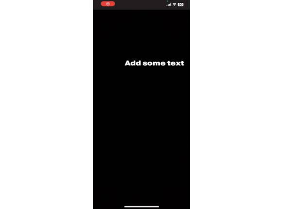
Example

Installation
To install expo-draggable-textfield, run the following command in your React Native project:
npm install expo-draggable-textfieldOr, if you use Yarn:
yarn add expo-draggable-textfieldRequirements
- react-native-reanimated
- react-native-gesture-handler
Usage
Here's a basic example of how to use expo-draggable-textfield in your app:
import React from "react";
import { DraggableTextEditor } from "expo-draggable-textfield";

const MyComponent = () => {
  return (
    <DraggableTextEditor
      placeholder="Enter text here"
      onChangeText={(text) => console.log(text)}
      // Add other props as needed
    />
  );
};

export default MyComponent;
Props
The DraggableTextEditor component accepts the following props:
onChangeText: Function called when the text changes.blurOnSubmit: Boolean indicating if the keyboard should be dismissed on submit.value: The text value of the input.onBlur: Function called when the input loses focus.onItemActive: Function called when the item becomes active.visible: Boolean to control the visibility of the text editor.externalTextStyles: Styles for the text or the view of the component.externalBorderStyles: Styles for the border of the component.placeholder: Placeholder text for the input.defaultTextValue: Default value for the text input.
These props enhance the flexibility and customization of the text editor component.
Customization
You can customize the style and behavior of the draggable text field by passing style props. For example:
<DraggableTextEditor
  externalTextStyles={{ color: "blue" }}
  externalBorderStyles={{ borderColor: "green" }}
/>
Contributing
Contributions to expo-draggable-textfield are welcome.
License
expo-draggable-textfield is available under the MIT License.
Contact
For support or queries, please open a issue or start a discussion.