react-sheet-slide
?️ ? ? A responsive React draggable sheet and dialog component.
No more hard to use and dismiss modal experiences for mobile users.
Instead react-sheet-slide provides a fully draggable sheet
that properly blocks weird overscrolling and focus bugs. Then on desktop
this component optionally supports a fully-featured modal.
Alterativly the sheet can be used on desktop as-well if so desired.
This library is largely based on the fantastic react-spring-bottom-sheet. While react-spring-bottom-sheet is much more feature-packed than react-sheet-slide, supporting more props like many different callbacks on sheet snap start/end.
However the extra dependencies like xstate and the resize-observer polyfill can lead to a larger bundle size.
Also using react-spring as a dependencies instead of a peer dependencies limits users of the library from
controlling the version of react-spring they use. It can also lead to 2 versions of react-spring being bundled,
if the user is using a newer or older major version than the library.
By simplifying the API these libraries can be removed, and by moving react-spring to a peer dependencies
makes the library have a much lighther footprint. Also react-sheet-slide includes a
dark mode and a fully-featured desktop modal that can be enabled for non-mobile users.
It also adds support for a backdrop animation similar to Apple’s UIKit.
Features
- Responsive way to display blocking modal-like content on mobile web-apps.
- Accessible with proper scroll & focus blocking, with
Escto close on desktop. - Supports dark and light mode out of the box
- Customizable detents
- Similar API to Apple’s UIKit sheet
- Supports Server-Side rendering.
- Built with css-modules (no styled-in-js library needed)
Installation
Yarn
yarn add react-sheet-slide @react-spring/web@^9 @use-gesture/react@^10
npm
npm install react-sheet-slide @react-spring/web@^9 @use-gesture/react@^10
Usage
import React, { useState, useRef } from 'react'
import { Sheet, Header, Content, Footer, detents, Portal } from 'react-sheet-slide'
import 'react-sheet-slide/style.css'
const App = () => {
const [open, setOpen] = useState(false)
const ref = useRef()
return (
<>
<button type="button" onClick={() => setOpen(true)}>
Open sheet
</button>
<Portal>
<Sheet
ref={ref}
open={open}
onDismiss={() => setOpen(false)}
onClose={() => {
console.log('Component unmounted')
}}
selectedDetent={detents.large}
detents={props => [
detents.large(props),
detents.medium(props)
]}
useDarkMode={false}
useModal={false}
>
<Header>Title</Header>
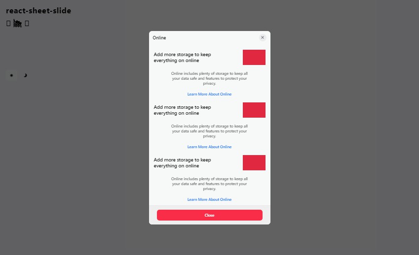
<Content>
<div>Add more storage to keep everything on online</div>
<div>
Online includes plenty of storage to keep all your data safe and
features to protect your privacy.
</div>
<div>Learn More About Online</div>
</Content>
<Footer>
<button type="button" onClick={() => setOpen(false)}>
Close
</button>
</Footer>
</Sheet>
</Portal>
</>
)
}
react-sheet-slide includes a Portal component however other portal can be used like
@reach/portal or @mui/base. The one included is just of modified version of @reach/portal however with support for string refs and defaults to body.
Props
-
openSet if the sheet is open. When this prop is changed the sheet will animate and the unmount/remount. When the component fully unmounts,
onClosewill be called. -
onDismissCalled when the sheet is dragged down or the user clicks on the backdrop. Also called when the user presses
Esc. This method should includesetOpen(false)to ensureopenis false. Otherwise the sheet may not close properly. -
onCloseCalled when the sheet finishes the close animation and is fully unmounted.
-
selectedDetentThe default detent size that the sheet will open to.
-
detentsList of available detents that the sheet will catch on. Reccomened to set to either
detents.largeorprops => [detents.large(props), detents.medium(props)]to mimic the UIKit behaviour however can be customized using the callback. -
useDarkModeProp to control if dark mode is enabled. By default this will use the system
prefers-color-scheme. -
useModalProp to control when a modal should be used instead of a sheet. If your app will likely only be used on mobile
useModal={false}is reccomened. Otherwise it will default to true on any device larger than(max-width: 640px)to use a modal on desktop. -
refThe sheet also supports forwarding a ref that will be added onto the sheet root.