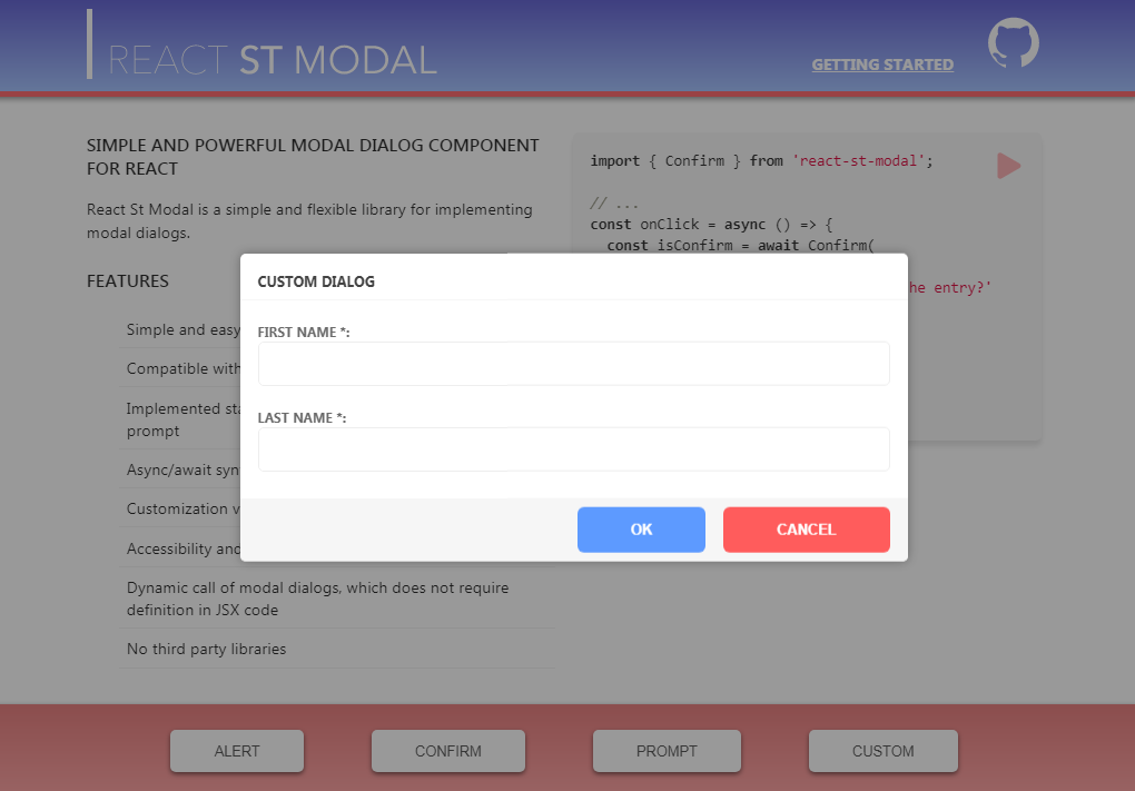
react-st-modal
React St Modal is a simple and flexible library for implementing modal dialogs.
Features
- Simple and easy to use api
- Compatible with mobile devices
- Implemented standard interaction functions: alert, confirm, prompt
- Async/await syntax
- Customization via css variables
- Accessibility and focus control
- Dynamic call of modal dialogs, which does not require definition in code
- No third party libraries
Getting started
Installation
You can install the latest version using npm:
npm install react-st-modal
Overview
To implement the functionality of modal dialogs this library has four functions and one react component.
Functions Alert, Confirm, Prompt implement the behavior of existing browser functions.
Function CustomDialog shows any JSX element in a modal window.
React component StaticDialog is used to define modals in your JSX element.
Interaction: (Alert, Prompt, Confirm)
All interaction functions are async.
| Method name | Parameters | Return type | Description |
|---|---|---|---|
Alert |
body: JSX.Element (string), title?: string, buttonText?: string |
void |
Shows a message (body) and waits for the user to press button |
Confirm |
body: JSX.Element (string), title?: string, okButtonText?: string, cancelButtonText?: string |
boolean |
Shows a modal window with a text (body) and two buttons: OK and Cancel. The result is true if OK is pressed and false otherwise |
Prompt |
title?: string, options?: PromptConfig |
string |
Shows a modal window with a text message, an input field for the visitor, and the buttons OK/Cancel |
PromptConfig allows you to specify the following optional parameters:
defaultValue: string | numberisRequired: booleanerrorText: stringokButtonText: stringcancelButtonText: string
Example
import { Confirm } from 'react-st-modal';

function ConfirmExample() {
  return (
    <div>
      <button
        onClick={async () => {
          const result = await Confirm('Сonfirmation text',
            'Сonfirmation title');

          if (result) {
            // Сonfirmation confirmed
          } else {
            // Сonfirmation not confirmed
          }
        }}
      >
          Show confirm
      </button>
    </div>
  );
}
CustomDialog
CustomDialog is an async function that shows any element in a modal window.
Parameters
body: JSX.Element- the element shown in the modal dialogoptions?: CustomConfig- specified options
CustomConfig allows you to specify the following optional parameters:
title?: string- modal dialog titleclassName?: string- css classNamedefaultBodyOverflow?: string(default:visible) - default value tobodycss propertyoverflowshowCloseIcon?: boolean(default:false) - show close button in the top corner of the windowisCanClose?: boolean(default:true) - is it possible to close the dialog by clicking on the overlay or ESC buttonisFocusLock?: boolean(default:true) - lock focus on modalisBodyScrollLocked?: boolean(default:true) - content scrolling lockreplaceScrollBar?: boolean(default:true) - whether to replace the body scrollbar with a placeholderscrollBarPlaceholderColor?: string(default:#eeeeee) - default color for the scrollbar placeholderonAfterOpen?: () => void- event called after the dialog was opened
To control a dialog from an inner element, use useDialog<T> hook
useDialog<T> returns an object containing:
isOpen: boolean- the current state of the modalclose: (result?: T) => void- function that closes the dialog and returns the result
Example
import { CustomDialog, useDialog } from 'react-st-modal';

// The element to be shown in the modal window
function CustomDialogContent() {
  // use this hook to control the dialog
  const dialog = useDialog();

  const [value, setValue] = useState();

  return (
    <div>
      <input
        type="text"
        onChange={(e) => {
          setValue(e.target.value);
        }}
      />
      <button
        onClick={() => {
          // Сlose the dialog and return the value
          dialog.close(value);
        }}
      >
        Custom button
      </button>
    </div>
  );
}

function CustomExample() {
  return (
    <div>
      <button
        onClick={async () => {
          const result = await CustomDialog(
            <CustomDialogContent />,
            {
              title: 'Custom Dialog',
              showCloseIcon: true,
            }
          );
        }}
      >
        Custom
      </button>
    </div>
  );
}
StaticDialog
StaticDialog it is a React component that used to define modals in your JSX element
Props
isOpen: boolean- describing if the modal should be shown or notchildren: React.ReactNode- the element shown in the modal dialogtitle?: string- modal dialog titleclassName?: string- css classNamedefaultBodyOverflow?: string(default:visible) - default value tobodycss propertyoverflowshowCloseIcon?: boolean(default:false) - show close button in the top corner of the windowisCanClose?: boolean(default:true) - is it possible to close the dialog by clicking on the overlay or ESC buttonisFocusLock?: boolean(default:true) - lock focus on modalisBodyScrollLocked?: boolean(default:true) - content scrolling lockreplaceScrollBar?: boolean(default:true) - whether to replace the body scrollbar with a placeholderscrollBarPlaceholderColor?: string(default:#eeeeee) - default color for the scrollbar placeholderonAfterClose?: (result?: T) => void- event called after the dialog was closedonAfterOpen?: () => void- event called after the dialog was opened
Example
import { StaticDialog, useDialog } from 'react-st-modal';

function CustomStaticExample() {
  const [isOpen, setOpen] = useState(false);

  return (
    <div>
      <StaticDialog
        isOpen={isOpen}
        title="Custom static dialog"
        onAfterClose={(result) => {
          setOpen(false);
          // do something with dialog result
        }}
    >
        {/* see previous demo */}
          <CustomDialogContent />
      </StaticDialog>

      <div>
        <button
          onClick={() => {
              setOpen(true);
          }}
        >
          Custom static
        </button>
      <div>
    </div>
    );
}
UI Elements
To decorate your dialogs, you can use the following components: ModalButton, ModalContent, ModalFooter
Example
import { ModalContent, ModalFooter, ModalButton, useDialog } from 'react-st-modal';

function CustomDialogContent() {
  const dialog = useDialog();

  const [value, setValue] = useState<string>();

  return (
      <div>
        <ModalContent>
          <div>Custom dialog content</div>
          <label>
            Input value:
            <input
              type="text"
              onChange={(e) => {
                setValue(e.target.value);
              }}
            />
          </label>
        </ModalContent>
        <ModalFooter>
          <ModalButton
            onClick={() => {
              dialog.close(value);
            }}
          >
            Custom button
          </ModalButton>
        </ModalFooter>
      </div>
  );
}