react-simple-modal-provider
Simple Modal Manager for React Projects
Installation
$ npm install react-simple-modal-provider
$ yarn add react-simple-modal-provider
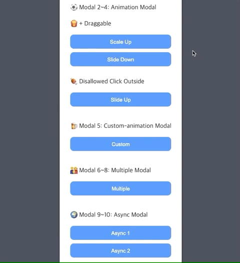
Examples
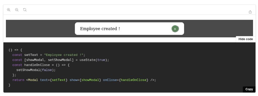
// BasicModal Component
import Modal, { useModalState } from "react-simple-modal-provider";

export default ({ children }) => {
  const { isOpen, setOpen } = useModalState();

  return (
    <Modal
      id={"BasicModal"}
      consumer={children}
      isOpen={isOpen}
      setOpen={setOpen}
    >
      <span>?</span>
    </Modal>
  );
};
Pass unique ID to the id props. It is, then, used to load modals.
Keeping eye on the four required props of the "Modal" module, you should create a modal in the child area.
// App Component
import { ModalProvider } from "react-simple-modal-provider";
import BasicModal from "./BasicModal";
import ConsumePage from "./ConsumePage";

export default () => {
  return (
    <ModalProvider value={[BasicModal, ...]}>
      <ConsumePage />
      <ConsumePage />
      ...
    </ModalProvider>
  );
};
Register a modal array through the "value" props of the "ModalProvider" module and wrap it around the application.
// ConsumePage Component
import { useModal } from "react-simple-modal-provider";

export default () => {
  const { open: openModal } = useModal("BasicModal");

  return <button onClick={openModal}>Open</button>;
};
"useModal" takes the modal ID as an argument and provides the open, close function of the modal.
It is recommended to name variables using destructuring assignment.
API
Modal Module
- Essential props
| Prop | Type | Default | Description |
|---|---|---|---|
| id | string | - | Identifier for a modal |
| consumer | children props | - | Components to use modals for |
| isOpen | boolean state | - | Returned by useModalState hooks |
| setOpen | state function | - | Returned by useModalState hooks |
- Optional props
| Prop | Type | Default | Description |
|---|---|---|---|
| asyncOpen | async function | - | Called when modal opened |
| draggable | boolean | false | Drag usable |
| allowClickOutside | boolean | true | Allow click outside |
| spinner | false | JSX | Built-in spinner | Async loading spinner |
| spinnerColor | string | #93dbe9 | Built-in spinner color |
| overlayColor | string | rgba(0, 0, 0, 0.6) | Overlay color |
| backgroundColor | string | transparent | Modal background color |
| animation | object | - | Open/Close animation |
| duration | number | 0 | Animation duration |
| vertical | number | 0 | Vertical position (px) |
| horizontal | number | 0 | Horizontal position (px) |
| width | number | 0 | Modal width (px) |
| height | number | 0 | Modal height (px) |
| radius | number | 0 | Border radius (px) |
Async
// AsyncModal Component
import { useState } from "react";
import Modal, { useModalState } from "react-simple-modal-provider";
import ModalBody from "./ModalBody";

export default ({ children }) => {
  const { isOpen, setOpen } = useModalState();
  const [data, setData] = useState(null);

  const asyncOpen = async () => {
    const response = await fetch("https://jsonplaceholder.typicode.com/todos/1");
    const json = await response.json();
    setData(json);
  };

  return (
    <Modal
      id={"AsyncModal"}
      consumer={children}
      isOpen={isOpen}
      setOpen={setOpen}
      asyncOpen={asyncOpen}
    >
      <ModalBody data={data} />
    </Modal>
  );
};
// ModalBody Component
export default ({ data }) => {
  return <h1>{data.title}</h1>;
};
A spinner is built-in. If you don't want to, specify false in "spinner" props.
Custom spinners in "JSX" format can also be specified.
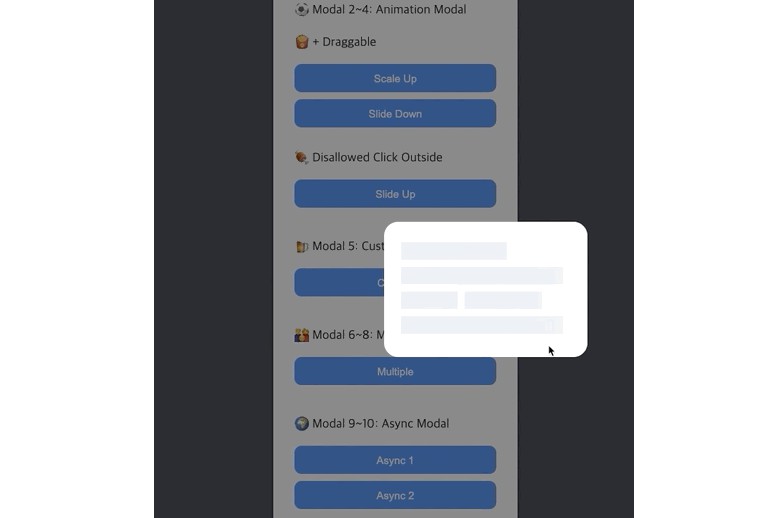
Animation
- Built-in animation
- Import "modalAnimation" module and pass the value to the animation props.
- scaleUp
- slideDown
- slideUp
import Modal, { modalAnimation } from "react-simple-modal-provider";

export default ({ children }) => {
  return (
    <Modal animation={modalAnimation.scaleUp}>
      ...
    </Modal>
  );
};
- Custom animation examples
top, bottom, left, right type cannot be used.
{
  type: "transform, opacity",
  base: "transform: translateY(-50px); opacity: 0;",
  before: "transform: translateY(50px); opacity: 0;",
  after: "transform: translateY(0px); opacity: 1;",
}
{
  type: "transform, opacity",
  base: "transform: rotate(0deg) scale(0.3); opacity: 0;",
  before: "transform: rotate(0deg) scale(0.3); opacity: 0;",
  after: "transform: rotate(360deg) scale(1); opacity: 1;"
}
ETC
- Forward props when opening modals
// ConsumePage Component
import { useModal } from "react-simple-modal-provider";

export default () => {
  const { open } = useModal("ETCModal");

  return <button onClick={() => open({ title: "Hello World" })}>Open</button>;
};
// ModalBody Component
import { useModal } from "react-simple-modal-provider";

export default () => {
  const { title } = useModal("ETCModal");

  return <h1>{title}</h1>;  // Hello World
};