Material-UI Storybook Components for React
React.js components made with TypeScript with on Material-UI look-like using Storybook.
The problem

- @Material UI was designed to be used from the get-go with its own styling solution, implemented over JSS, but it’s a great option to build fast UI interfaces.
- @Vanilla JavaScript has such an extensive verbose syntax, thats not good for website production.
- How to keep the congruence between built in components’ functionalities without everything go as mess up! ?
Solution
- Use @Styled components to overriding Material UI original theme.
- Use @TypeScript for:
- Static Typing avoids Typos.
- Maintenance of Large Code Base is made easy by references.
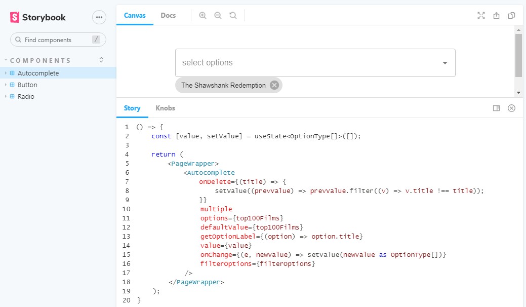
- Use @Storybook for building UI components and pages in isolation ?.
Learn More about React and its common issues
You can learn more in the Create React App documentation.
To learn React, check out the React documentation.
Code Splitting
This section has moved here: https://facebook.github.io/create-react-app/docs/code-splitting
Analyzing the Bundle Size
This section has moved here: https://facebook.github.io/create-react-app/docs/analyzing-the-bundle-size
Making a Progressive Web App
This section has moved here: https://facebook.github.io/create-react-app/docs/making-a-progressive-web-app
Advanced Configuration
This section has moved here: https://facebook.github.io/create-react-app/docs/advanced-configuration
Deployment
This section has moved here: https://facebook.github.io/create-react-app/docs/deployment
npm run build fails to minify
This section has moved here: https://facebook.github.io/create-react-app/docs/troubleshooting