react-virtualized-dnd
react-virtualized-dnd is a React-based, fully virtualized drag-and-drop framework, enabling the the cross over of great user interaction and great performance. This project was made in response to the large amount of issues experienced trying to use virtualization libraries together with drag and drop libraries - react-virtualized-dnd does it all for you!
Install
npm install --save react-virtualized-dnd
Usage
React-Virtualized-DnD utilizes a three part abstraction for drag and drop:
- A DragDropContext, which controls the overall flow and events of the drag and drop.
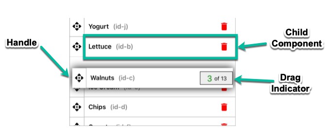
- Draggables, which are wrappers for the elements you want to drag around.
- Droppables, which indicate a drop zone that Draggables can be dropped on, and create the virtualizing container.
Draggables and Droppables can be organized in groups.
Droppables use an internal scrollbar to virtualize its children, and the DragDropContext offers the option to include a horizontal scrollbar.
React-virtualized-dnd places a placeholder in droppables during drag, which is placed after the draggable element hovered over during drag. The placeholderId represents the id of the element it was placed after.
On drag end, the DragDropContext returns the placeholderId.
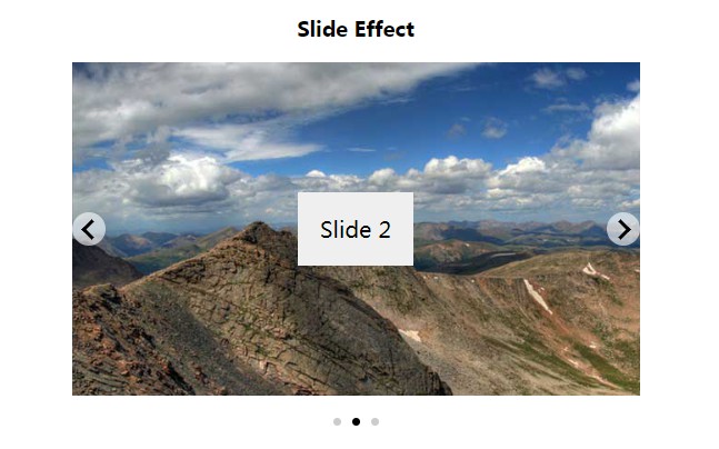
Example code can be seen below. A live example can be found at: https://forecast-it.github.io/react-virtualized-dnd/
import React, {Component} from 'react';

import ExampleBoard from 'react-virtualized-dnd';

class Example extends Component {
	render() {
    const name = 'my-group';
    const elemsToRender = [... your data here ...];
		return (
			<DragDropContext dragAndDropGroup={name} onDragEnd={this.onDragEnd.bind(this)} horizontalScroll={true}>
				<div className={'your-drag-container'}>
					{elemsToRender.map((elem, index) => (
						<div className={'your-droppable-container'}>
							<Droppable dragAndDropGroup={name} droppableId={elem.droppableId} key={elem.droppableId}>
								{elem.items.map(item => (
									<Draggable dragAndDropGroup={name} draggableId={item.id}>
										<div className='your-draggable-element'>
											<p>
												{item.name}
											</p>
										</div>
									</Draggable>
								))}
							</Droppable>
						</div>
					))}
				</div>
			</DragDropContext>
		);
	}
}
Documentation & API
DragDropContext
Props
| Prop | Type | Required | Description |
|---|---|---|---|
| dragAndDropGroup | string | yes | Unique identifier for the drag and drop group the context uses |
| outerScrollBar | boolean | no | Enables or disables global outer scrolling of the context (triggered by dragging) |
| scrollYSpeed | number | no | Custom scroll speed for global page scrolling (y-axis) |
| scrollXSpeed | number | no | Custom scroll speed for global page scrolling (x-axis) |
| scrollContainerHeight | number | no, yes with outerScrollBar | Height of the outer scrollable container |
| scrollContainerMinHeight | number | no | Minimum height of the outer scrollable container |
| onDragEnd | function | no | Function fired on drag end with the source object, the droppableId of the destination, and the ID of the placeholder dropped on as params |
| onDragCancel | function | no | Function fired on drag end if the drop did not occur inside a droppable with the draggableId of the dragged element as params |
| onDragStart | function | no | Function fired on drag start with the draggableId of the dragged element as params |
The placeholder ID can be used to determine where to place the dragged element on drag end. The placeholderID returns the string "END_OF_LIST" if dragged below the last element of a droppable.
Draggable
Props
| Prop | Type | Required | Description |
|---|---|---|---|
| dragAndDropGroup | string | yes | Unique identifier for the drag and drop group the context uses |
| draggableId | string | yes | Unique identifier for the draggable |
| dragActiveClass | string | no | CSS class applied to a draggable element during an active drag |
| dragDisabled | bool | no | Flag to disabled dragging of element |
Draggables will ignore drags started by clicking on any element with the "no-drag" css class. This can be used to control drag interactions with interactive elements, such as inputs or buttons.
Droppable
Props
| Prop | Type | Required | Description |
|---|---|---|---|
| dragAndDropGroup | string | yes | Unique identifier for the drag and drop group the context uses |
| droppableId | string | yes | Unique identifier for the droppable |
| placeholderStyle | object | no | Style object for placeholder. If included, remember to include placeholder height. |
| containerHeight | number | yes | Height of the virtualizing scroll container |
| containerMinHeight | number | no | Minimum height of the virtualizing scroll container (if larger than total height of elems) |
| rowHeight | number | no | Height of each row with borders. Default is 50px. |
| disableScroll | boolean | no | Flag to disable scrollbars. This disables virtualization as well |
| listHeader | HTML element | no | Element to use as header for a droppable list, to react to drops on top of the list. |
| listHeaderHeight | Number | no (yes with listHeader) | Height of the header element, necessary for calculations. |
| activeHeaderClass | string | no | CSS class added to the header when an active drag is hovering over the list header |
| hideList | boolean | no | Hides (unrenders) all droppable elements in the list |
| dynamicElemHeight | boolean | no | Flag to indicate differing/dynamicly changing heights of children elements.* |
*Enabling dynamic element height currently disables virtualization, but allows usage of the framework for DnD/Autoscroll purposes. Virtualization for dynamicly sized elements will come in a future update.