React Layout Masonry
React Layout Masonry is a flexible and customizable React component for creating dynamic and fixed/responsive masonry layouts.
Installation
You can install React Layout Masonry using npm, pnpm or yarn:
npm install react-layout-masonry
or
pnpm install react-layout-masonry
or
yarn add react-layout-masonry
Usage
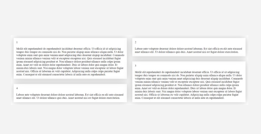
Fixed Columns Layout
Here’s an example of how to use React Layout Masonry with a fixed number of columns in your React application:
import Masonry from 'react-layout-masonry';

const FixedColumnsMasonry = () => {
  return (
    <Masonry columns={3} gap={16}>
      {items.map((item) => {
        return <Item {...item}>
      })}
    </Masonry>
  );
};

export default FixedColumnsMasonry;
Responsive Columns Layout
Here’s an example of how to use React Layout Masonry with responsive columns in your React application:
import Masonry from 'react-layout-masonry';

const ResponsiveColumnsMasonry = () => {
  return (
    <Masonry columns={{ 640: 1, 768: 2, 1024: 3, 1280: 5 }} gap={16}>
        {items.map((item) => {
        return <Item {...item}>
      })}
    </Masonry>
  );
};

export default ResponsiveColumnsMasonry;
Column Props
The columnProps prop allows you to apply additional props to the container of each column. Here’s an example:
<Masonry
  columns={3}
  gap={16}
  columnProps={{
    className: 'custom-column',
    style: { backgroundColor: 'lightgray' },
  }}
>
  {/* ... */}
</Masonry>
Props
columns(number or object, required): The number of columns in the masonry layout, or an object with breakpoints and corresponding column counts.gap(number, optional): The spacing between columns and rows in pixels. Defaults to 0.columnProps(object, optional): Additional props to be applied to each column, such as className for styling.
Examples
For examples, usage and customization options, please refer to the stories directory in this repository.