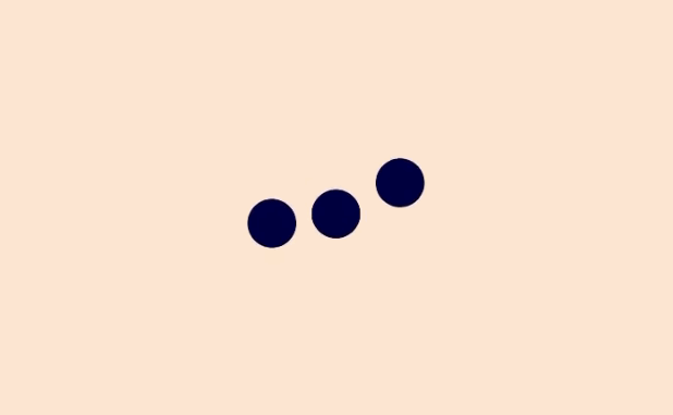
React Spinners
A collection of loading spinners with React.js based on Halogen.
This package is bootstraped using react-npm-boilerplate
Installation
npm install react-spinners --save
Usage
Each loader has their own default properties. You can overwrite the defaults by passing props into the loaders.
Each loader accepts a loading prop as a boolean. The loader will not render anything if loading is false. The loading prop defaults to true.
IMPORTANT: This package uses emotion. Remember to add the plugin to .babelrc, for example:
{
    "presets": [ "react", "es2015", "stage-0"],
    "plugins": ["emotion"]
}
Example
import React from 'react';
import { RingLoader } from 'react-spinners';

class AwesomeComponent extends React.Component {
  constructor(props) {
    super(props);
    this.state = {
      loading: true
    }
  }
  render() {
    return (
      <div className='sweet-loading'>
        <RingLoader
          color={'#123abc'}
          loading={this.state.loading}
        />
      </div>
    )
  }
}
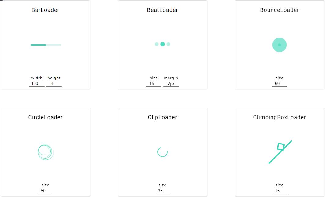
Available Loaders, PropTypes, and Default Values
Common default props for all loaders:
loading: true
color: '#000000'
| Loader | size:int | height:int | width:int | radius:int | margin:str |
|---|---|---|---|---|---|
| BarLoader | 4 |
100 |
|||
| BeatLoader | 15 |
2px |
|||
| BounceLoader | 60 |
||||
| CircleLoader | 50 |
||||
| ClipLoader | 35 |
||||
| ClimbingBoxLoader | 15 |
||||
| DotLoader | 60 |
2px |
|||
| FadeLoader | 15 |
5 |
2 |
2px |
|
| GridLoader | 15 |
||||
| HashLoader | 50 |
2px |
|||
| MoonLoader | 60 |
2px |
|||
| PacmanLoader | 25 |
2px |
|||
| PropagateLoader | 15 |
||||
| PulseLoader | 15 |
2px |
|||
| RingLoader | 60 |
2px |
|||
| RiseLoader | 15 |
2px |
|||
| RotateLoader | 15 |
2px |
|||
| ScaleLoader | 35 |
4 |
2 |
2px |
|
| SyncLoader | 15 |
2px |