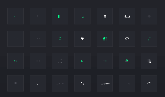
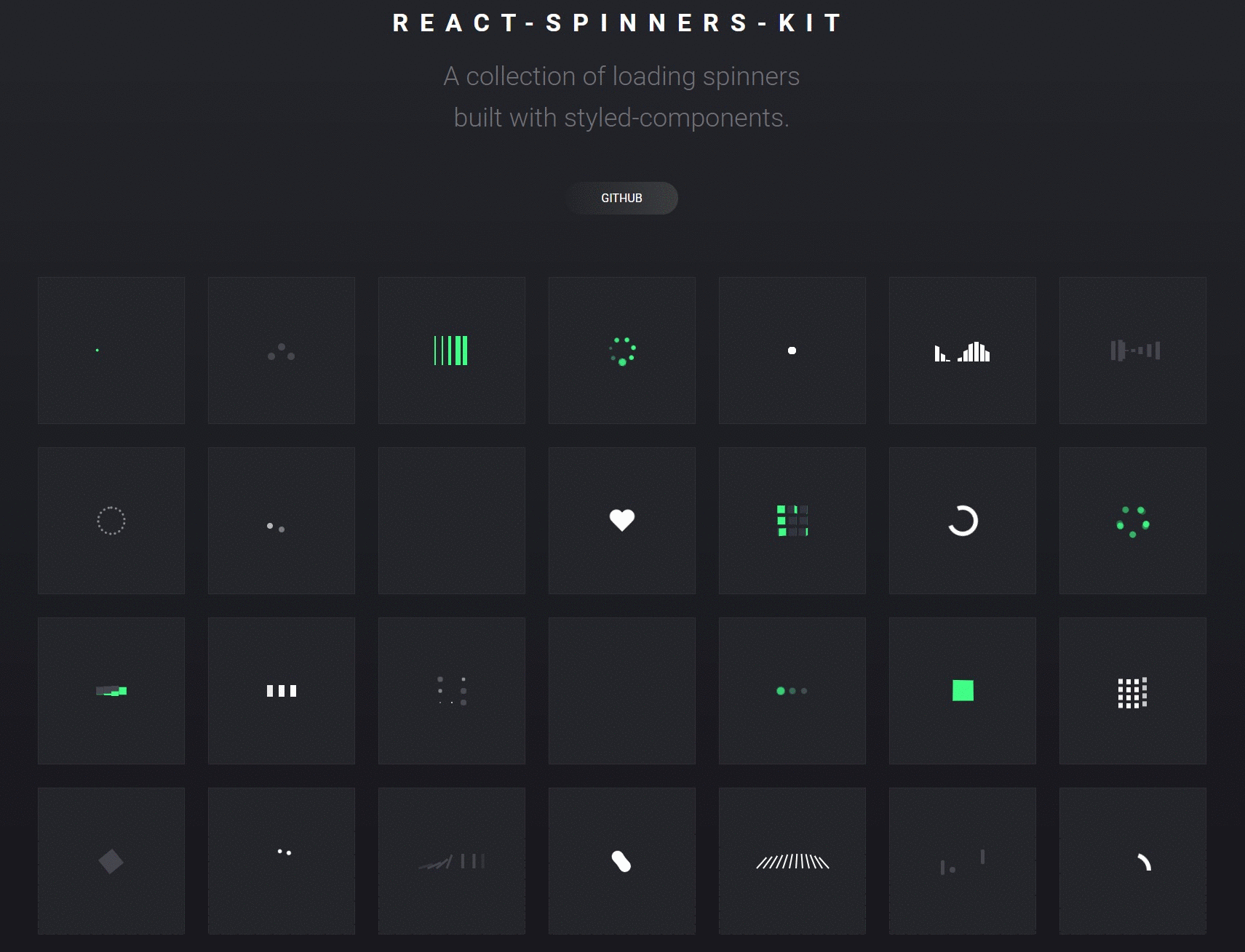
react-spinners-kit
A collection of loading spinners built with styled-components.
Installation
Install react-spinners-kit using npm.
npm install --save react-spinners-kit
or if you prefer yarn
yarn add react-spinners-kit
Usage
import React from "react";
import ReactDOM from "react-dom";
import { PushSpinner } from "react-spinners-kit";

class App extends React.Component {
    constructor(props) {
        super(props);
        this.state = {
            loading: true,
        };
    }

    render() {
        const { loading } = this.state;
        return (
            <PushSpinner
                size={30}
                color="#686769"
                loading={loading}
            />
        );
    }
}

ReactDOM.render(<App />, document.getElementById("root"));
PropTypes and Default Props
- Each spinner accepts a
loadingprop as a boolean. - The
loadingprop defaults totrue. - The loader will not render anything if
loadingisfalse.
| Spinner | Size | Color | FrontColor | BackColor | LeftColor | TopColor | FirstColor | SecondColor |
|---|---|---|---|---|---|---|---|---|
| BallSpinner | 40 | #00ff89 | - | - | - | - | - | - |
| BarsSpinner | 40 | #00ff89 | - | - | - | - | - | - |
| CircleSpinner | 30 | #fff | - | - | - | - | - | - |
| CubeSpinner | 25 | - | #00ff89 | #686769 | - | - | - | - |
| DominoSpinner | 100 | #686769 | - | - | - | - | - | - |
| FillSpinner | 20 | #686769 | - | - | - | - | - | - |
| FireworkSpinner | 40 | #fff | - | - | - | - | - | - |
| FlagSpinner | 40 | #fff | - | - | - | - | - | - |
| GridSpinner | 40 | #fff | - | - | - | - | - | - |
| GuardSpinner | 40 | - | #00ff89 | - | #686769 | - | - | - |
| HeartSpinner | 40 | #fff | - | - | - | - | - | - |
| ImpulseSpinner | 40 | - | - | #686769 | - | #00ff89 | - | - |
| PulseSpinner | 40 | #fff | - | - | - | - | - | - |
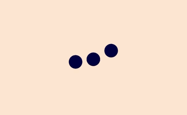
| PushSpinner | 30 | #686769 | - | - | - | - | - | - |
| SequenceSpinner | 40 | - | #686769 | - | #00ff89 | - | - | - |
| SphereSpinner | 30 | #fff | - | - | - | - | - | - |
| SpiralSpinner | 40 | #00ff89 | #686769 | - | - | - | - | |
| StageSpinner | 40 | #fff | - | - | - | - | - | - |
| SwapSpinner | 40 | #686769 | - | - | - | - | - | - |
| WaveSpinner | 30 | #fff | - | - | - | - | - | - |
| ClapSpinner | 30 | - | - | #686769 | - | #00ff89 | - | - |
| RotateSpinner | 45 | #00ff89 | - | - | - | - | - | - |
| SwishSpinner | 40 | - | - | - | - | - | #4b4c56 | #fff |
| GooSpinner | 55 | #fff | - | - | - | - | - | - |
| CombSpinner | 100 | #fff | - | - | - | - | - | - |
| PongSpinner | 60 | #4b4c56 | - | - | - | - | - | - |
| RainbowSpinner | 50 | #fff | - | - | - | - | - | - |
| RingSpinner | 30 | #00ff89 | - | - | - | - | - | - |
| HoopSpinner | 45 | #4b4c56 | - | - | - | - | - | - |
Development
You can also test the components locally by cloning this repo and doing the following steps:
Install dependencies from package.json:
npm install
Runs the app in the development mode.
Open http://localhost:1234 to view it in the browser.
npm start
Run linter