Draftail
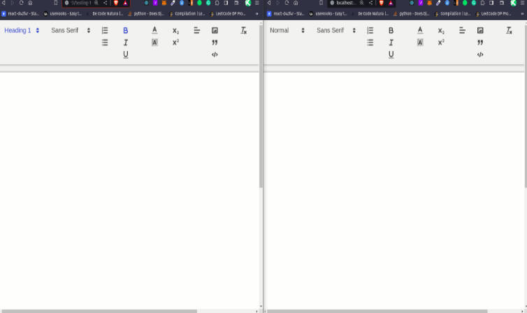
A configurable rich text editor based on Draft.js, built for Wagtail.
It’s developed alongside our Python Draft.js exporter, for integration into Wagtail.
Features
This project adheres to Semantic Versioning, and measures performance and code coverage. We also try to follow accessibility best practices (tested with aXe) – please get in touch if you can help us do better in this area.
Draftail aims for a mouse-free, keyboard-centric experience. Most formatting can be done by using common keyboard shortcuts, inspired by Google Docs and Markdown.
Here are important features worth highlighting:
- Support for keyboard shortcuts. Lots of them!
- Paste from Word. Or any other editor.
- Autolists – start a line with
-,*,1.to create a list item. - Shortcuts for heading levels
##, code blocks```, and more. - Undo / redo – until the end of times.
- Common text types: headings, paragraphs, quotes, lists.
- Common text styles: Bold, italic, and many more.
- API to build custom controls for links, images, and more.
Using Draftail
Have a look at the user guide.
Draftail is meant to be used in scenarios where not all formatting should be available, and where custom formatting can be necessary. Available formats, built-in and custom, can be specificed declaratively for each editor instance.
Built-in formats
- Block types: H1, H2, H3, H4, H5, H6, Blockquote, Code, UL, OL, P
- Inline styles: Bold, Italic, Underline, Code, Strikethrough, Mark, Keyboard, Superscript, Subscript
- And HR, BR
Draftail does not come with built-in controls for things like images and links, so you can build your own exactly as you wish. This is particularly useful when integrating with content sources, like a CMS, an API, or other tools with a fixed schema.
Custom formats
Your mileage may vary! There is good support for custom block-level and inline formatting. Custom entities or decorators require knowledge of the Draft.js API, which is very low-level.
Getting started
First, grab the package from npm:
# Draftail's peerDependencies:
npm install --save draft-js@^0.10.5 react react-dom prop-types
npm install --save draftail
Import the styles for Draft.js, and the editor:
@import 'draft-js/dist/Draft';
@import 'draftail/dist/draftail';
Then, import the editor and use it in your code. Here is a simple example:
import React from 'react';
import ReactDOM from 'react-dom';

import { DraftailEditor, BLOCK_TYPE, INLINE_STYLE } from 'draftail';

const initial = JSON.parse(sessionStorage.getItem('draftail:content'));

const onSave = content => {
    console.log('saving', content);
    sessionStorage.setItem('draftail:content', JSON.stringify(content));
};

const editor = (
    <DraftailEditor
        rawContentState={initial || null}
        onSave={onSave}
        blockTypes={[
            { type: BLOCK_TYPE.HEADER_THREE, label: 'H3' },
            { type: BLOCK_TYPE.UNORDERED_LIST_ITEM, label: 'UL' },
        ]}
        inlineStyles={[
            { type: INLINE_STYLE.BOLD, label: 'B' },
            { type: INLINE_STYLE.ITALIC, label: 'I' },
        ]}
    />
);

ReactDOM.render(editor, document.querySelector('[data-mount]'));
Finally, be sure to check out the required polyfills.
Options and configuration
To change the behavior of the editor, pass props to DraftailEditor. Here are the available props, and their default values:
// Initial content of the editor. Use this to edit pre-existing content.
rawContentState: null,
// Called when changes occured. Use this to persist editor content.
onSave: () => {},
// Displayed when the editor is empty. Hidden if the user changes styling.
placeholder: null,
// Enable the use of horizontal rules in the editor.
enableHorizontalRule: false,
// Enable the use of line breaks in the editor.
enableLineBreak: false,
// Show undo control in the toolbar.
showUndoControl: false,
// Show redo control in the toolbar.
showRedoControl: false,
// Disable copy/paste of rich text in the editor.
stripPastedStyles: true,
// Set whether spellcheck is turned on for your editor.
// See https://draftjs.org/docs/api-reference-editor.html#spellcheck.
spellCheck: false,
// Optionally set the overriding text alignment for this editor.
// See https://draftjs.org/docs/api-reference-editor.html#textalignment.
textAlignment: null,
// Optionally set the overriding text directionality for this editor.
// See https://draftjs.org/docs/api-reference-editor.html#textdirectionality.
textDirectionality: null,
// Set if auto capitalization is turned on and how it behaves.
// See https://draftjs.org/docs/api-reference-editor.html#autocapitalize-string.
autoCapitalize: null,
// Set if auto complete is turned on and how it behaves.
// See https://draftjs.org/docs/api-reference-editor.html#autocomplete-string.
autoComplete: null,
// Set if auto correct is turned on and how it behaves.
// See https://draftjs.org/docs/api-reference-editor.html#autocorrect-string.
autoCorrect: null,
// See https://draftjs.org/docs/api-reference-editor.html#aria-props.
ariaDescribedBy: null,
// List of the available block types.
blockTypes: [],
// List of the available inline styles.
inlineStyles: [],
// List of the available entity types.
entityTypes: [],
// List of active decorators.
decorators: [],
// Additional React components to render in the toolbar.
controls: [],
// Max level of nesting for list items. 0 = no nesting. Maximum = 10.
maxListNesting: 1,
// Frequency at which to call the save callback (ms).
stateSaveInterval: 250,
Formatting options
Draftail, like Draft.js, distinguishes between 3 content formats:
- Blocks, that provide structure to the content. Blocks do not overlap – no content can be both a paragraph and a title.
- Inline styles, providing inline formatting for text. Styles can overlap: a piece of text can be both bold and italic.
- Entities, annotating content with metadata to represent rich content beyond text. Entities can be inline (eg. a link applied on a portion of text), or block-based (eg. an embedded video).
Configuring available formats
By default, the editor provides the least amount of rich text features. Formats have to be explicitly enabled by the developer, so they have as much control over what rich content is available as possible.
To use a given format, add it to the corresponding list, following the options detailed in the next sections.
// List of the available block types.
blockTypes: [],
// List of the available inline styles.
inlineStyles: [],
// List of the available entity types.
entityTypes: [],
Blocks
// Unique type shared between block instances.
type: PropTypes.string.isRequired,
// Describes the block in the editor UI, concisely.
label: PropTypes.string,
// Describes the block in the editor UI.
description: PropTypes.string,
// Represents the block in the editor UI.
icon: [...], // see documentation.
// DOM element used to display the block within the editor area.
element: PropTypes.string,
Inline styles
// Unique type shared between inline style instances.
type: PropTypes.string.isRequired,
// Describes the inline style in the editor UI, concisely.
label: PropTypes.string,
// Describes the inline style in the editor UI.
description: PropTypes.string,
// Represents the inline style in the editor UI.
icon: [...], // see documentation.
// CSS properties (in JS format) to apply for styling within the editor area.
style: PropTypes.Object,
Entities
// Unique type shared between entity instances.
type: PropTypes.string.isRequired,
// Describes the entity in the editor UI, concisely.
label: PropTypes.string,
// Describes the entity in the editor UI.
description: PropTypes.string,
// Represents the entity in the editor UI.
icon: [...], // see documentation.
// React component providing the UI to manage entities of this type.
source: PropTypes.func.isRequired,
// React component to display inline entities.
decorator: PropTypes.func,
// React component to display block-level entities.
block: PropTypes.func,
// Array of attributes the entity uses, to preserve when filtering entities on paste.
// If undefined, all entity data is preserved.
attributes: PropTypes.arrayOf(PropTypes.string),
// Attribute - regex mapping, to whitelist entities based on their data on paste.
// For example, { url: '^https:' } will only preserve links that point to HTTPS URLs.
whitelist: PropTypes.object,
Decorators
// Determines which pieces of content are to be decorated.
strategy: PropTypes.func,
// React component to display the decoration.
component: PropTypes.func,
Custom formats
Draftail is meant to provide a consistent editing experience regardless of what formats (blocks, inline styles, entities) are available. It should be simple for developers to enable/disable a certain format, or to create new ones.
Here are quick questions to help you determine which formatting to use, depending on the use case:
| In order to... | Use |
|---|---|
| Format a portion of a line | Inline styles |
| Indicate the structure of the content | Blocks |
| Enter additional data/metadata | Entities |
Custom inline styles
Custom inline styles only require a style prop, defining which CSS properties to apply when the format is active.
Here is a basic example:
inlineStyles={[
    {
        label: 'Redacted',
        type: 'REDACTED',
        style: {
            backgroundColor: 'currentcolor',
        },
    },
]}
It is also possible to override the styling of predefined inline styles:
inlineStyles={[
    {
        label: 'Bold',
        type: INLINE_STYLE.BOLD,
        style: {
            fontWeight: 'bold',
            textShadow: '1px 1px 1px black',
        },
    },
]}
Custom blocks
Simple blocks are very easy to create. Add a new block type to blockTypes, specifying which element to display the block as.
Here is an example, creating a "Tiny text" block:
blockTypes={[
    {
        type: 'tiny-text',
        label: 'Tiny',
        element: 'div',
    },
]}
You may also use CSS to style the block, via the Draftail-block--tiny-text class:
.Draftail-block--tiny-text {
    font-size: 11px;
    font-style: italic;
}
More advanced blocks, requiring custom React components, aren't supported at the moment. If you need this, feel free to create an issue.
Custom entity types
Creating custom entity types is a bit more involved because entities aren't simply on/off: they often need additional data (thus a UI to enter this data), and can be edited. The entity API is at a much lower level of abstraction than that of blocks and styles, and knowledge of the Draft.js API is expected.
Apart from the usual type/label/description/icon options, entities need:
- A
source, a React component that will be rendered to display the UI when creating or editing an entity. This could involve a modal window, API calls, a tooltip, or any other mean of gathering entity data. - A
decorator, a React component to display the entity within the editor area for inline entities (eg. links). - Finally, the
blockis for block-level entities (think: image block, embed) to supply their React component.
Optionally, entities can also take an attributes and whitelist props. These can be used to determine whitelisting rules when pasting content into the editor, to only keep the entities considered valid. If undefined, all entities are always preserved with all of their data.
{
    type: ENTITY_TYPE.IMAGE,
    icon: '#icon-image',
    // Preserve the src and alt attributes and no other.
    attributes: ['src', 'alt'],
    // Preserve images for which the src starts with "http".
    whitelist: {
        src: '^http',
    },
}
Sources
Sources are responsible for creating and editing entities, and are toggled when requested from the toolbar, or from a decorator or block. Here is a simple image source which uses window.prompt to ask the user for an image's src, then creates an entity and its atomic block:
import { Component } from 'react';
import { AtomicBlockUtils } from 'draft-js';

class ImageSource extends Component {
    componentDidMount() {
        const { editorState, entityType, onComplete } = this.props;

        const src = window.prompt('Image URL');

        if (src) {
            const content = editorState.getCurrentContent();
            const contentWithEntity = content.createEntity(
                entityType.type,
                'IMMUTABLE',
                { src },
            );
            const entityKey = contentWithEntity.getLastCreatedEntityKey();
            const nextState = AtomicBlockUtils.insertAtomicBlock(
                editorState,
                entityKey,
                ' ',
            );

            onComplete(nextState);
        } else {
            onComplete(editorState);
        }
    }

    render() {
        return null;
    }
}
The source component is given the following props:
// The editorState is available for arbitrary content manipulation.
editorState: PropTypes.object.isRequired,
// Takes the updated editorState, or null if there are no changes.
onComplete: PropTypes.func.isRequired,
// Closes the source, without focusing the editor again.
onClose: PropTypes.func.isRequired,
// Whole entityType configuration, as provided to the editor.
entityType: PropTypes.object.isRequired,
// Current entityKey to edit, if any.
entityKey: PropTypes.string,
// Current entity to edit, if any.
entity: PropTypes.object,
Decorators
Decorators render inline entities based on their data.
const Link = ({ entityKey, contentState, children }) => {
    const { url } = contentState.getEntity(entityKey).getData();

    return (
        <span title={url} className="Link">
            {children}
        </span>
    );
};
They receive the following props:
// Key of the entity being decorated.
entityKey: PropTypes.string.isRequired,
// Full contentState, read-only.
contentState: PropTypes.object.isRequired,
// The decorated nodes / entity text.
children: PropTypes.node.isRequired,
// Call with the entityKey to trigger the entity source.
onEdit: PropTypes.func.isRequired,
// Call with the entityKey to remove the entity.
onRemove: PropTypes.func.isRequired,
The onEdit and onRemove props are meant so decorators can also serve in managing entities, eg. to build tooltips to edit links.
Blocks
Blocks render block-level entities based on their data, and can contain editing controls. Here is a simple image block, rendering images with src and alt attributes:
import React, { Component } from 'react';

class ImageBlock extends Component {
    render() {
        const { blockProps } = this.props;
        const { entity } = blockProps;
        const { src, alt } = entity.getData();

        return <img className="ImageBlock" src={src} alt={alt} width="256" />;
    }
}
They receive the following props:
// The current atomic block.
block: PropTypes.object.isRequired,
blockProps: PropTypes.shape({
    // The editorState is available for arbitrary content manipulation.
    editorState: PropTypes.object.isRequired,
    // Current entity to manage.
    entity: PropTypes.object.isRequired,
    // Current entityKey to manage.
    entityKey: PropTypes.string.isRequired,
    // Whole entityType configuration, as provided to the editor.
    entityType: PropTypes.object.isRequired,
    // Make the whole editor read-only, except for the block.
    lockEditor: PropTypes.func.isRequired,
    // Make the editor editable again.
    unlockEditor: PropTypes.func.isRequired,
    // Shorthand to edit entity data.
    onEditEntity: PropTypes.func.isRequired,
    // Shorthand to remove an entity, and the related block.
    onRemoveEntity: PropTypes.func.isRequired,
    // Update the editorState with arbitrary changes.
    onChange: PropTypes.func.isRequired,
}).isRequired,
Custom text decorators
Custom decorators follow the Draft.js CompositeDecorator API.
Other controls
Finally, Draftail also has an API to add arbitrary controls in the toolbar, via the controls prop. This prop takes an array of React components, which will be given a getEditorState function and the onChange handler as props.
Those controls can import the Icon and ToolbarButton components from Draftail if necessary.
UI and styling
Without custom controls, the editor has a very simple UI and its styles are relatively straightforward. To make sure everything works, use a CSS reset, like Normalize.css.
To tweak the editor UI, Draftail uses old-fashioned stable, namespaced class names that you are free to add more styles to. For example, the toolbar uses .Draftail-Toolbar.
Draftail also makes its Sass stylesheets available for extension:
// Increase the default editor z-index.
$draftail-editor-z-index: 100;

// Import all of the styles in your build.
@import 'draftail/lib/index';

// Alternatively, only import the constants to reuse them elsewhere in your project.
@import 'draftail/lib/api/constants';
Icons
Draftail can use icons to display each format in the toolbar. There are multiple possible formats:
- A
<path />data string (thedattribute), eg'M10 10 H 90 V 90 H 10 Z'. - An array of paths, eg.
['M10 10 H 90 V 90 H 10 Z', 'M10 10 H 90 V 90 H 10 Z']. - An SVG symbol reference, inline or external eg.
#square/test.svg#square.
The SVG has to use a 1024x1024 viewbox that will be downscaled to 16x16.
To deal with more complex requirements, the icon can be an arbitrary React component: <Icon icon={<CustomIcon icon="square" />.
Theming
If using Sass, you can get very far by adding new default values for the variables in _constants.scss. For example,
// Remove the editor's border and make the toolbar free-floating
$draftail-editor-border: 0;
$draftail-editor-padding: 0;
$draftail-toolbar-radius: 5px;

@import 'draftail/lib/index';
Draftail also has a draftail-richtext-styles mixin you can use to make sure styles on rich text content don't leak to other parts of your site:
@include draftail-richtext-styles {
    // Style Draft.js blockquotes.
    blockquote {
        border-left: 1px solid #e5e5e5;
        padding: 0 0 0 20px;
        margin-left: 0;
        font-style: italic;
    }
}
Without Sass, refer to class names starting with Draftail- or Draft / public-Draft (Draft.js)..
Other APIs
i18n - Internationalization
The editor comes with default labels in english, but all are overridable.
- For blocks, styles, and entities, use the
labeland-ordescriptionprop to set text in the right language. - For boolean controls (
enableLineBreak, etc), set instead an object withicon,label,descriptionprops (all optional).
Depending on the target language, you may also need to use the textDirectionality prop (LTR or RTL). See the full Draft.js documentation for more details.
Managing focus
Draftail has a focus() API like that of Draft.js. Use it to imperatively move focus to the editor.
Browser support and polyfills
Supported browser / device versions:
| Browser | Device/OS | Version |
|---|---|---|
| Chrome | Windows, macOS | latest |
| Firefox | Windows, macOS | latest |
| MS Edge | Windows | latest |
| Safari | macOS | latest |
| Mobile Safari | iOS Phone | latest |
| Mobile Safari | iOS Tablet | latest |
| Chrome | Android | latest |

