dark-mode
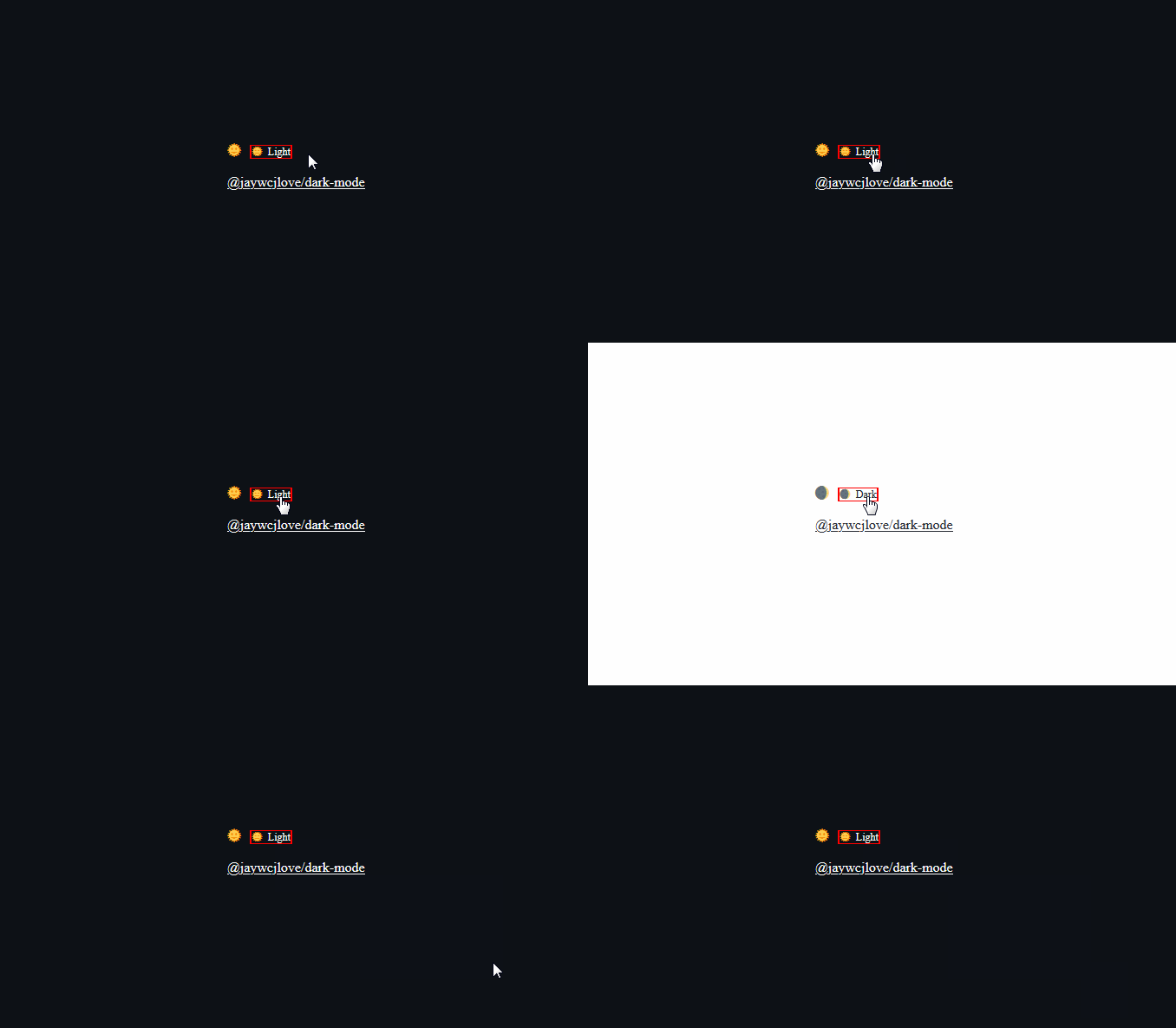
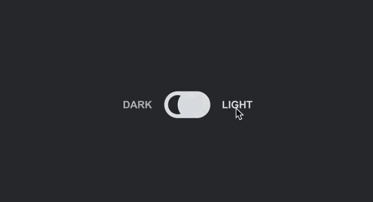
A custom element that allows you to easily put a Dark Mode ? toggle. so you can initially adhere to your users’ preferences according to prefers-color-scheme, but also allow them to (optionally permanently) override their system setting for just your site.
Installation
Install from npm:
npm install --save @wcj/dark-mode
Or, alternatively, use a <script defer> tag (served from unpkg’s CDN):
CDN: UNPKG | jsDelivr | Githack | Statically
<script src="https://unpkg.com/@wcj/dark-mode" defer></script>
Usage
There are two ways how you can use <dark-mode>:
<dark-mode></dark-mode>
<dark-mode light="Dart" dark="Light"></dark-mode>
<dark-mode dark="Dark" light="Light" style="border: 1px solid red; font-size: 12px;"></dark-mode>
Use in React:
import React from 'react';
import '@wcj/dark-mode';

function Demo() {
  return (
    <div>
      <dark-mode light="Dart" dark="Light"></dark-mode>
    </div>
  );
}
Contributors
As always, thanks to our amazing contributors!
Made with github-action-contributors.
License
Licensed under the MIT License.


