react-dropdown
Simple Dropdown component for React, inspired by react-select.
Why
- The default HTML select element is hard to style
- And sometime we also want grouped menus
- if you want more advanced select, check react-select
Installation
//with npm
$ npm install react-dropdown  --save
//with yarn
$ yarn add react-dropdown
Changelog
If you want to support React version under v0.13, use [email protected]
Usage
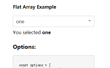
Flat Array options
const options = [
  'one', 'two', 'three'
]
Object Array options
const options = [
  { value: 'one', label: 'One' },
  { value: 'two', label: 'Two', className: 'myOptionClassName' },
  {
   type: 'group', name: 'group1', items: [
     { value: 'three', label: 'Three', className: 'myOptionClassName' },
     { value: 'four', label: 'Four' }
   ]
  },
  {
   type: 'group', name: 'group2', items: [
     { value: 'five', label: 'Five' },
     { value: 'six', label: 'Six' }
   ]
  }
]
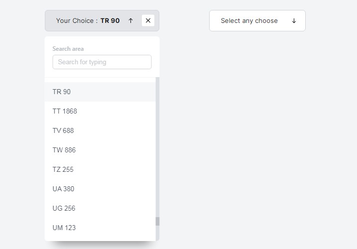
When using Object options you can add to each option a className string to further customize the dropdown, e.g. adding icons to options
Mount
import Dropdown from 'react-dropdown'
import 'react-dropdown/style.css'
const defaultOption = options[0]
<Dropdown options={options} onChange={this._onSelect} value={defaultOption} placeholder="Select an option" />
Disabling the Dropdown
Just pass a disabled boolean value to the Dropdown to disable it. This will also give you a .Dropdown-disabled class on the element, so you can style it yourself.
<Dropdown disabled onChange={this._onSelect} value={defaultOption} placeholder="Select an option" />
Custom className
The className prop is passed down to the wrapper div, which also has the Dropdown-root class.
<Dropdown className='myClassName' />
The controlClassName prop is passed down to the control div, which also has the Dropdown-control class.
<Dropdown controlClassName='myControlClassName' />
The placeholderClassName prop is passed down to the placeholder div, which also has the Dropdown-placeholder class.
<Dropdown placeholderClassName='myPlaceholderClassName' />
The menuClassName prop is passed down to the menu div (the one that opens and closes and holds the options), which also has the Dropdown-menu class.
<Dropdown menuClassName='myMenuClassName' />
The arrowClassName prop is passed down to the arrow span , which also has the Dropdown-arrow class.
<Dropdown arrowClassName='myArrowClassName' />
The arrowClosed & arrowOpen props enable passing in custom elements for the open/closed state arrows.
<Dropdown
  arrowClosed={<span className="arrow-closed" />}
  arrowOpen={<span className="arrow-open" />}
/>
Check more examples in the example folder.
Run example
$ npm start