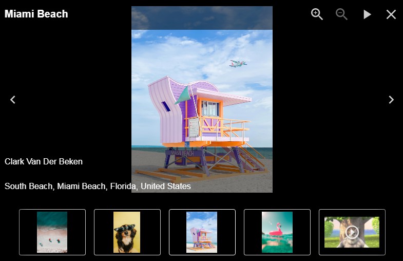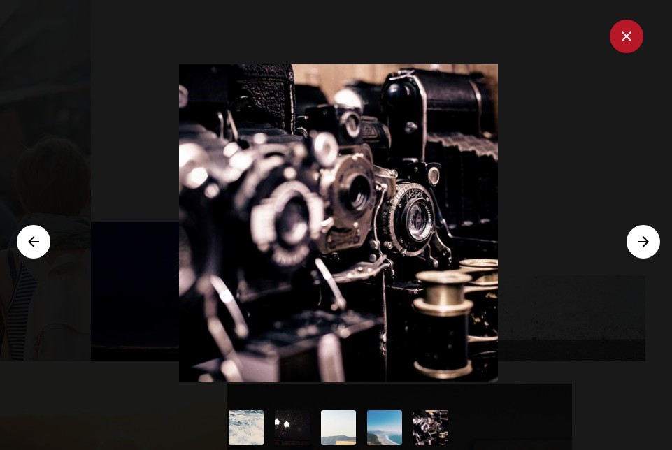
react-spring-lightbox
React-spring-lightbox is a flexible image gallery lightbox with native-feeling touch gestures and buttery smooth animations.
✨ Features
- :point_up:
Mousewheel, swipe or click+drag to page photos - :keyboard: Keyboard controls ← → Esc
- :mouse2: Ctrl +
MousewheelorTrackpad Pinchto zoom - :mag_right: Double/Single-tap or double/single-click to zoom in/out
- :ok_hand: Pinch to zoom
- :point_left: Panning on zoomed-in images
- :checkered_flag: Highly performant spring based animations via react-spring
- No external CSS
- Implement your own UI
- Supports IE 11, Edge, Safari, Chrome, Firefox and Opera
Install
yarn add react-spring-lightbox
Usage
import React, { useState } from 'react';
import Lightbox from 'react-spring-lightbox';
const images = [
{
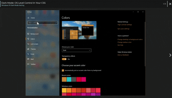
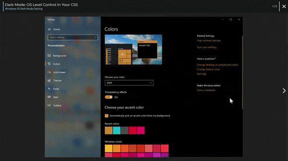
src:
'https://timellenberger.com/static/blog-content/dark-mode/win10-dark-mode.jpg',
alt: 'Windows 10 Dark Mode Setting'
},
{
src:
'https://timellenberger.com/static/blog-content/dark-mode/macos-dark-mode.png',
alt: 'macOS Mojave Dark Mode Setting'
},
{
src:
'https://timellenberger.com/static/blog-content/dark-mode/android-9-dark-mode.jpg',
alt: 'Android 9.0 Dark Mode Setting'
}
];
const CoolLightbox = () => {
const [currentImageIndex, setCurrentIndex] = useState(0);
const gotoPrevious = () =>
currentImageIndex > 0 && setCurrentIndex(currentImageIndex - 1);
const gotoNext = () =>
currentImageIndex + 1 < images.length &&
setCurrentIndex(currentImageIndex + 1);
return (
<Lightbox
isOpen={true}
onPrev={gotoPrevious}
onNext={gotoNext}
images={images}
currentIndex={currentImageIndex}
/* Add your own UI */
// renderHeader={() => (<CustomHeader />)}
// renderFooter={() => (<CustomFooter />)}
// renderPrevButton={() => (<CustomLeftArrowButton />)}
// renderNextButton={() => (<CustomRightArrowButton />)}
// renderImageOverlay={() => (<ImageOverlayComponent >)}
/* Add styling */
// className="cool-class"
// style={{ background: "grey" }}
/* Handle closing */
// onClose={handleClose}
/* Use single or double click to zoom */
// singleClickToZoom
/* react-spring config for open/close animation */
// pageTransitionConfig={{
// from: { transform: "scale(0.75)", opacity: 0 },
// enter: { transform: "scale(1)", opacity: 1 },
// leave: { transform: "scale(0.75)", opacity: 0 },
// config: { mass: 1, tension: 320, friction: 32 }
// }}
/>
);
};
export default CoolLightbox;
Props
| Prop | Description |
|---|---|
| isOpen | Flag that dictates if the lightbox is open or closed |
| onClose | Function that closes the Lightbox |
| onPrev | Function that changes currentIndex to previous image in images |
| onNext | Function that changes currentIndex to next image in images |
| currentIndex | Index of image in images array that is currently shown |
| renderHeader | A React component that renders above the image pager |
| renderFooter | A React component that renders below the image pager |
| renderPrevButton | A React component that is used for previous button in image pager |
| renderNextButton | A React component that is used for next button in image pager |
| renderImageOverlay | A React component that renders within the image stage, useful for creating UI overlays on top of the current image |
| singleClickToZoom | Overrides the default behavior of double clicking causing an image zoom to a single click |
| images | Array of image objects to be shown in Lightbox |
| className | Classes are applied to the root lightbox component |
| style | Inline styles are applied to the root lightbox component |
| pageTransitionConfig | React-Spring useTransition config for page open/close animation |
Local Development
Clone the repo
git clone https://github.com/tim-soft/react-spring-lightbox.git react-spring-lightbox
cd react-spring-lightbox
Setup symlinks
yarn link
cd example
yarn link react-spring-lightbox
Run the library in development mode
yarn start
Run the example app in development mode
cd example
yarn dev
Changes to the library code should hot reload in the demo app