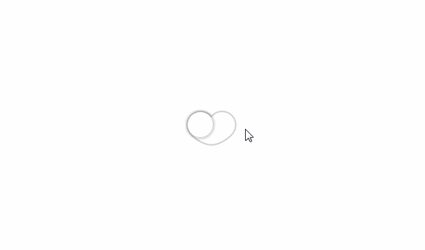

heart-switch
A heart-shaped toggle switch component for React. Inspired by Tore Bernhoft’s I heart toggle Dribbble shot.


? Getting Started
⚡️ Quick Start
npm install @anatoliygatt/heart-switch @emotion/react @emotion/styled
import { useState } from 'react';
import { HeartSwitch } from '@anatoliygatt/heart-switch';

function Example() {
  const [checked, setChecked] = useState(false);
  return (
    <HeartSwitch
      size="lg"
      inactiveTrackFillColor="#cffafe"
      inactiveTrackStrokeColor="#22d3ee"
      activeTrackFillColor="#06b6d4"
      activeTrackStrokeColor="#0891b2"
      inactiveThumbColor="#ecfeff"
      activeThumbColor="#ecfeff"
      checked={checked}
      onChange={(event) => {
        setChecked(event.target.checked);
      }}
    />
  );
}
? Live Demo

⚙️ Configuration
HeartSwitch supports the following props:
| Prop | Type | Default value | Description |
|---|---|---|---|
| size | string | sm |
The size of the toggle switch. There are 3 available sizes:
|
| inactiveTrackFillColor | string | #ffffff |
The fill color of the track when the toggle switch is in an inactive/off state. |
| inactiveTrackStrokeColor | string | #d1d1d1 |
The stroke color of the track when the toggle switch is in an inactive/off state. |
| activeTrackFillColor | string | #ff708f |
The fill color of the track when the toggle switch is in an active/on state. |
| activeTrackStrokeColor | string | #ff4e74 |
The stroke color of the track when the toggle switch is in an active/on state. |
| disabledTrackFillColor | string | #f2f2f2 |
The fill color of the track when the toggle switch is in a disabled state. |
| disabledTrackStrokeColor | string | #d1d1d1 |
The stroke color of the track when the toggle switch is in a disabled state. |
| invalidTrackFillColor | string | #ffffff |
The fill color of the track when the toggle switch is in an invalid state. |
| invalidTrackStrokeColor | string | #d1d1d1 |
The stroke color of the track when the toggle switch is in an invalid state. |
| inactiveThumbColor | string | #ffffff |
The color of the thumb when the toggle switch is in an inactive/off state. |
| activeThumbColor | string | #ffffff |
The color of the thumb when the toggle switch is in an active/on state. |
| disabledThumbColor | string | #ffffff |
The color of the thumb when the toggle switch is in a disabled state. |
| invalidThumbColor | string | #ffffff |
The color of the thumb when the toggle switch is in an invalid state. |
| thumbShadowColor | string | rgb(23 23 23 / 0.25) |
The color of the thumb’s shadow. |
| thumbFocusRingColor | string | rgb(59 130 246 / 0.5) |
The color of the thumb’s focus ring. |
The majority of the native <input type="checkbox" /> attributes are also supported; namely, autoFocus, checked, defaultChecked, disabled, form, name, required, value, id, title, tabIndex, aria-disabled, aria-label, aria-describedby, aria-labelledby, onBlur, onChange, onFocus and onInvalid.
HeartSwitch also supports ref forwarding. If ref is passed, it will be forwarded to the underlying <input type="checkbox" /> element. It can be especially useful when we want to use HeartSwitch as an uncontrolled component.
♿️ Accessibility
In order to comply with the web accessibility standards, we must make use of an aria-label or aria-labelledby attribute, like so:
function AccessibleExample() {
  return <HeartSwitch aria-label="Accept Terms and Conditions" />;
}
Also, it is recommended to use an aria-disabled instead of a disabled attribute to make HeartSwitch immutable but focusable, like so:
function AccessibleAndDisabledExample() {
  return (
    <HeartSwitch
      aria-label="Accept Terms and Conditions"
      aria-disabled="true"
    />
  );
}