react-simple-tooltip
A lightweight and simple tooltip component for React.
Getting started

You can download react-simple-tooltip from the NPM registry via the npm or yarn commands
yarn add react-simple-tooltip
npm install react-simple-tooltip --save
If you don't use package manager and you want to include react-simple-tooltip directly in your html, you could get it from the UNPKG CDN
https://unpkg.com/react-simple-tooltip/dist/react-simple-tooltip.min.js.
Usage
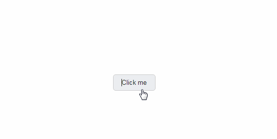
Attached to a Component
import React from "react"
import Tooltip from "react-simple-tooltip"
const App = () => (
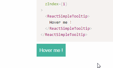
<Tooltip content="?">
<button>Hover me !</button>
</Tooltip>
)
Standalone
import React from "react"
import Tooltip from "react-simple-tooltip"

const App = () => (
  <div style={{position: "relative"}}>
    <Tooltip
      style={{position: "absolute", top: "50%", right: "0"}}
      content="?"
    />
  </div>
)
Custom css
import React from "react"
import Tooltip from "react-simple-tooltip"
import {css} from "styled-components"

const App = () => (
  <Tooltip
    content="?"
    customCss={css`
      white-space: nowrap;
    `}
  >
    <button>Hover me !</button>
  </Tooltip>
)
Props
| Name | PropType | Description | Default |
|---|---|---|---|
| arrow | PropTypes.number | Arrow size, in pixels | 8 |
| background | PropTypes.string | Tooltip background color | "#000" |
| border | PropTypes.string | Tooltip border color | "#000" |
| color | PropTypes.string | Tooltip text color | "#fff" |
| content | PropTypes.any.isRequired | Tooltip content | - |
| customCss | PropTypes.any | Custom css | - |
| fadeDuration | PropTypes.number | Fade duration, in milliseconds | 0 |
| fadeEasing | PropTypes.string | Fade easing | "linear" |
| fixed | PropTypes.bool | Tooltip behavior, hover by default | false |
| fontFamily | PropTypes.bool | Tooltip text font-family | "inherit" |
| fontSize | PropTypes.bool | Tooltip text font-size | "inherit" |
| padding | PropTypes.number | Tooltip padding, in pixels | 16 |
| placement | PropTypes.oneOf(["left", "top", "right", "bottom"]) | Tooltip placement | "top" |
| radius | PropTypes.number | Tooltip border radius | 0 |
| zIndex | PropTypes.number | Tooltip z-index | 1 |