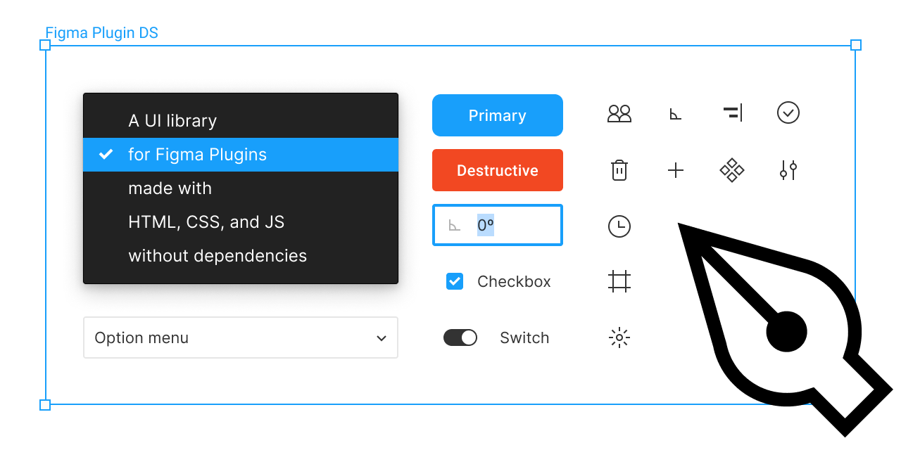
React Figma UI
React implementation for figma-plugin-ds by Tom Lowry
How to Install
First, install the library in your project by npm:
$ npm install react-figma-ui
Or Yarn:
$ yarn add react-figma-ui
Components
Button
To use the button, use the following component. Each button has a destructive option. Tertiary buttons are styled like hyperlinks.
import { Button } from 'react-figma-ui';

// Primary
<Button tint="primary">Label</Button>
<Button tint="primary" destructive>Label</Button>
<Button tint="primary" disabled>Label</Button>

// Secondary
<Button tint="secondary">Label</Button>
<Button tint="secondary" destructive>Label</Button>
<Button tint="secondary" disabled>Label</Button>

// Tertiary (Hyperlink style button)
<Button tint="tertiary">Label</Button>
<Button tint="tertiary" destructive>Label</Button>
<Button tint="tertiary" disabled>Label</Button>
Available options
HTML button element props and dedicated params
| Param | Description |
|---|---|
tint |
Display style for button: primary (filled), secondary (outlined), tertiary (hyperlink) |
destructive |
Add red destructive variant for actions such as deleting something |
Checkbox
To use the checkbox, use the following component. Remember each checkbox should get a unique ID.
import { Checkbox } from 'react-figma-ui';

// Checkbox unchecked
<Checkbox id="uniqueId">Label</Checkbox>

// Checkbox checked
<Checkbox id="uniqueId" checked>Label</Checkbox>

// Checkbox disabled
<Checkbox id="uniqueId" disabled>Label</Checkbox>
Available options
HTML input element props and dedicated params
| Param | Description |
|---|---|
containerProps |
Props for checkbox container |
labelProps |
Props for label element |
Disclosure
To use a disclosure panel, you must use the following component.
import { Disclosure, DisclosureTip } from 'react-figma-ui';

// Example tips
const tips = [
  { heading: 'Heading 1', content: 'Content 1', id: 1 },
  { heading: 'Heading 2', content: 'Content 2', id: 2 },
  { heading: 'Heading 3', content: 'Content 3', id: 3 },
];

() => (
  <Disclosure
    tips={tips}
    render={({ heading, content, id }, index) => (
      <DisclosureTip
        heading={heading}
        content={content}
        section={index % 2 === 0}
        expanded={index % 2 === 1}
        key={id}
      />
    )}
  />
);
Available options
Disclosure
HTML ul element props and dedicated params
| Param | Description |
|---|---|
tips |
Array with disclosure tips |
render |
Render props for DisclosureTip |
DisclosureTip
HTML li element props and dedicated params
| Param | Description |
|---|---|
heading |
Heading text value |
content |
Content text value |
section |
Style label like a heading |
expanded |
Add this option to have item expanded on load |
labelProps |
Props for label element |
contentProps |
Props for content element |
Icon
To use the icon, use the following component. Apply the appropriate icon name to select the item you wish to use, you can also add option to change the color, or even spin the icon. You can also specify no icon name to use a text character as an icon (for example, like found in the width + height icon inputs in Figma)
import { Icon } from 'react-figma-ui';

// Icon
<Icon iconName="theme" />

// Icon with blue colorName to change color
<Icon iconName="theme" colorName="blue" />

// Spinner Icon with spinning animation
<Icon iconName="spinner" spin />

// Text Icon
<Icon>W</Icon>
Available options
HTML div element props and dedicated params
| Param | Description |
|---|---|
iconName |
Sepcify which icon to use (e.g.: alert, draft, settings) |
spin |
Causes the icon to spin in an endless loop (e.g.: loader used with spinner icon) |
colorName* |
Pass the name of any Figma color var to this prop (e.g.: blue, black3) |
*Colors accepted: blue, purple, purple4, hot-pink, green, red, yellow, black, black8, black3, white, white8, white4
Icon button
The icon button is essentially a wrapper for the icon component.
import { IconButton } from 'react-figma-ui';

// Icon button with a blend icon
<IconButton iconProps={{ iconName: 'blend' }} />

// Icon button with selected option
<IconButton iconProps={{ iconName: 'blend' }} selected />
Available options
HTML div element props and dedicated params
| Param | Description |
|---|---|
selected |
Add this option to have selected style for button |
iconProps |
Props for icon component |
Input
To use the input, use the following component.
import { Input } from 'react-figma-ui';

// Input with placeholder
<Input placeholder="Placeholder" />

// Input with initial value
<Input value="Initial value" />

// Disabled input
<Input value="Initial value" disabled />

// Input with icon
<Input value="Value" iconProps={{ iconName: 'angle' }} />
Available options
HTML input element props and dedicated params
| Param | Description |
|---|---|
containerProps |
Props for switch container |
iconProps |
Props for icon component |
Labels and sections
To use a label or section, use following components.
import { Label, SectionTitle } from 'react-figma-ui';

// Label
<Label>Label</Label>

// Section title
<SectionTitle>Section title</SectionTitle>
Available options
Onboarding tip
To create an onboarding tip, use the following component.
import { Onboarding } from 'react-figma-ui';

() => (
  <Onboarding iconProps={{ iconName: 'styles' }}>
    Onboarding tip goes here.
  </Onboarding>
);
Available options
HTML div element props and dedicated params
| Param | Description |
|---|---|
containerProps |
Props for switch container |
iconProps |
Props for icon component |
Radio button
To create an radio button, use the following component. Remember each group of radio buttons must share the same name so that they are related to one another. Each button should have a unique id so that its label is associated with it and remains part of the clickable hit area.
import { Radio } from 'react-figma-ui';

// Radio button
<Radio value="Value" id="radioButton1" name="radioGroup">Radio button</Radio>

// Radio button checked
<Radio value="Value" id="radioButton2" name="radioGroup" checked>Radio button</Radio>

// Radio button disabled
<Radio value="Value" id="radioButton3" name="radioGroup" disabled>Radio button</Radio>
Available options
HTML input element props and dedicated params
| Param | Description |
|---|---|
containerProps |
Props for radio container |
labelProps |
Props for label element |
Select menu
To create an select menu, use following components.
The select menu will open and position the menu to the selected object. If there is no vertical room inside your plugin's iFrame, the position of the menu will be moved to ensure it fits inside the iframe. If you have a select menu with too many options to fit within the iFrame, the menu will scroll vertically.
import { SelectMenu, SelectMenuOption } from 'react-figma-ui';

// Example options
const options = [
  { value: 1, label: 'Option 1' },
  { value: 2, label: 'Option 2' },
  { value: 3, label: 'Option 3' },
];

() => (
  <SelectMenu
    options={options}
    render={({ value, label }) => (
      <SelectMenuOption value={value} key={value}>
        {label}
      </SelectMenuOption>
    )}
  />
);
Available options
SelectMenu
HTML select element props and dedicated params
| Param | Description |
|---|---|
options |
Array with select menu options |
render |
Render props for SelectMenuOption |
SelectMenuOption
Switch
To use the switch, use the following component. Remember each switch should get a unique ID that is referenced in the label. This ensures the switch and the entire label are clickable.
import { Switch } from 'react-figma-ui';

// Switch
<Switch id="uniqueId">Label</Switch>

// Switch checked
<Switch id="uniqueId" checked>Label</Switch>

// Switch disabled
<Switch id="uniqueId" disabled>Label</Switch>
Available options
HTML input element props and dedicated params
| Param | Description |
|---|---|
containerProps |
Props for switch container |
labelProps |
Props for label element |
Textarea
To use the textarea, use the following component.
import { Textarea } from 'react-figma-ui';

// Textarea
<Textarea value="Initial value" rows={2} />

// Textarea disabled
<Textarea value="Initial value" rows={2} disabled />
Available options
Type
To use the typography that is styled like it is in the Figma UI, use the following component plus additional options to modify the size, weight, and letterspacing that is optimized for positive (dark text on light background) and negative (light text on dark background) applications.
import { Type } from 'react-figma-ui';

<Type>UI11, size: xsmall (default) weight: normal, positive</Type>

<Type>UI13, size: large, weight: bold, positive</Type>

<Type size="large" weight="medium" inverse>UI12, size: large, weight: medium, negative</Type>
Available options
HTML div element props and dedicated params
| Param | Description |
|---|---|
size |
Font size: small - 12px, large - 13px, xlarge - 14px |
weight |
Font weight: medium, bold |
inverse |
Inversed (negative) application where light text is on dark background with increased letterspacing |
Defaults: Font size 11px, normal weight, positive application
License
This project is licensed under the MIT License © 2020-present Jakub Biesiada