React Poppop
A responsive, mobile support, multi directions and easy to use modal for ReactJS.
Compatible with React 15 and 16.
Features
- Mobile support — Responsive and support tap action.
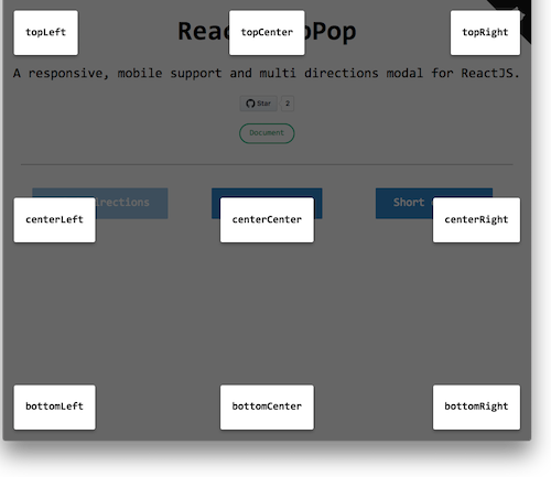
- Multi directions — support 9 positions. ↑ ↗ ︎→ ↘ ︎↓ ↙ ︎← ↖ ︎⥁
- Easily customize style
- React v16 portal — Using react v16 official portal API. Also backward compatible with v15
Installation
Install it with npm.
npm install react-poppop --save
Then, import the module by module bundler like webpack, browserify
// es6
import PopPop from 'react-poppop';

// not using es6
var PopPop = require('react-poppop');
UMD build is also available. If you do this, you'll need to include the dependencies:
For example:
<script src="https://unpkg.com/[email protected]/umd/react.production.min.js"></script>
<script src="https://unpkg.com/[email protected]/umd/react-dom.production.min.js"></script>
<script src="https://unpkg.com/[email protected]/prop-types.min.js"></script>
<script src="https://unpkg.com/react-poppop/dist/react-poppop.min.js"></script>
You can reference standalone.html example.
Usage
Minimum Config
The miminum usage of PopPop is set open as true.
<PopPop open={true}>
  <h1>Title</h1>
  <p>Content</p>
</PopPop>
Multi directions - 9 positions
The default position of react-poppop is Top Center.
There are 9 positions provided by react-poppop.
'topLeft', 'topCenter', 'topRight', 'centerLeft', 'centerCenter', 'centerRight', 'bottomLeft', 'bottomCenter', 'bottomRight'
Select a position you want and pass it to position props.
Example
<PopPop open={true}
        position="topRight">
  <h1>Title</h1>
  <p>Content</p>
</PopPop>
Controllable
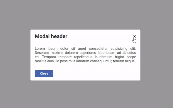
You can set onClose callback, close by click close button, esc button and overlay.
import React, {Component} from 'react';
import PopPop from 'react-poppop';

export default class Example extends Component {
  constructor(props) {
    super(props);
    this.state = {
      show: false
    }
  }

  toggleShow = show => {
    this.setState({show});
  }

  render() {
    const {show} = this.state;
    return (
      <div>
        <button className="btn btn-default" onClick={() => this.toggleShow(true)}>Show Modal</button>
        <PopPop position="centerCenter"
                open={show}
                closeBtn={true}
                closeOnEsc={true}
                onClose={() => this.toggleShow(false)}
                closeOnOverlay={true}>
          <h1>title</h1>
          <p>
            content
          </p>
        </PopPop>
      </div>
    )
  }
}
Props
* means required
| Props | Type | Default | Description |
|---|---|---|---|
| open * | bool |
Open the modal or not | |
| closeBtn | bool |
false | Whether to show close button |
| closeOnOverlay | bool |
true | Whether to close modal on click overlay area |
| closeOnEsc | bool |
false | Whether to close modal when click `esc` |
| onClose | function |
close modal callback | |
| position |
topLefttopCentertopRightcenterLeftcenterCentercenterRightbottomLeftbottomCenterbottomRight
|
topCenter | Modal position |
| overlayStyle |
object
|
reference: link | customize overlay style |
| contentStyle | object |
reference: link | customize content style |
