react-grid-system
A powerful Bootstrap-like responsive grid system for React.
Installation
# Install react peer dependency
npm install react@16

# Install react grid system
npm install react-grid-system --save
Getting started
Responsive grid
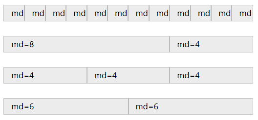
react-grid-system provides a responsive grid similar to Bootstrap (see: https://getbootstrap.com/docs/4.1/layout/grid/). However, react-grid-system is purely React, even no CSS or class names are used. Moreover, it adds various powerful features, such as setting breakpoints and gutter widths through React's context.
Three components are provided for creating responsive grids: Container, Row, and Col.
An example on how to use these:
<Container>
  <Row>
    <Col sm={4}>
      One of three columns
    </Col>
    <Col sm={4}>
      One of three columns
    </Col>
    <Col sm={4}>
      One of three columns
    </Col>
  </Row>
</Container>
For all features of these components, please have a look at the API documentation: https://JSxMachina.github.io/react-grid-system/
Responsive utilities
Next to the grid, two components are provided for showing or hiding content: Visible and Hidden.
The main difference between these two components and the similar CSS classes provided by Bootstrap is that these two components do not render the content at all when it should be hidden, instead of just hiding it with CSS.
Some examples on how to use these components:
<p>
  <span>Your current screen class is </span>
  <Visible xs><strong>xs</strong></Visible>
  <Visible sm><strong>sm</strong></Visible>
  <Visible md><strong>md</strong></Visible>
  <Visible lg><strong>lg</strong></Visible>
  <Visible xl><strong>xl</strong></Visible>
  <span>.</span>
</p>
<Visible xs sm>
  <p>Paragraph visible on extra small and small.</p>
</Visible>
<Hidden xs sm>
  <p>Paragraph hidden on extra small and small.</p>
</Hidden>
<Visible md lg>
  <p>Paragraph visible on medium and large.</p>
</Visible>
<Hidden md lg>
  <p>Paragraph hidden on medium and large.</p>
</Hidden>
Next to that, the ScreenClassRender component is provided, for rendering a component differently based on the screen class. An example on how to use this:
<ScreenClassRender render={(screenClass) => (
  <p style={{ fontSize: ['lg', 'xl'].includes(screenClass) ? '2rem' : '1rem' }} >
    Screen class: {screenClass}
  </p>
)} />
Context types
The following child context types can be provided to the grid components, to alter their responsive behavior. An example on how to use them can be found in the Example application with SSR below.
| Context Type | Default Value | Description |
|---|---|---|
breakpoints |
[576, 768, 992, 1200] |
The breakpoints (minimum width) of devices in screen class sm, md, lg, and xl. The default values are based on the Bootstrap 4 breakpoints. |
containerWidths |
[540, 750, 960, 1140] |
The container widths in pixels of devices in screen class sm, md, lg, and xl. The default values are based on the Bootstrap 4 container widths. |
gutterWidth |
30 |
The gutter width in pixels. A gutter width of 30 means 15px on each side of a column. The default value is based on the Bootstrap 4 gutter width. |
gridColumns |
12 |
The number of colums in the grid . |
serverSideScreenClass |
xl |
The screen class used when the view port cannot be determined using window. This is useful for server-side rendering (SSR) based on the user agent. See also the example application below. |


