React Editor Kit
A suite of plugins for composing react-based text editors. Editor Kit is built using Slate (v0.50+) - the fantastic editor framework for React. You don't need any Slate knowledge to use Editor Kit but it is recommended if you plan to extend it.
NOTE project is in alpha and you might experience some issues.
NOTE project is in alpha and you might experience some issues.
Quick Start
- Install the package
npm i @mpkelly/react-editor-kit
- Create an editor.
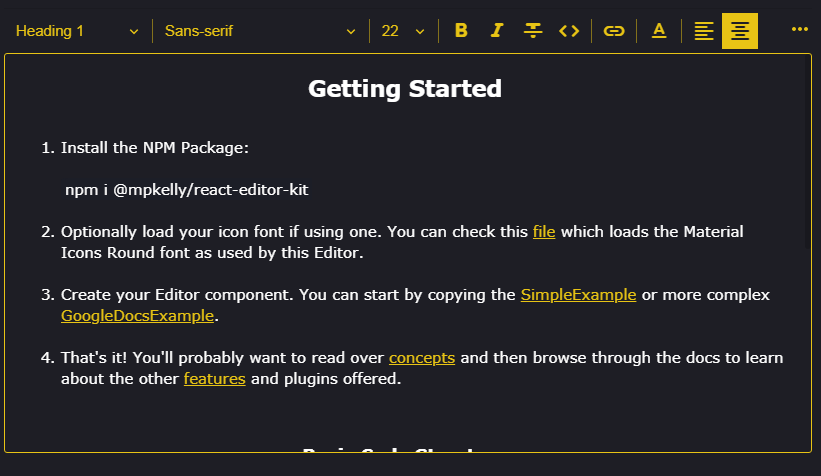
The easiest way to create an editor is to start with one of the examples, such as SimpleEditor.
- Optionally load your icon font. SimpleEditor uses Editor Kit's built-in Button components which are designed to work with icon fonts and require CSS class names and optionally a ligature. If you're also using an icon font then you'll need to make sure it is loaded before you render the editor.
Concepts
Editor Kit's source code and API are easy to understand but there are few concepts that are worth learning in advance.
Plugins
Apart form a small core, the project functionality is plugin-based. This means you can turn on/off anything you like and also that you can extend Editor Kit with your own plugins. A Plugin definition looks like so:
//All properties optional
export type Trigger = { pattern: MatchExpression; range: EditorRange };

export interface Plugin {
  triggers?: Trigger[];
  onTrigger?(
    editor: ReactEditor,
    match?: MatchResult[],
    trigger?: Trigger
  ): void;
  renderElement?: (props: RenderElementProps) => JSX.Element | undefined;
  renderLeaf?: (
    props: RenderLeafProps,
    editor: ReactEditor
  ) => JSX.Element | undefined;
  decorate?: (entry: NodeEntry, editor: ReactEditor) => Range[];
  withPlugin?(editor: ReactEditor): ReactEditor;
  editorStyles?(): string;
  globalStyles?(): string;
  onKeyDown?(
    event: React.KeyboardEvent<HTMLElement>,
    editor: ReactEditor
  ): boolean | undefined;
  onClick?(event: React.MouseEvent<HTMLElement>, editor: Editor): void;
  name?: string;
  data?: Object;
}
As an example, imagine you wanted to replace the text :) with the smiley face ?. You can do this by defining a plugin as follows:
import { ReactEditor } from "slate-react";
import { Plugin } from "../../plugins/Plugin";

export const SmileyPlugin: Plugin = {
  triggers: [{ pattern: ":)", range: "block" }],
  onTrigger: (editor: ReactEditor) => {
    editor.deleteBackward("character");
    editor.deleteBackward("character");
    editor.insertText("?");
  }
};
This is just a very simple plugin which doesn't even render JSX. To see more complex plugins you can browse the features folder.
Here's another simple plugin which actually renders JSX. This plugin triggers on the a regex match - the ">" character at the start of a line which is the common markdown shortcut for a blockquote element.
export const QuotePlugin: Plugin = {
  triggers: [
    { pattern: /^>\s$/, range: "line-before" }
  ],
  onTrigger: (editor: ReactEditor, matches: MatchResult[]) => {
    if (matches[0]) {
      const range = matches[0].range;
      const length = range.focus.offset - range.anchor.offset;
      deleteBackward(editor, length);
      toggleBlock(editor, "quote");
    }
  },
  renderElement: (props: RenderElementProps) => {
    const { children, attributes, element } = props;
    if (element.type == "quote") {
      return <blockquote {...attributes}>{children}</blockquote>
    }
  }
};
You can do much more with plugins, including extending and overriding Slate. Please refer to the plugin guide for more info.
Editor Kit has some built-in plugins that are required, such as IconProviderPlugin and LabelsPlugin. These plugins can be overridden by passing a plugin with same name to <EditorKit plugins={[...]}>. You'll need to do this override the built-in icons and text used
Actions
Actions perform specfic tasks, such as changing the font weight to bold or changing the font-family. Actions don't render anything other than the children they are passed. The action interface looks as follows:
export interface ActionProps {
  children: JSX.Element;
  onMouseDown(event?: ReactMouseEvent<HTMLElement, MouseEvent>): void;
  isActive(): boolean;
  disabled?: boolean;
}
If you're using an icon font then you will probably not need to worry about Actions and instead use some of the dedicated buttons, such as BoldButton, which is already using the BoldAction internally. However, if you are using SVG icons or want to use the bold action somewhere else, such as a menu, then you would need to use the BoldAction instead of the BoldButton as shown below.
const MyBoldButton = () => {
  return (
    <BoldAction>
      <svg
        ...
      >
       ...
      </svg>
      );
    </BoldAction>
  );
};
NOTE As Action passes the props to the child element below you will need to ensure these props are passed down to the root JSX tag of your component.
NOTE: THIS DOES NOT WORK
const BoldSvgIcon = () => {
  return (
    <svg
        ...
      >
        ...
      </svg>
      );
  )
}

const MyBoldButton = () => {
  return (
    <BoldAction>
      <BoldSvgIcon />
    </BoldAction>
  );
};
You can fix the above code like so:
const BoldSvgIcon = (props:ActionChildProps) => {
  return (
    <svg
        ...
        {...props} //important
      >
        ...
      </svg>
      );
  )
}

const MyBoldButton = () => {
  return (
    <BoldAction>
      <BoldSvgIcon />
    </BoldAction>
  );
};
Buttons and other controls
Toolbar buttons and select boxes are provided. The button components, such as BoldButton, accept properties for the CSS className for your icon font icon and optional a ligature. Here's how you would declare you buttons with and without ligatures:
Font Awesome - no ligature
// <link rel="stylesheet" href="https://stackpath.bootstrapcdn.com/font-awesome/4.7.0/css/font-awesome.min.css">

<BoldButton className="fas fa-bold" />
Material Icons Round - ligature
// <link rel="stylesheet" href="https://fonts.googleapis.com/css?family=Material+Icons+Round">

<BoldButton className="material-icons-round" ligature="format_bold" />
Editor Kit also includes Select controls which can be included similarly to Buttons.
    <EditorKit plugins={plugins}>
        <EditorToolbar>
          <HeadingSelect />
          <Divider />
          <FontSelect />
          <Divider />
          <FontSizeSelect />
          ...
Toolbars
There are two built-in Toolbars which are both optional. It's fine to use your own toolbar or just a regular div to group your controls, so long as they are inside of the <EditorKit> scope.
This toolbar supports overflow which is the main reason you would use it over a regular div. There are two strategies supported:
- Menu: show the controls that don't fit in popup menu
- Wrap: wrap the toolbar over multiple lines so that all controls are always visible
export interface EditorToolbarProps {
    children: JSX.Element[];
    className?: string;
    overflowStrategy?: OverflowStrategy;
    style?: CSSProperties;
}
export declare enum OverflowStrategy {
    Wrap = 0,
    Menu = 1 // default
}
You can see this toolbar in use here and use it in your own project like so:
<EditorKit plugins={plugins}>
  <EditorToolbar>
    <HeadingSelect />
    <Divider />
    <FontSelect />
    <Divider />
    <FontSizeSelect />
    <Divider />
    <BoldButton className="material-icons-round" ligature="format_bold" />
    ...
  </EditorToolbar>
  ...
</EditorKit>
The SelectionToolbar is shown as the user selects text inside the editor. Medium is one reason this type of floating toolbar became popular. You can see it being used here and use it in your own project like so:
<EditorKit plugins={plugins}>
  <SelectionToolbar>
    <BoldButton className="material-icons-round" ligature="format_bold" />
    <ItalicButton
      className="material-icons-round"
      ligature="format_italic"
    />
    <LinkButton className="material-icons-round" ligature="link" />
    <StrikethroughButton
      className="material-icons-round"
      ligature="format_strikethrough"
    />
  </SelectionToolbar>
  ...
<EditorKit>