React JSON Schema Form Generator
A React component package for generating forms based on (almost) the full power of JSON Schema
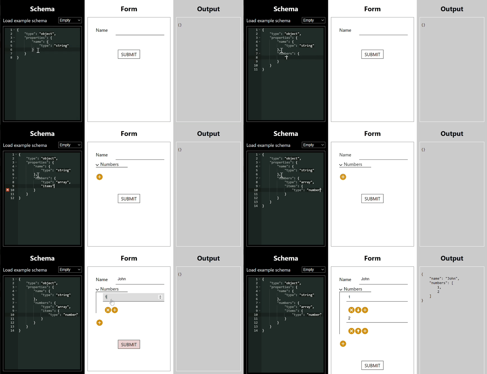
Introduction
This tool is designed to drastically reduce the effort needed to create complex forms in React. It uses JSON schema as a description language for the form you want to create. It is highly flexible and can deal with pretty much any requirement
through the power of JSON schema or customisations. A summary of its features is as follows:
- without customisation, covers form fields of types text, single checkbox, number, currency, date, date-time,
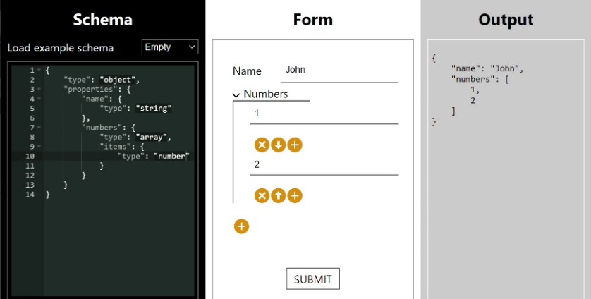
email, password, hidden, textarea, select, multibutton, multicheckbox, radiobuttons, radio checkboxes, file upload - full heirarchical subforms and arrays of fields or arrays of subforms. Arrays have add, reorder, duplicate, delete functions. Heirarchy can be recursive.
- conditional fields e.g. radio buttons and if you select 'other' a textbox appears
- heterogeneous arrays e.g. an array of individuals and companies, with two different forms and a selector
- JSON schema based validation of all fields
- form value returned as a JSON object
- custom field components, full event model
Schema form is a key part of the Restspace project. Restspace defines its data store structure using JSON Schema files which are available over the web, allowing for a single source of truth for structure for data input and data storage. It's available as an NPM package @restspace/schema-form. You can find a demo playground here: https://restspace.io/react/schema-form/demo.
Using the components
The simplest component is SchemaForm which is a controlled component which has a schema and a value that matches the schema passed
in as props. It has no submit logic, and simply updates the current value via a changed event.
import SchemaForm from "schema-form";
<SchemaForm schema={schema} value={value}
    onChange={onSubmitChange}
    onFocus={onFocus}
    onBlur={onBlur}
    onEditor={onEditor}
    showErrors={showErrors}
    className={className}
    changeOnBlur={changeOnBlur}
    collapsible={collapsible}
    componentContext={componentContext}
    components={components}
    containers={containers} />
Then you can use SchemaSubmitForm. This has a submit button and an onSubmit event plus it can suppress error messages until the first submit.
import { SchemaSubmitForm } from "schema-form";
<SchemaSubmitForm schema={loginSchema} value={valueSubmit}
    onSubmit={onSubmit}
    onFocus={onFocus}
    onBlur={onBlur}
    onEditor={onEditor}
    onSubmit={onSubmit}
    onSubmitError={onSubmitError}
    onDirty={onDirty}
    className={className}
    changeOnBlur={changeOnBlur}
    collapsible={collapsible}
    componentContext={componentContext}
    components={components}
    containers={containers}
    makeSubmitLink={(onClick) => (
        <div onClick={onClick}>Submit</div>
    )} />
The final component is designed to support paged forms, this is SchemaPagedForm.
import { SchemaPagedForm } from "schema-form";
<SchemaPagedForm schema={schemaPaged} value={valuePaged} page={page}
    onPage={onPage}
    onSubmit={onSubmit}
    onFocus={onFocus}
    onBlur={onBlur}
    onEditor={onEditor}
    onSubmit={onSubmit}
    onSubmitError={onSubmitError}
    onDirty={onDirty}
    className={className}
    changeOnBlur={changeOnBlur}
    collapsible={collapsible}
    componentContext={componentContext}
    components={components}
    containers={containers}
    makePreviousLink={(previousPage, onClick) => (
      <div onClick={() => onClick(previousPage)}>Previous</div>
    )}
    makeNextLink={(nextPage, onClick) => (
      <div onClick={() => onClick(nextPage)}>Next</div>
    )}
    makeSubmitLink={(onClick) => (
      <div onClick={() => onClick()}>Submit</div>
    )} />
An explanation of each of the props follows:
| Prop | Type | Description |
|---|---|---|
| schema | object | This is the JSON Schema which defines the form's structure and validation. It can optionally be an array of schemas, in which case the first is the base schema actually used and the others provide schemas to which it can refer using $ref references. |
| value | object | This is the current value for the form fields to display. This can be used to make the form controlled |
| page | number | On the paged form, the current page number being shown (starts at 0) |
| onChange | function | This function is called when the form fields' value is displayed. It's called with parameters (value, path, errors, action). value is an object representing the value of all the fields in the form. path is a list of property name strings indicating the path to the property which just changed. errors is an ErrorObject describing any current errors. action is an enum number indicating what action was just taken in terms mainly of array manipulation. |
| changeOnBlur | boolean | This prop determines whether the onChange event is called whenever a form value changes (the default) or only when the focus moves away from a changed form field. |
| onFocus | function | This function is called when focus moves to a new form field. The parameter is (path). path is a list of property name strings indicating the path to the property of the field which just gained focus. |
| onBlur | function | This function is called when focus moves away from a form field. The parameter is (path). path is a list of property name strings indicating the path to the property of the field which just lost focus. |
| onEditor | function | This function is called when a custom editor needs to raise an event. The parameters are (data, path). data is a custom data object depending on the editor, path is a list of property name strings indicating the path to the property of the field which has the custom editor. |
| onSubmit | function | This function is called when a submit or paged form is successfully submitted. The parameter is (value). value is the object representing the value of the form fields when submitted. |
| onSubmitError | function | This function is called when a submit or paged form is submitted but has an error. The parameters are (value, error). value is an object representing the current value of the form fields. error is an ErrorObject describing the current errors. |
| onDirty | function | This function is called when the 'dirty' status of a form changes. A form is not dirty initially and when just submitted. It becomes dirty the first time a field value is changed. The parameter is (dirty). dirty is a boolean indicating whether the form is now dirty or not. |
| onPage | function | This function is called when a paged form changes page. The parameters are (value, page, previousPage). value is an object representing the value of all the form fields on all the pages. page is the new page number. previousPage is the previous page number. |
| showErrors | boolean | This property only has an effect on SchemaForm. The SchemaForm only renders validation errors on the form if it is true. |
| className | string | Appends the class or classes in this string to the classes on the SchemaForm wrapper div. |
| collapsible | boolean | Whether the form renders collapsers for form sections (i.e. sub arrays or objects). Default is true. |
| componentContext | object | Used to communicate data into custom editor components |
| components | object | Property key values - the key is the name of an editor type, the value is the editor component type used. This is used to override the default map of editor types to editor components. The editor type comes from the schema, in priority order the editor property, the format property or the type property. If the type property is 'array' or 'object', the editor is found in the containers prop below. |
| containers | object | Property key values - the key is the name of a container type, the value is the editor component type used. The container type comes from the schema. Containers have 'array' or 'object' types only. In priority order, the editor property then the type property is used. |
| makeSubmitLink | function | A render prop which returns an element which lets the user tell the form to submit. The parameter is (onClick). onClick is a function the rendered element must call when the user has requested to submit. |
| makePreviousLink | function | A render prop which returns an element which lets the user tell the paged form to return to the previous page. The parameters is (previousPage, onClick). previousPage is the page number (starting 0) of the previous page. onClick is a function the rendered element must call when the user has requested to go to the previous page. It has one argument which is the number of the page to which to go. |
| makeNextLink | function | A render prop which returns an element which lets the user tell the paged form to go to the next page. The parameters is (nextPage, onClick). nextPage is the page number (starting 0) of the next page. onClick is a function the rendered element must call when the user has requested to go to the next page. It has one argument which is the number of the page to which to go. |
Styling the components
The package comes with a base CSS file which sets up expected layout. This can then be overriden with style customisations.
import "@restspace/schema-form/build/index.css";
JSON schema
JSON Schema is a (provisional but widely used) web standard defining a system for describing validity conditions on a JSON object. It is described here: https://json-schema.org/.
JSON schema is an extremely powerful descriptive language and this package while not yet implementing every feature of JSON schema includes the most powerful ones:
- list of different fields of all standard form field types plus others
- forms with arbitrary nested subsections
- forms with arbitrary nested lists (with ability to create, delete and reorder items)
- powerful conditionality system allowing for fields or sections to appear conditional on other values, lists of different kinds of subsections etc.
- complex validation rules
Supported JSON Schema features
Types
| Type | Implementation |
|---|---|
| type: string | Generally implemented as an input type="text" |
| type: number | By default a text input field type="number" |
| type: boolean | By default a checkbox input |
| type: object | The top level field will generally be an object: below this an object is a subsection on the form and a subobject in the Javascript object value |
| type: array | An array is by default shown as a user-manageable list of fields or subsections in the form, and corresponds to a Javascript array in the object value |
| type: null | This field won't be shown on the form |
| type: [ multiple types ] | This is not supported |
Type specific keywords
| Type: Keyword | Implementation |
|---|---|
| string: length | Implemented only as validation |
| string: pattern | Implemented only as validation |
| string: format | Supported formats are described below |
| number: multipleOf | Implemented only as validation |
| number: minimum | Implemented only as validation |
| number: exclusiveMinimum | Implemented only as validation |
| number: maximum | Implemented only as validation |
| number: exclusiveMaximum | Implemented only as validation |
| object: properties | Every property is rendered as a field or form subsection |
| object: required | Implemented as validation |
| object: propertyNames | Implemented as validation |
| object: minProperties | Implemented as validation |
| object: maxProperties | Implemented as validation |
| object: dependencies | Not supported |
| object: patternProperties | Not supported |
| object: propertyOrder | NON-STANDARD. This custom keyword should be followed by a list of property names as strings or sublists of the same. It has no effect on validation. It allows specification of the order in which properties are displayed in the data entry form. See below for how orders are merged with combined schemas. Sublists are rendered contained within an outer div to allow more control over layout. |
| object: currencySymbol | NON-STANDARD. This custom keyword can only be present on the top-level schema object. It determines the string used as a currency prefix for the currency editor. |
| object: additionalProperties | Assumed to be true when validating, and false when constructing a UI. See below for more. This means that additionalProperties: false in a schema is not supported. |
| array: items | This schema is used to render each subsection of the array. Tuple validation (where items is a list of schemas) is not supported. |
| array: contains | Not supported except for validation |
| array: additionalItems | Not supported |
| array: maxItems | Implemented only as validation |
| array: minItems | Implemented only as validation |
| array: uniqueItems | Implemented as validation |
| generic: title | The label of a field uses title for preference, otherwise it defaults to convering camel case into separated words e.g. initialRepeatingCost -> Initial repeating cost |
| generic: description | Description is rendered as part of the label and can be styled differently |
| generic: default | Not supported. Normally a default would be set on the initial value object passed to the form. |
| generic: enum | A string-typed schema with an enum property will be rendered by default as a drop-down list i.e. an HTML select |
| generic: readOnly | If true, the value should not be editable just displayed |
| generic: const | Only implemented as validation: for use in conditionals only. |
| generic: editor | NON-STANDARD. This custom keyword which has no effect on validation allows definition of an editor to be used to render this schema. See Built-in editors below for a list of possibilities. |
| combiner: allOf | A conjoin (see below) is done between the list of subschemas given and the main schema. Validation is also applied |
| combiner: anyOf | A disjoin (see below) is done between the list of subschemas given filtered to those which when conjoined to the parent schema validate against the current entered values. This is then conjoined with the main schema. Validation is also applied |
| combiner: oneOf | This is rendered as a selector which allows you to choose one of the subschemas which is then rendered as a subform |
| combiner: not | Only supported as validation |
| conditional: if then else | Supported by validating the current values against the 'if' schema, then conjoining the main schema with the 'then' clause if the validate, or else the 'else' clause if they don't |
| references: $ref | Supported: can be used to refer to a schema by its $id value: this also works for a schema to refer to itself recursively. For an example see recursive.json. Also supports refering to other subschemas by path within the main schema, see oneOf.json. Won't fetch schemas by url but external schemas can be listed in the object array version of the schema prop. |
| references: $id | Supported, but only at the top level of a schema, nested subschemas have to be referred to by path |
Rendering based on combiners and conditionals
Combiners and conditionals are a powerful means for creating conditional forms,
however it is conceptually difficult to understand how they should be used to build a UI.
Schema-form's rationale for how it renders a data entry UI for a JSON schema is based on providing a UI that can be used to enter AT LEAST all the possible allowed values the JSON schema might validate. With arrays and primitives, it is pretty clear what these allowed values are. With an object, there is an ambiguity about the semantics of the properties. This is expressed by the 'additionalProperties' keyword, which says whether it is allowed for properties not listed to validate or whether they are forbidden.
'additionalProperties' is assumed to be true when validating. Otherwise there is no way a conditional schema could add properties to the base schema. Given this, conjoining two sets of properties results in a properties object containing the union of the properties, and where the property exists in both sets, the subschema of that property is the conjunction of the subschemas in the two sets.
'additionalProperties' is however taken as if it were false when constructing a UI, i.e. it is assumed that the user will not be able to add data for any additional properties.
This inconsistency is required to cross the bridge between a constraint validation language where each element in the language restricts the output to a UI language where each element of the UI extends the output.
The result of adding an 'allOf' property to a schema is straightforward according to this method, you simply conjoin all the schema constraints with the parent schema and render the UI which results.
However for the 'anyOf' property a problem arises as you have now created a number of disjoint possibilities where you may have a property in one and not in another. This requires the UI to take on different states corresponding to the 'anyOf' subschemas. To choose which state(s) to use, schema-form looks at the current value and uses it to rule out any subschemas which do not currently validate. If used carefully, 'anyOf' can then be used to produce a usable conditional form: however it is easy to create a situation where the form contains current values which mean it cannot be transitioned to allow data entry which would validate to another 'anyOf' subschema.
Another choice ideal for creating a heterogeneous list is 'oneOf'. This is rendered as a selector control (whose value is not returned as part of the
Similarly, the 'if', 'then', 'else' keywords are used on the basis that the UI to be shown is the one conjoining the subschema on the 'then' keyword if the 'if' subschema currently validates, or the 'else' keyword if not. This is a little less likely to result in an unusable form and works better for conditional form generation than 'anyOf'. Indeed an ideal structure for a form with many conditional elements is 'allOf' with a number if 'if' 'then' 'else' subschemas.
We may include an optional feature where the 'anyOf' property gives rise to a UI element allowing manual selection of which 'anyOf' clause the user wishes to satisfy. This UI element would have no effect on the output value.
Built-in and Custom editors
Built-in editors
schema-form has default editors for all schemas it supports. However a number of obvious alternatives are included as built-in options that can be made use of via the custom 'editor' schema property.
Here are the built-in editors:
| Keyword | Valid for Type | Description |
|---|---|---|
| textarea | string | Renders a textarea HTML tag rather than an input for text entry |
| currency | number | Renders a text entry box with an automatic currency label (set with the currencySymbol property on the top-level schema object). Supplies a decimal number to the output value. |
| hidden | string | Renders a type='hidden' text box |
| multiCheck | array of enums | Renders a multi-select set of check boxes which supplies an array of values of an enum whose values correspond to the check box labels |
| upload | string | Renders a file upload. The behaviour of the file upload is determined a property on the object passed in to the optional componentContext prop. |
{
  uploadEditor: {
    getFileUrl: (file: File, filePath: string[], schema: object) => string,
    sendFile: (url: string, file: File, progress: (percent: number) => void) => Promise<void>,
    saveSiteRelative: boolean
  }
}
getFileUrl takes the file object, the property path describing the position of the uploader in the schema, and the schema itself and returns a url to where the file should be sent. sendFile actually sends the file to that url, taking the url to send to, the file object, and a callback to be called within the body of the sendFile function to update progress. saveSiteRelative indicates whether the url saved in the field is site relative or absolute.
A default function value for 'sendFile' is provided as a named export that can be imported from the schema-form module:
import { sendFileAsBody } from '@lynicon/schema-form';
This posts the file as the HTTP request body.
The file uploader uploads a file dropped onto its rendered area or one chosen with the file chooser. It does this immediately before the form is submitted. It shows upload progress. When the file is uploaded, the value of the field is set to the url where the file has been saved and from where it can be retrieved.
Custom editors
Custom editors can be built as single React components according to certain rules and these components passed in via the components or containers props (see above for these props' details).
Examples can be seen in this repo under editors.
Editor components take a props as defined in ISchemaComponentProps (single value editors) or ISchemaContainerProps (array or object value editors) - see (schema-form-interfaces.ts)[https://github.com/restspace/schema-form/blob/master/src/components/schema-form-interfaces.ts].
Generally speaking, the editor will set render itself for the value in the value prop. On interaction which updates the value, it reports this by dispatching an update to a context. The context is called ValueDispatch. It's reducer-style, and updates are sent to it via actions which are created using methods on ValueAction.
(radio-buttons-editor.tsx)[https://github.com/restspace/schema-form/blob/master/src/editors/radio-buttons-editor.tsx] provides a good basic example for a component. Notice it wraps the rendered output in SchemaFormComponentWrapper to which all the properties are passed. This allows for standardised field rendering.
(oneOf-radio-editor.tsx)[https://github.com/restspace/schema-form/blob/master/src/editors/oneOf-radio-editor.tsx] is a good container example. It recurses into its children objects using ComponentForType to render them, passing through the relevant sub value (in this case actually the original value) and sub schema.
