pagination-component
React component for pagination.
Installation
npm install pagination-component --save
or
yarn add pagination-component
Demo
To build and run the demo:
- Clone this repository:
git clone https://github.com/dibenso/pagination-component.git
- Install dependencies:
npm install
or
yarn install
- Start demo server:
npm start
Then check http://localhost:3000
Usage
The component accepts 5 required props:
-
currentPage (type: int)
Indicates the current page of pagination. It is zero based, so the first page is indicated by 0. -
pageCount (type: int)
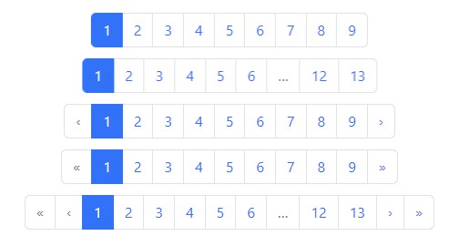
Indicates how many pages to paginate through. For example if the current page is 0 and pageCount is 50. The result of the pagination will show:
first 1 2 3 4 5 6 7 8 9 10 ... next last
Clicking the "last" link will callback with 49 (page 50) in the onPageClick prop. -
pageLinkClassName (type: string | object)
If this prop is a string, then the prop indicates the className of the css to use for all links in pagination. Example style:
.pageLink {
  margin: 2px;
  display: inline-block;
  padding: 2px;
  -webkit-border-radius: 20px;
  -moz-border-radius: 20px;
  border-radius: 20px;
}
Then import this css into js:
import styles from './styles.css';
Then pass styles.pageLink in for this prop to use these styles.
If this prop is a object, then the prop indicates the style to use. This is useful for CSS in JS libraries like glamor. Example using glamor:
import { css } from 'glamor';

const pageLink = css({
  margin: '2px',
  display: 'inline-block',
  padding: '2px',
  WebkitBorderRadius: '20px',
  MozBorderRadius: '20px',
  borderRadius: '20px'
})
Then pass the pageLink object in for this prop.
- currentLinkClassName (type: string | object)
This works the same way as pageLinkClassName except its styling is for the page link for the current page. Use this prop to make a visual difference between the current page link and the others. Example style:
.currentLink {
  background-color: #0074c2;
  color: #FFFFFF;
}

.currentLink a:link { color: #FFFFFF; }
.currentLink a:visited { color: #FFFFFF; }
.currentLink a:active { color: #FFFFFF; }
Pass this prop to the component in the same was as pageLinkClassName.
- onPageClick (type: function)
This is called everytime a page link is clicked. This callback accepts the page that was clicked. Remember, the page is zero based. So when a user clicks on a page link that is displayed as 15, the value passed to this callback will be 14. Here's how one might use this prop with the history API and perhaps react-router:
function handlePageClick(page) {
  console.log(`Link to page ${page} was clicked.`);
  history.push(`/?page=${page}`);
}
Full example (using glamor for styles):
import React from 'react'
import {render} from 'react-dom'
import Pagination from 'pagination-component';
import { css } from 'glamor';

const pageLink = css({
  margin: '2px',
  display: 'inline-block',
  padding: '2px',
  WebkitBorderRadius: '20px',
  MozBorderRadius: '20px',
  borderRadius: '20px'
})

const currentLink = css({
  backgroundColor: '#0074c2',
  display: 'inline-block',
  color: '#FFFFFF',
  'a:link': { color: '#FFFFFF' },
  'a:visited': { color: '#FFFFFF' },
  'a:active': { color: '#FFFFFF' }
})

let Example = React.createClass({
  render() {
    return <div>
      <h1>react-paginator Demo</h1>
      <Pagination currentPage={0}
                 pageCount={50}
                 pageLinkClassName={pageLink}
                 currentLinkClassName={currentLink}
                 onPageClick={i => {
                  console.log(`Link to page ${i} was clicked.`);
                 }} />
    </div>
  }
})

render(<Example />, document.querySelector('#root'))
Tests
To run the tests:
- Install dependencies from package.json
npm install
or
yarn install
- Then:
yarn test