React Scrolling NavBar
This Repo is not actively maintained! Please do not use in professional environment!
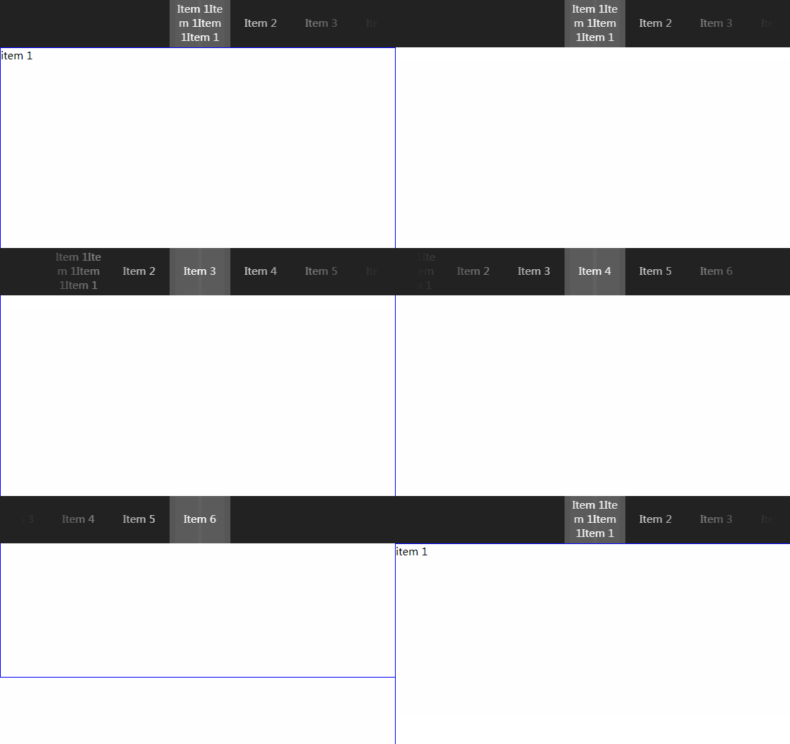
This is a React navbar component based on react-scroll. While this component is good, it doesn't support mobile well, especially when there are many items in navbar. That's why we need another navbar design for more responsiveness, mobile friendliness.
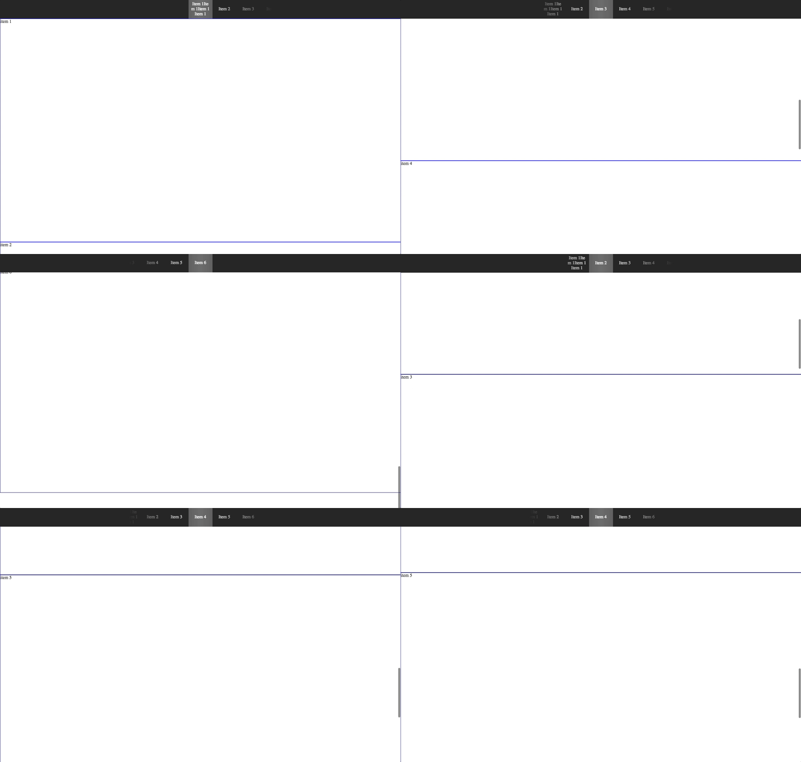
A quick screenshot example is shown below. desktop
Installation
$ npm install --save react-scrolling-nav
Run Example locally
$ npm install
$ npm run watch
Open localhost:8080, you'll see a simple example.
Usage
ES6:
import React, { Component } from 'react';
import NavBar, { ElementsWrapper } from 'react-scrolling-nav';

class App extends Component {
    render() {
        const navbarItems = [{
            label: "Item 1",
            target: "item-1"
        }, {
            label: "Item 2",
            target: "item-2"
        }, {
            label: "Item 3",
            target: "item-3"
        }, {
            label: "Item 4",
            target: "item-4"
        }, {
            label: "Item 5",
            target: "item-5"
        }, {
            label: "Item 6",
            target: "item-6"
        }, ]
        return (
            <div>
                <NavBar items={navbarItems} offset={-80} duration={500} delay={0}>
                </NavBar>
                <div className="container">
                    <ElementsWrapper items={navbarItems}>
                        <div name="item-1" className="item">item 1</div>
                        <div name="item-2" className="item">item 2</div>
                        <div name="item-3" className="item">item 3</div>
                        <div name="item-4" className="item">item 4</div>
                        <div name="item-5" className="item">item 5</div>
                        <div name="item-6" className="item">item 6</div>
                    </ElementsWrapper>
                </div>
            </div>
        );
    }
}

export default App;
Define an array that contains all of your navbar items in format { label: "item1", target: "item-1" }, where label is the text that you want to show on the navbar, and target is mapped to the name property in ElementWrapper. You should wrap all of the components to which you want to be navigated into ElementWrapper.
Options
<NavBar
    items={navbarItems} // Required, the items you want to navigate
    offset={-80} // scroll additional px
    duration={500} // time of scroll animation
    delay={0} // wait x milliseconds before scroll
    height={70} // the height of navbar
    backgroundColor={"#222"} // the background color of navbar
    coverWidth={600} // the width of the gradient cover, default is calculated by (navWidth * count of navItems)
    navWidth={86} // the width of every item on navbar
    linkClass={"link"} // the class of link
    activeLinkClass={"activeLink"} // class applied when element is reached
/>

<ElementsWrapper
    items={items={navbarItems}} // Required, the items you want to navigate
>
    // components...
</ElementsWrapper>
Except coverWidth, all values above are the default, respectively.
TODO
- Add eslint and refactor.
- Add unit tests.
Contribution
You
- Create your own branch, let's say
new-featureand Switch to the branch.
git checkout -b new-feature && git checkout new-feature
- Coding with
webpack-dev-server.
npm run watch
- Build Github static page.
npm run build
- Push to Github.
git push origin new-feature
- Get your PR reviewed, approved and merge.
Admin
- Change local branch to master and pull remote.
git checkout master
git pull
- Update version, then build and publish to npm.
npm version [major|minor|patch]
npm run publish
