Fixed Data Table 2 for React
Fixed-Data-Table-2 is a continuation of facebook/fixed-data-table. The original repo is no longer maintained and has many pull requests awaiting response.
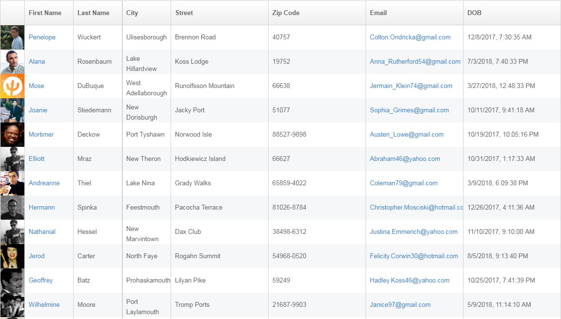
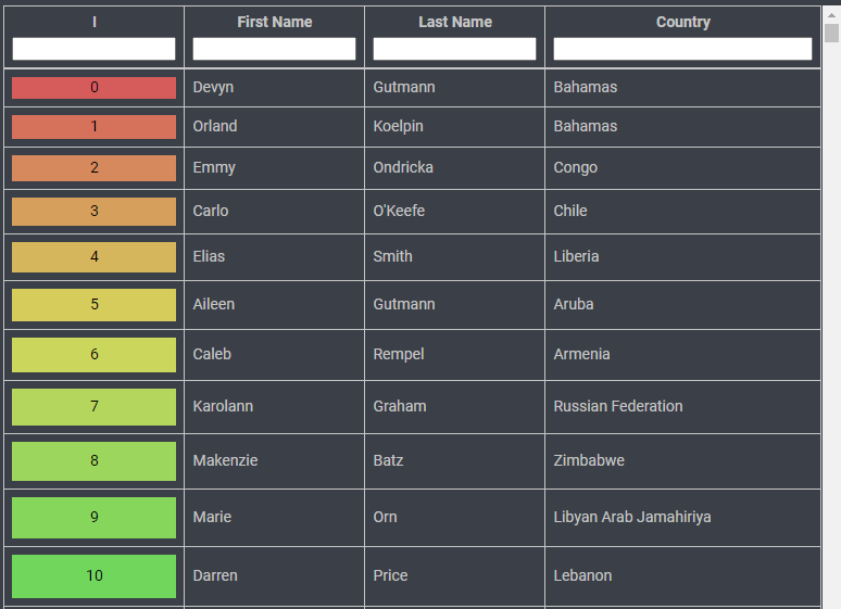
FixedDataTable is a React component for building and presenting data in a flexible, powerful way. It supports standard table features, like headers, columns, rows, header groupings, and both fixed-position and scrolling columns.
The table was designed to handle thousands of rows of data without sacrificing performance. Scrolling smoothly is a first-class goal of FixedDataTable and it's architected in a way to allow for flexibility and extensibility.
Features of FixedDataTable:
- Fixed headers and footer
- Both fixed and scrollable columns
- Handling huge amounts of data
- Variable row heights (with adaptive scroll positions)
- Column resizing
- Performant scrolling
- Customizable styling
- Jumping to a row or column
- Controlled scroll API allows touch support
Things the FixedDataTable doesn't do:
- FixedDataTable does not provide a layout reflow mechanism or calculate content layout information such as width and height of the cell contents. The developer has to provide the layout information to the table instead.
- FixedDataTable does not handle sorting of data. Instead it allows the developer to supply data getters that can be sort-, filter-, or tail-loading-aware.
- FixedDataTable does not fetch the data (see above)
This version of FixedDataTable is maintained by Schrödinger, Inc. It is a forked version of Facebook’s FixedDataTable Repository available here available under the BSD License. Contributions and modifications to FixedDataTable are also subject to the BSD License (see here).
Getting started
Install fixed-data-table-2 using npm.
npm install fixed-data-table-2
Add the default stylesheet dist/fixed-data-table.css using a link tag or import it with a CSS module.
Implementing a table involves three component types- <Table/>,<Column/>, and <Cell/>.
<Table /> contains configuration information for the entire table, like dimensions and row count. It's also where you pass down the data to be rendered in the table.
  const rows =[0,1,2];

  <Table
    rowHeight={50}
    rowsCount={100}
    width={5000}
    height={5050}
    headerHeight={50}
    data={rows}>
    ...
  </Table>
<Column /> defines the way data is displayed for one column in the table, including all cell behavior for that column. Rather than manipulating each cell directly, pass a cell component as a prop to the column, and the column will render a cell for each index in the data array.
    <Column
      header={<Cell>Col 1</Cell>}
      cell={<Cell>Column 1</Cell>}
      width={2000}
    />
The cell components in a column will receive the current array index of your data as a prop (this.props.rowIndex). Use this to access the correct value for each cell.
    const rows = [0,1,2];

    <Column
      header={<Cell>Column 1</Cell>}
      cell={({rowIndex, ...props}) => (
        <Cell {...props}>
        {rows[rowIndex]}
        </Cell>
      )}
      width={2000}
    />
If your data is an array of objects, define a columnKey prop for each column and it too will be passed to all cells in that column.
    const rows = [
      { someKey: "someValue" },
      { someKey: "anotherValue" },
      { someKey: "yetAnother" }
    ];

  <Column
    header={<Cell>Col 1</Cell>}
    columnKey="someKey"
    cell={({ rowIndex, columnKey, ...props }) =>
      <Cell {...props}>
        {rows[rowIndex][columnKey]}
      </Cell>}
    width={2000}
  />;
You may find it useful to define custom Cell components, which can also be passed to the Column:
    const MyCustomCell = ({ isSpecial }) =>
      <Cell>
        {isSpecial ? "I'm Special" : "I'm Not Special"}
      </Cell>;


    <Column
      header={<Cell>Col 3</Cell>}
      cell={<MyCustomCell isSpecial/>}
      width={2000}
    />
Code Sample
For more detailed examples, please see the examples section of the documentation. If you need help getting started with a React build system, we recommend create-react-app.
import React from 'react';
import ReactDOM from 'react-dom';
import {Table, Column, Cell} from 'fixed-data-table-2';
import 'fixed-data-table-2/dist/fixed-data-table.css';


// Table data as a list of array.
const rows = [
  "first row",
  "second row",
  "third row"
  // .... and more
];

// Custom cell implementation with special prop
const MyCustomCell = ({ mySpecialProp }) =>
  <Cell>
    {mySpecialProp === "column2" ? "I'm column 2" : "I'm not column 2"}
  </Cell>;

// Render your table
ReactDOM.render(
  <Table
    rowHeight={50}
    rowsCount={rows.length}
    width={5000}
    height={5000}
    headerHeight={50}>
    <Column
      header={<Cell>Col 1</Cell>}
      cell={<Cell>Column 1 static content</Cell>}
      width={2000}
    />
    <Column
      header={<Cell>Col 2</Cell>}
      cell={<MyCustomCell mySpecialProp="column2" />}
      width={1000}
    />
    <Column
      header={<Cell>Col 3</Cell>}
      cell={({rowIndex, ...props}) => (
        <Cell {...props}>
          Data for column 3: {rows[rowIndex]}
        </Cell>
      )}
      width={2000}
    />
  </Table>,
  document.getElementById('example')
);
Browser Support
| Chrome | Firefox | IE | Safari |
|---|---|---|---|
| Latest | Latest | 11+ | Unsupported* |
