react-carousel
Feature-rich, react-way carousel component that does not suck.
Why?
There are some great carousels (like slick) that do not have real React implementations. This library provides you with carousel that is not merely a wrapper for some jQuery solution, can be used as controlled or uncontrolled element (similar to inputs), and has tons of useful features.
Installation
npm i @brainhubeu/react-carousel
Demo
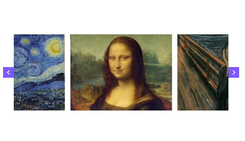
You can access a clickable demo with many examples and a live code editor here.
Typescript
npm i @types/brainhubeu__react-carousel -D
Usage
By default the component does not need anything except children to render simple carousel.
Remember that styles does not have to be imported everytime you use carousel, you can do it once in an entry point of your bundle.
import React, { Component } from 'react';
import Carousel from '@brainhubeu/react-carousel';
import '@brainhubeu/react-carousel/lib/style.css';

export default class MyCarousel extends Component {
  render() {
    return (
      <Carousel>
        <img src={imageOne} />
        <img src={imageTwo} />
        <img src={imageThree} />
      </Carousel>
    );
  }
}
Carousel as controlled element
You can control which slides are being shown by providing Carousel with value and onChange props
import Carousel from '@brainhubeu/react-carousel';
import '@brainhubeu/react-carousel/lib/style.css';

// ...

constructor(props) {
  super(props);
  this.state = {
    value: 0,
  };
}

// we check if we got event from input (and it has target property) or just value from Carousel
onChange = e => this.setState({ value: e.target ? e.target.value : e });
render() {
  return (
    <div>
      <input value={this.state.value} onChange={this.onChange} type="number" />
      <Carousel
        value={this.state.value}
        onChange={this.onChange}
      >
        <img src={imageOne} />
        <img src={imageTwo} />
        <img src={imageThree} />
      </Carousel>
    </div>
  );
}
Where:
valueis the current slide's index (zero based, in the example above imageOne has index 0, imageTwo has index 1 and so on)onChangehandler triggered when carousel wants to change current slide (e.g. on arrow click or on swipe)
Default arrows
You can turn default arrows on with arrows prop
import Carousel from '@brainhubeu/react-carousel';
import '@brainhubeu/react-carousel/lib/style.css';

// ...

render() {
  return (
    <Carousel
      arrows
    >
      <img src={imageOne} />
      <img src={imageTwo} />
      <img src={imageThree} />
    </Carousel>
  );
}
Where:
arrowsis boolean flag that determines usage of default arrows
Custom arrows
You can define custom components for arrows using arrowLeft and arrowRight props. If you don't need to change default click listeners, add addArrowClickHandler prop. Otherwise, add click event handlers to your custom components.
import Carousel from '@brainhubeu/react-carousel';
import Icon from 'react-fa';
import '@brainhubeu/react-carousel/lib/style.css';

// ...

render() {
  return (
    <Carousel
      arrowLeft={<Icon className="icon-example" name="arrow-left" />}
      arrowRight={<Icon className="icon-example" name="arrow-right" />}
      addArrowClickHandler
    >
      <img src={imageOne} />
      <img src={imageTwo} />
      <img src={imageThree} />
    </Carousel>
  );
}
Where:
arrowLeftandarrowRightare React components for arrowsaddArrowClickHandleris boolean flag - default click event handlers are used when it's set to true
Passing slides as a prop
import Carousel from '@brainhubeu/react-carousel';
import '@brainhubeu/react-carousel/lib/style.css';

// ...

render() {
  const slides = [
    (<img key={1} src={abstractImage} />),
    (<img key={2} src={animalsImage} />),
    (<img key={3} src={businessImage} />),
    (<img key={4} src={cityImage} />),
    (<img key={5} src={fashionImage} />),
    (<img key={6} src={foodImage} />),
    (<img key={7} src={natureImage} />),
    (<img key={8} src={nightlifeImage} />),
    (<img key={9} src={peopleImage} />),
    (<img key={10} src={sportsImage} />),
    (<img key={11} src={technicsImage} />),
    (<img key={12} src={transportImage} />),
  ];

  return (
    <Carousel slides={slides} />
  );
}
Where:
slidesis an array of slides (it must be an array, if you want to use a component as an only slide you have to pass it as a child)
Additional options
import Carousel from '@brainhubeu/react-carousel';
import '@brainhubeu/react-carousel/lib/style.css';

// ...

render() {
  return (
    <Carousel
      slidesPerPage={5}
      slidesPerScroll={2}
      animationSpeed={1500}
      autoPlay={3000}
      stopAutoPlayOnHover
      offset={50}
      itemWidth={250}
      clickToChange
      centered
    >
      <img src={imageOne} />
      <img src={imageTwo} />
      <img src={imageThree} />
    </Carousel>
  );
}
Where:
slidesPerPageis the number of slides visible at onceslidesPerScrollis the number by which value will change on autoPlay and when arrow is clickedanimationSpeed(number) transition duration in millisecondsautoPlay(number) slide change interval in millisecondsstopAutoPlayOnHover(boolean) determines if autoPlay should stop when mouse hover over carouseloffset(number) padding between itemsitemWidth(number) determines custom width for each slide in carouselclickToChangeboolean indicating if clicking on a slide should trigger changing the current valuecenteredboolean indicating if the current active slide should be aligned to the center or to the left of a carousel
Infinite
import Carousel, { Dots } from '@brainhubeu/react-carousel';
import '@brainhubeu/react-carousel/lib/style.css';

// ...

render() {
  return (
    <div>
      <Carousel
        infinite
      >
        <img className="img-example" src={someImage} />
        ...
        <img className="img-example" src={anotherImage} />
      </Carousel>
    </div>
  );
}
Responsive
All props (except value, onChange, responsive, children) can be set to different values on different screen resolution
import Carousel from '@brainhubeu/react-carousel';
import Icon from 'react-fa';

// ...

render() {
  return (
    <Carousel
      slidesPerPage={5}
      slidesPerScroll={2}
      infinite
      clickToChange
      centered
      breakpoints={{
        1000: { // these props will be applied when screen width is less than 1000px
          slidesPerPage: 2,
          clickToChange: false,
          centered: false,
          arrows: true,
          infinite: false,
        },
        500: {
          slidesPerPage: 1,
          slidesPerScroll: 1,
          clickToChange: false,
          centered: false,
          arrowLeft: (<Icon className="icon-example" name="arrow-left" />),
          arrowRight: (<Icon className="icon-example" name="arrow-right" />),
          animationSpeed: 2000,
          infinite: false,
        },
      }}
    >
      <img src={imageOne} />
      <img src={imageTwo} />
      <img src={imageThree} />
    </Carousel>
  );
}
Note: In the example above you cannot leave clickToChange value out in 500 breakpoint. In that case value from 1000 breakpoint will not be applied as the options are not inherited from higher to lower resolutions, only from default to current resolution.
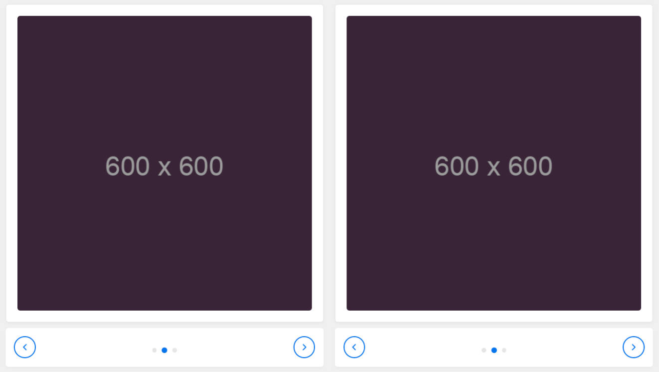
Showing dots or thumbnails
There is a separate Dots component that can be used to show navigation dots.
import Carousel, { Dots } from '@brainhubeu/react-carousel';
import '@brainhubeu/react-carousel/lib/style.css';

// ...

constructor(props) {
  super(props);
  this.state = {
    value: 0,
  };
}

onChange = value => this.setState({ value });

render() {
  return (
    <div>
      <Carousel
        value={this.state.value}
        onChange={this.onChange}
      >
        <img className="img-example" src={someImage} />
        ...
        <img className="img-example" src={anotherImage} />
      </Carousel>
      <Dots value={this.state.value} onChange={this.onChange} number={12} />
    </div>
  );
}
It can also show thumbnails instead of dots
import Carousel, { Dots } from '@brainhubeu/react-carousel';
import '@brainhubeu/react-carousel/lib/style.css';

// ...

constructor(props) {
  super(props);
  this.state = {
    value: 0,
  };
}

onChange = value => this.setState({ value });

render() {
  return (
    <div>
      <Carousel
        value={this.state.value}
        onChange={this.onChange}
      >
        <img className="img-example" src={someImage} />
        ...
        <img className="img-example" src={anotherImage} />
      </Carousel>
      <Dots
        value={this.state.value}
        onChange={this.onChange}
        thumbnails={[
          (<img key={1} className="img-example-small" src={abstractImage} />),
          ...
          (<img key={12} className="img-example-small" src={transportImage} />),
        ]}
      />
    </div>
  );
}
Unit tests
npm run test-unit
Regression tests
Install selenium if it is not installed
npm run selenium-install
1. npm run selenium-start
2. npm run example
3. npm run test-regression