Bandwidth UI Shared Tools
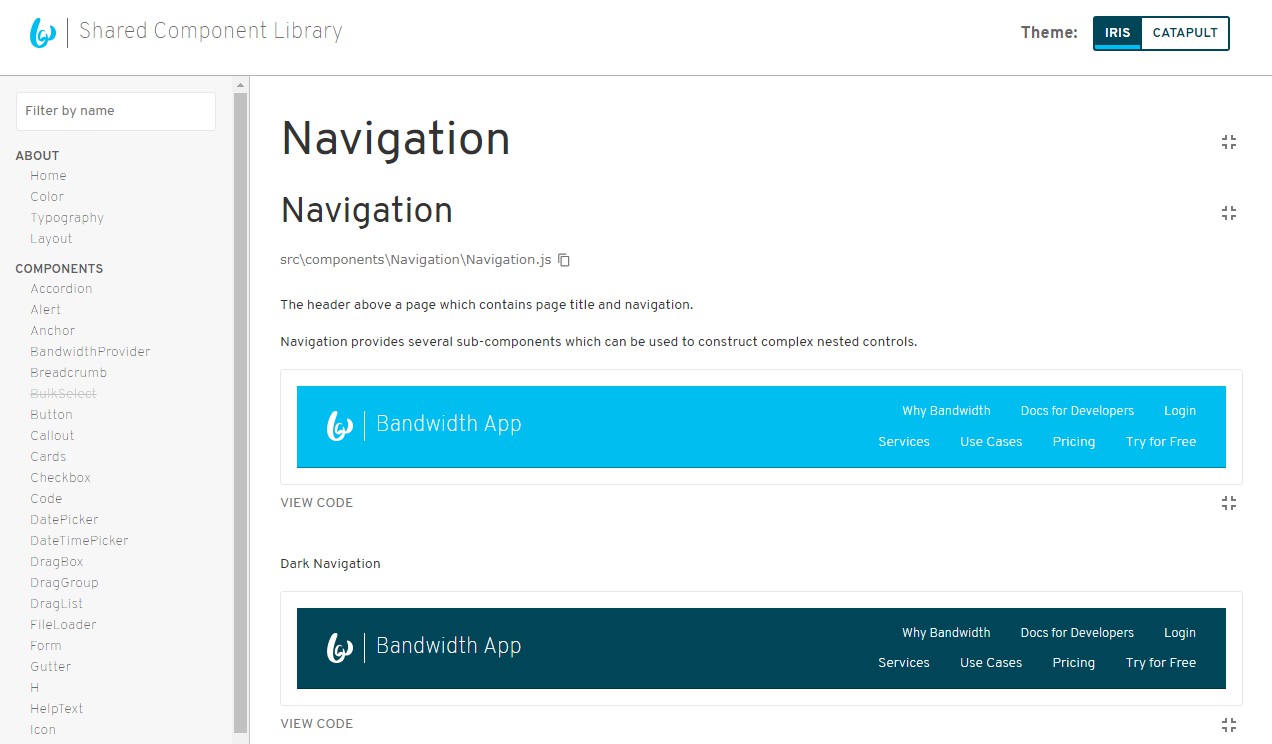
Contains multiple NPM packages we use at Bandwidth to build powerful, consistent, and engaging user experiences.
Code is located under /packages. The shared-components package is published to NPM at @bandwidth/shared-components, and the layouts package is published to @bandwidth/layouts.
Installing both libraries as NPM modules: npm i --save @bandwidth/shared-components styled-components
styled-componentsis a peer dependency and required for usage
Add the BandwidthProvider to the root of your React component structure:
import { BandwidthProvider } from '@bandwidth/shared-components';

...

<BandwidthProvider>
  <MyApp />
</BandwidthProvider>
Now you can start including the components in your code. Require them by name from the module root:
import { Button } from '@bandwidth/shared-components'`;
If you want to use layouts, you can also install @bandwidth/layouts. Add the RootLayout to your application root as well:
import { BandwidthProvider } from '@bandwidth/shared-components';
import { RootLayout } from '@bandwidth/layouts';

...

<BandwidthProvider>
  <RootLayout>
    <MyApp />
  </RootLayout>
</BandwidthProvider>
