React-Datasheet
A simple react component to create a spreadsheet.
Current features:
- Select cells, copy-paste cells
- Navigation using keyboard keys
- Deletion using keyboard keys
- Callbacks for onCellsChanged, valueRenderer(visible data)
- dataRenderer(underlying data in the input, takes the value by default)
- Supply your own editors and view controls with custom renderers
- Extensive control over generated markup via custom renderers
Using Typescript? View Usage
Installation
Install from npm:
$ npm install react-datasheet --save
Import in your project:
import ReactDataSheet from 'react-datasheet';
// Be sure to include styles at some point, probably during your bootstrapping
import 'react-datasheet/lib/react-datasheet.css';
Usage
React-Datasheet generates a table with the cells. Double-clicking or typing edits the value and if changed, initiates an onCellsChanged callback.
Pasting tabular data or deleting a range of cells also calls onCellsChanged.
The data provided should be an array of rows, and each row should include the cells.
Basic Usage
class App extends React.Component {
  constructor (props) {
    super(props)
    this.state = {
      grid: [
        [{value:  1}, {value:  3}],
        [{value:  2}, {value:  4}]
      ]
    }
  }
  render () {
    return (
      <ReactDataSheet
        data={this.state.grid}
        valueRenderer={(cell) => cell.value}
        onCellsChanged={changes => {
          const grid = this.state.grid.map(row => [...row])
          changes.forEach(({cell, row, col, value}) => {
            grid[row][col] = {...grid[row][col], value}
          })
          this.setState({grid})
        }}
      />
    )
  }
}
Cells with underlying data
There are two values that each cell shows. The first is via valueRenderer and the second is via dataRenderer. When a cell is in edit mode, it will show the value returned from dataRenderer. It needs to return a string as this value is set in an input field.
Each of these callbacks are passed the cell value as well as the cell's coordinates in the spreadsheet. This allows you to apply formatting logic at rendering time, such as all cells in the third column should be formatted as dates.
const grid = [
   [{value:  5, expr: '1 + 4'}, {value:  6, expr: '6'}, {value: new Date('2008-04-10')}],
   [{value:  5, expr: '1 + 4'}, {value:  5, expr: '1 + 4'}, {value: new Date('2004-05-28')}]
]
const onCellsChanged = (changes) => changes.forEach(({cell, row, col, value}) => console.log("New expression :" + value))
<ReactDataSheet
  data={grid}
  valueRenderer={(cell, i, j) => j == 2 ? cell.value.toDateString() : cell.value}
  dataRenderer={(cell, i, j) => j == 2 ? cell.value.toISOString() : cell.expr}
  onCellsChanged={onCellsChanged}
/>
Cells with underlying component
const grid = [
   [{
    value:  5,
      component: (
        <button onClick={() => console.log("clicked")}>
          Rendered
        </button>
      )
    }]
]
<ReactDataSheet
  data={grid}
  valueRenderer={(cell) => cell.value}
/>
This renders a single cell with the value 5. Once in edit mode, the button will appear.
Cells with extra attributes
const grid = [
  [{value:  1, hint: 'Valid'}, {value:  3, hint: 'Not valid'}],
  [{value:  2}, {value:  4}]
]
<ReactDataSheet
  data={grid}
  valueRenderer={(cell) => cell.value}
  attributesRenderer={(cell) => {'data-hint': cell.hint || {}}
  ...
/>
This render 2 rows, each one with two cells, the cells in the first row will have an attribute data-hint and the other 2 will not.
Custom renderers
React-Datasheet allows you replace the renderers both for the overall structure (rows, cells, the sheet itself) as well as editors and viewers for individual cells. This allows you to radically refashion the sheet to suit your requirements.
For example, this shows how to add separate headers and a checkbox at the start of each row to control row "selected" state. It also specifies a custom view renderer and a custom editor for the first column of each row:
const columns = getColumnsFromSomewhere()
const isSelected = yourSelectionFunction
const selectHandler = yourCallbackFunction

<ReactDataSheet
  data={grid}
  valueRenderer={(cell) => cell.value}
  sheetRenderer={props => (
    <table className={props.className + ' my-awesome-extra-class'}>
        <thead>
            <tr>
                <th className='action-cell' />
                {columns.map(col => (<th>{col.name}</th>))}
            </tr>
        </thead>
        <tbody>
            {props.children}
        </tbody>
    </table>
  )}
  rowRenderer={props => (
    <tr>
        <td className='action-cell'>
            <input
                type='checkbox'
                checked={isSelected(props.row)}
                onChange={selectHandler}
            />
        </td>
        {props.children}
    </tr>
  )}
  valueViewer={MyViewComponent}
  dataEditor={props => (
    props.col === 0 ? <MyDatePicker {...props} /> : <DataEditor {...props}/>
  )}
  ...
/>
Note: For brevity, in this example the custom renderers are all defined as arrow functions inside of render, but using a bound function in the parent component or a separate custom component will let you avoid a lot of needless re-renders.
Options
| Option | Type | Description |
|---|---|---|
| data | Array | Array of rows and each row should contain the cell objects to display |
| valueRenderer | func | Method to render the value of the cell function(cell, i, j). This is visible by default |
| dataRenderer | func | Method to render the underlying value of the cell function(cell, i, j). This data is visible once in edit mode. |
| overflow | 'wrap'|'nowrap'|'clip' | Grid default for how to render overflow text in cells |
| onCellsChanged | func | onCellsChanged handler: function(arrayOfChanges[, arrayOfAdditions]) {}, where changes is an array of objects of the shape {cell, row, col, value}. See below for more details. |
| onContextMenu | func | Context menu handler : function(event, cell, i, j) |
| parsePaste | func | function (string) {} If set, the function will be called with the raw clipboard data. It should return an array of arrays of strings. This is useful for when the clipboard may have data with irregular field or line delimiters. If not set, rows will be split with line breaks and cells with tabs. |
Advanced options
The following are optional functions or React Component that can completely override the native renderers of react datasheet. To know which props are passed down, see custom renderers
| Option | Type | Description |
|---|---|---|
| sheetRenderer | func | Optional function or React Component to render the main sheet element. The default renders a table element. |
| rowRenderer | func | Optional function or React Component to render each row element. The default renders a tr element. |
| cellRenderer | func | Optional function or React Component to render each cell element. The default renders a td element. |
| valueViewer | func | Optional function or React Component to customize the way the value for each cell in the sheet is displayed. Affects every cell in the sheet. See cell options to override individual cells. |
| dataEditor | func | Optional function or React Component to render a custom editor. Affects every cell in the sheet. Affects every cell in the sheet. See cell options to override individual cells. |
| selected | object | Optional. Whether the selection is controlled or uncontrolled. Must be an object of this format: { start: { i: number, j; number }, end: { i: number, j: number } }, or null for no selection. |
| onSelect | func | Optional. function ({ start, end }) {} Triggered on every selection change. start and end have the same format as the selected prop. |
onCellsChanged(arrayOfChanges[, arrayOfAdditions]) handler
React-DataSheet will call this callback whenever data in the grid changes:
- When the user enters a new value in a cell
- When the user hits the delete key with one or more selected cells
- When the user pastes tabular data into the table
The argument to the callback usually will be one array of objects with these properties:
| Property | Type | Description |
|---|---|---|
| cell | object | the original cell object you provided in the data property. This may be null (see below) |
| row | number | row index of changed cell |
| col | number | column index of changed cell |
| value | any | The new cell value. This is usually a string, but a custom editor may provide any type of value. |
If the change is the result of a user edit, the array will contain a single change object. If the user pastes data or deletes a range of cells, the array will contain an element for each affected cell.
Additions: If the user pastes data that extends beyond the bounds of the grid (for example, pasting two-row-high data on the last line), there will be a second argument to the handler containing an array of objects that represent the out-of-bounds data. These object will have the same properties, except:
- There is no
cellproperty - either
roworcol, or both, will be outside the bounds of your original grid. They will correspond to the indices the new data would occupy if you expanded your grid to hold them.
You can choose to ignore the additions, or you can expand your model to accomodate the new data.
Deprecated handlers
Previously React-DataSheet supported two change handlers. These are still supported for backwards compatibility, but will be removed at some point in the future.
| Option | Type | Description |
|---|---|---|
| onChange | func | onChange handler: function(cell, i, j, newValue) {} |
| onPaste | func | onPaste handler: function(array) {} If set, the function will be called with an array of rows. Each row has an array of objects containing the cell and raw pasted value. If the pasted value cannot be matched with a cell, the cell value will be undefined. |
Cell Options
The cell object is what gets passed back to the onChange callback. They can contain the following options as well
| Option | Type | Default | Description |
|---|---|---|---|
| readOnly | Bool | false | Cell will never go in edit mode |
| key | String | undefined | By default, each cell is given the key of col number and row number. This would override that key |
| className | String | undefined | Additional class names for cells. |
| component | ReactElement | undefined | Insert a react element or JSX to this field. This will render on edit mode |
| forceComponent | bool | false | Renders what's in component at all times, even when not in edit mode |
| disableEvents | bool | false | Makes cell unselectable and read only |
| colSpan | number | 1 | The colSpan of the cell's td element |
| rowSpan | number | 1 | The rowSpan of the cell's td element |
| width | number or String | undefined | Sets the cell's td width using a style attribute. Number is interpreted as pixels, strings are used as-is. Note: This will only work if the table does not have a set width. |
| overflow | 'wrap'|'nowrap'| 'clip' | undefined | How to render overflow text. Overrides grid-level overflow option. |
| valueViewer | func | undefined | Optional function or React Component to customize the way the value for this cell is displayed. Overrides grid-level valueViewer option. |
| dataEditor | func | undefined | Optional function or React Component to render a custom editor. Overrides grid-level dataEditor option. |
Custom Renderers
Each of the following custom renderers should be either a React Component or a function that takes a props argument and returns a react element (a.k.a stateless functional component). React-DataSheet will supply certain properties to each renderer.
In some cases React-DataSheet will include event handlers as properties to your custom renderer. You must hook up these handlers to your component or aspects of React-DataSheet's built-in behavior will cease to work.
Except for valueViewer and dataEditor, each custom renderer will receive react's regular props.children. Be sure to render {props.children} in your custom renderer.
Sheet Renderer
The sheetRenderer is responsible for laying out the sheet's main parent component. By default, React-DataSheet uses a table element. React-DataSheet will supply these properties:
| Option | Type | Description |
|---|---|---|
| data | Array | The same data array as from main ReactDataSheet component |
| className | String | Classes to apply to your top-level element. You can add to these, but your should not overwrite or omit them unless you want to implement your own CSS also. |
| children | Array or component | The regular react props.children. You must render {props.children} within your custom renderer or you won't see your rows and cells. |
Row Renderer
The rowRenderer lays out each row in the sheet. By default, React-DataSheet uses a tr element. React-DataSheet will supply these properties:
| Option | Type | Description |
|---|---|---|
| row | number | The current row index |
| cells | Array | The cells in the current row |
| children | Array or component | The regular react props.children. You must render {props.children} within your custom renderer or you won't see your cells. |
Cell Renderer
The cellRenderer creates the container for each cell in the sheet. The default renders a td element. React-DataSheet will supply these properties:
| Option | Type | Description |
|---|---|---|
| row | number | The current row index |
| col | number | The current column index |
| cell | Object | The cell's raw data structure |
| className | String | Classes to apply to your cell element. You can add to these, but your should not overwrite or omit them unless you want to implement your own CSS also. |
| style | Object | Generated styles that you should apply to your cell element. This may be null or undefined. |
| selected | Bool | Is the cell currently selected |
| editing | Bool | Is the cell currently being edited |
| updated | Bool | Was the cell recently updated |
| attributesRenderer | func | As for the main ReactDataSheet component |
| onMouseDown | func | Event handler important for cell selection behavior |
| onMouseOver | func | Event handler important for cell selection behavior |
| onDoubleClick | func | Event handler important for editing |
| onContextMenu | func | Event handler to launch default content-menu handling. You can safely ignore this handler if you want to provide your own content menu handling. |
| children | Array or component | The regular react props.children. You must render {props.children} within your custom renderer or you won't your cell's data. |
Value Viewer
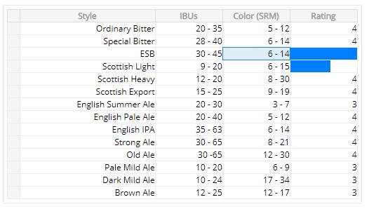
The valueViewer displays your cell's data with a custom component when in view mode. For example, you might show a "three star rating" component instead the number 3. You can specify a valueViewer for the entire sheet and/or for an individual cell.
React-DataSheet will supply these properties:
| Option | Type | Description |
|---|---|---|
| value | node | The result of the valueRenderer function |
| row | number | The current row index |
| col | number | The current column index |
| cell | Object | The cell's raw data structure |
Data Editor
The dataEditor displays your cell's data when in edit mode. You can can use any component you want, as long as you hook up the event handlers that constitute the contract between React-DataSheet and your editor. You can specify a dataEditor for the entire sheet and/or for an individual cell.
| Option | Type | Description |
|---|---|---|
| value | String or node | The result of the dataRenderer (or valueRenderer if none) |
| row | number | The current row index |
| col | number | The current column index |
| cell | Object | The cell's raw data structure |
| onChange | func | function (string) {} callback for when the user changes the value during editing (for example, each time they type a character into an input). onChange does not indicate the final edited value. It works just like a controlled component in a form. |
| onKeyDown | func | function (event) {} An event handler that you can call to use default React-DataSheet keyboard handling to signal reverting an ongoing edit (Escape key) or completing an edit (Enter or Tab). For most editors based on an input element this will probably work. However, if this keyboard handling is unsuitable for your editor you can trigger these changes explicitly using the onCommit and onRevert callbacks. |
| onCommit | func | function (newValue, [event]) {} A callback to indicate that editing is over, here is the final value. If you pass a KeyboardEvent as the second argument, React-DataSheet will perform default navigation for you (for example, going down to the next row if you hit the enter key). You actually don't need to use onCommit if the default keyboard handling is good enough for you. |
| onRevert | func | function () {} A no-args callback that you can use to indicate that you want to cancel ongoing edits. As with onCommit, you don't need to worry about this if the default keyboard handling works for your editor. |


