Simple React Validator
A simple react and react native form validator inspired by Laravel validation.
Simple React Validator is exactly as it sounds. We wanted to build a validator for react that had minimal configuration and felt natural to use. It's configuration and usage is similar to the Laravel PHP framework and make validation as easy as one line.
Usage
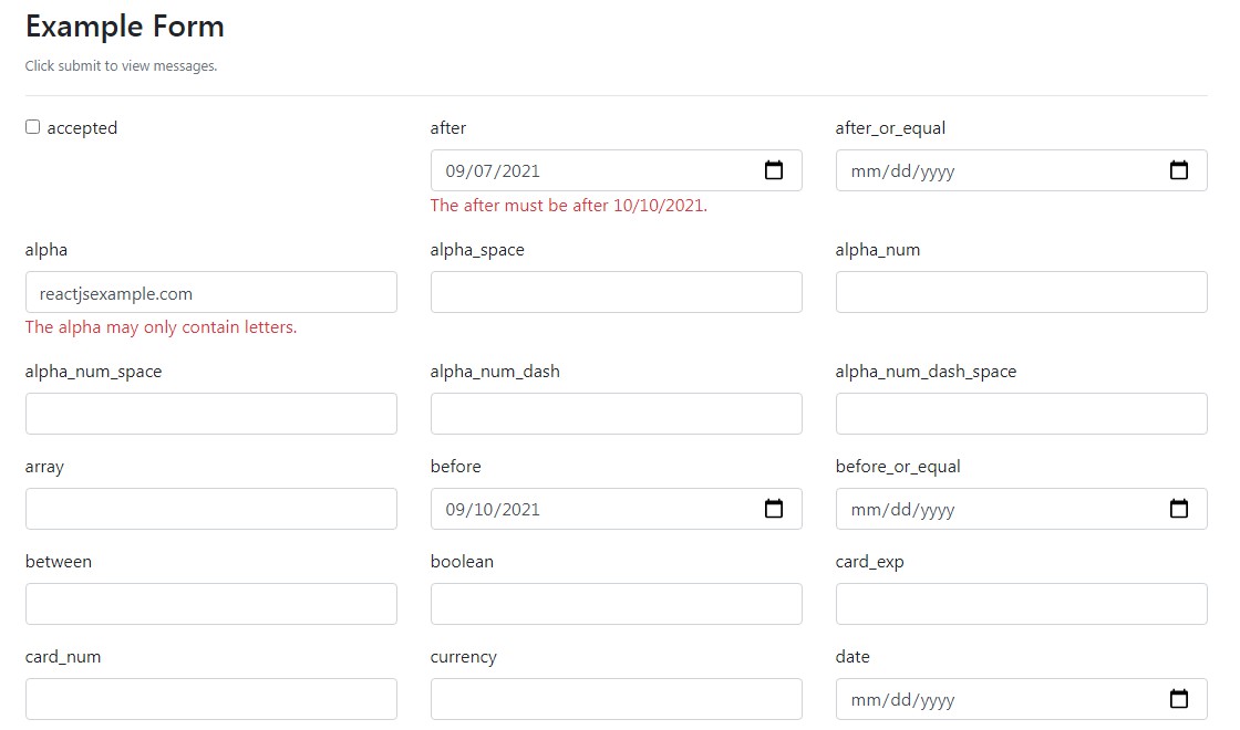
Open the example/index.html file for more usage examples of the library or check out the Example
npm
npm install simple-react-validator --save
bower
bower install simple-react-validator --save
3 Easy Steps
- Import and Initialize the validator.
import SimpleReactValidator from 'simple-react-validator';
es5
componentWillMount: function() {
  this.validator = new SimpleReactValidator();
},
es6
constructor() {
  this.validator = new SimpleReactValidator();
}
- Add validation rules under inputs. The
messagemethod accepts 5 arguments:
- Field Name: A unique underscored string that gets replaced in the messaging as the name of the field.
- Value: Usually the state of the current field.
- Rules String: A pipe separated list of rules to apply to the string.
- Options (Optional): Object of options same as the default options.
this.validator.message('title', this.state.title, 'required|email')
Example:
render() {
  return (
    <div className="container">
      <h1>Write a Review</h1>
      <div className="form-group">
        <label>Title</label>
        <input className="form-control" value={this.state.title} onChange={this.setTitle} />

        {/**********   This is where the magic happens     ***********/}
        {this.validator.message('title', this.state.title, 'required|alpha')}

      </div>
      <div className="form-group">
        <label>Email</label>
        <input className="form-control" value={this.state.email} onChange={this.setEmail} />

        {/**********   This is where the magic happens     ***********/}
        {this.validator.message('email', this.state.email, 'required|email', { className: 'text-danger' })}

      </div>
      <div className="form-group">
        <label>Review</label>
        <textarea className="form-control" value={this.state.review} onChange={this.setReview} />

        {/**********   This is where the magic happens     ***********/}
        {this.validator.message('review', this.state.review, 'required|min:20|max:120')}

      </div>
      <button className="btn btn-primary" onClick={this.submitForm}>Save Review</button>
    </div>
  );
}
- Check if the validation passes when submitting and turn on messaging if it fails. Once messaging is turned on, validation messages will change and update as the user types.
submitForm() {
  if (this.validator.allValid()) {
    alert('You submitted the form and stuff!');
  } else {
    this.validator.showMessages();
    // rerender to show messages for the first time
    // you can use the autoForceUpdate option to do this automatically`
    this.forceUpdate();
  }
}
There is another method you can use to check if a single field is valid or not.
if (this.validator.fieldValid('email')) {
  // booya this field is valid!
}
Note: autoForceUpdate
As of v1.1.0 you can initialize the the constructor with the autoForceUpdate option and pass it react instance that is responsible for the state. This will automatically call the this.forceUpdate() for you when showMessages, hideMessages, showMessageFor, and hideMessageFor are called.
constructor() {
  this.validator = new SimpleReactValidator({autoForceUpdate: this});
}
1. Available Public Methods
getErrorMessages() Returns a JS object, key being the field name, value being the error message.
showMessages() Turns on showing messages for all messages.
hideMessages() Turns off showing messages for all messages.
showMessageFor(field) Turns on showing messages for a specific field. Useful for onBlur.
hideMessageFor(field) Turns off showing messages for a specific field. Useful for onBlur.
allValid() Returns a boolean if all the fields pass validation or not.
fieldValid(field) Checks if a single field is valid or not.
purgeFields() Empties the validation object for conditional fields.
messageWhenPresent(message, options = {}) Show a message when the message is set, good for ajax validation errors.
check(value, validations) A simple way of checking a value against a built in validation rule. Does not add to the validator, just gives a true / false return value.
message(field, value, validations, options = {}) How you define validation rules and add messages into the form.
2. onBlur
You can use the react onBlur action to show individual fields once the input is blurred. Use the showMesssageFor or hideMessageFor methods.
<div>
  <label>Email</label>
  <input value={this.state.email} onChange={/* update email */} onBlur={() => this.validator.showMessageFor('email')} />
  {this.validator.message('email', this.state.email, 'required|email')}
</div>
3. Conditional Fields
A field is added to validator via the above message method. But sometimes you want to conditionally add and remove validation as the form is completed. For this you can use the purgeFields method to clear all validator before each render so only the fields added during that render are validated.
render() {
  this.validator.purgeFields();
  return (
    <div>
      <div className="form-group">
        <label>Address Line 1</label>
        <input className="form-control" value={this.state.title} onChange={this.setTitle} />
        {this.validator.message('title', this.state.title, 'required|alpha')}
      </div>
      {this.optinallyAddAnotherAddressLine()}
      <button className="btn btn-primary" onClick={this.submitForm}>Save Review</button>
    </div>
  );
}
4. React Hooks
SimpleReactValidator is a class but if you instantiate a class in a stateless React component it will do this on every render (losing any message information that may have been added).
useRef: instruct React to treat SimpleReactValidator as a singleton:
const simpleValidator = useRef(new SimpleReactValidator())

<Input
  name="name"
  value={companyInformation.name}
  onChange={handleInputChange}
  onBlur={()=>simpleValidator.current.showMessageFor('name')} />
{simpleValidator.current.message('name', companyInformation.name, 'required')}
For more detail see issue: #97
5. React Native
You need to wrap validator with <Text> Element.
<Text>
  {this.validator.message('title', this.state.title, 'required|alpha')}
</Text>
Rules
This is the list of all the rules you can validate form inputs against. When using multiple rules, separate them with a pipe |. When adding options, append a colon to the rule and separate options with commas. Examples: 'required|min:20|max:120' and 'required|in:stu,stuart,stuyam'. You can apply the rules via an array like ['required', {max: 20}, {min: 120}] or ['required', {in: ['stu', 'stuyam']}]. This is necessary for things like the regex validator where you may be using pipes or commas in the regex and would conflict with the rule string.
- Accepted
- After
- After or Equal
- Alpha
- Alpha Space
- Alpha Num
- Alpha Num Space
- Alpha Num Dash
- Alpha Num Dash Space
- Array
- Before
- Before or Equal
- Between
- Boolean
- Card Expiration
- Card Number
- Currency
- Date
- Date Equals
- In
- Integer
- Max
- Min
- Not In
- Not Regex
- Numeric
- Phone
- Regex
- Required
- Size
- String
- Type Of
- Url
accepted
Must be a JavaScript true, good for required check boxes.
after:date
Must be after date. See Date for info on accepted date values.
after_or_equal:date
Must be after or on date. See Date for info on accepted date values.
alpha
Must only container letters.
alpha_space
Must only container letters and spaces.
alpha_num
Must only container letters and numbers.
alpha_num_space
Must only container letters, numbers, and spaces.
alpha_num_dash
Must only container letters, numbers, dashes, and underscores.
alpha_num_dash_space
Must only container letters, numbers, dashes, underscores, and spaces.
array
Must be a JavaScript Array.
before:date
Must be before date. See Date for info on accepted date values.
before_or_equal:date
Must be before or on date. See Date for info on accepted date values.
between:min,max,type(optional)
Must be between two values. See Size for info on how size is calculated and how options work.
boolean
Must be a JavaScript Boolean.
card_exp
Must be a valid credit card expiration date. Ex. 10/18 or 10/2018
card_num
Must be a valid credit card number. Ex. 4242424242424242 or 4242 4242 4242 4242
currency
Must be a valid currency. Dollar signs and commas are optional. Ex. 4.25, $3000 or $3,245,525.12
date
Must be a date type momentjs date.
Requires Momentjs
date_equals:date
Must be a date on a specific date.
Options: date must be a momentjs date object.
Must be a valid email format.
in:foo,bar,...
Must match a string in options.
Options: list of values it must match.
integer
Must be an integer value.
max:size,type(optional)
Must not be greater than max. See Size for info on how size is calculated and how options work.
min:size,type(optional)
Must not be less than min. See Size for info on how size is calculated and how options work.
not_in:foo,bar,...
Must NOT match a string in options.
Options: list of values it must not match.
not_regex:pattern
Must NOT match a regex.
Options: regex it must not match.
Note: if your regex uses a | or , or other special characters use the array syntax to define the rule.
numeric
Must be a number of any type.
Positive numbers: "numeric|min:0,num"
Negative numbers "numeric|max:0,num"
phone
Must be a valid phone number format. Ex. (508) 555-1234 or 5085551234
regex:pattern
Must match a regex.
Options: regex it must match.
Note: if your regex uses a | or , or other special characters use the array syntax to define the rule.
required
Must be present, use with other validators to require them.
size:size,type(optional)
Must be of a particular size. Can be a string length, array length, or number.
Options: type is optional and defaults to string. There are 3 types 'string', 'num', and 'array'. String is length of string, num is size of number, array is length of array.
string
Must be of type string.
typeof:type
Must be of JavaScript type specified in the options.
Options: compare the type of the value given to the type provided. Use array syntax to define the type else it will always be type string.
url
Must be a valid url. Ex. https://dockwa.com or dockwa.com
Options
The Simple React Validator can receive an options object when initialized or as the fourth parameter when defining a validator. There are 4 options you can provide.
1. element:
Accepts a block where you can return the default element that you want to wrap the message from a validator message. The default element is <div className="srv-validation-message">{message}</div>. If you are using React Native the default will be just the message the gets returned. You can also set element: false to just return a message.
- Takes 2 params
- message: The message coming from the validator.
- className (optional): Will optionally be provided so you can change the className on a per validation basis.
this.validator = new SimpleReactValidator({
  element: message => <div>{message}</div>
  // OR
  element: (message, className) => <div className={className}>{message}</div>
})
2. className:
String of classes to be passed into an element, default is srv-validation-message and can be overriden.
3. messages:
Accepts an object to override validation messages. It also accepts a default which will override all messages.
this.validator = new SimpleReactValidator({
  messages: {
    email: 'That is not an email.'
    // OR
    default: 'Validation has failed!'  // will override all messages
  },
})
4. validators:
Accepts an object of custom validators. See Custom Validators for more info on defining custom validators.
5. autoForceUpdate:
Accepts a react instance and will automatically be called when messages are shown and hidden automatically. More on autoForceUpdate
6. locale:
Accepts a string with the localized messages of your choice. For this to work, the correct language file also needs to be loaded into your front end. Current Supported Languages. To contribute to translating the project use this file as a template.
// sets french default validation messages.
this.validator = new SimpleReactValidator({locale: 'fr'});
You can apply custom messages with the messages option. However you can also apply a custom language that you can later select with the addLocale class method.
SimpleReactValidator.addLocale('klingon', {
  accepted: 'Hab SoSlI’ Quch!',
  email: 'Heghlu’meH QaQ jajvam'
});
...
this.validator = new SimpleReactValidator({locale: 'klingon'});
Custom Validators
You can write custom rules that you can use the validate. A rule has 4 options:
- message: The message the will be shown when the validation fails. :attribute will be replaced by the humanized name that your provide of the attribute you are validating (supports snake_case or camelCase).
- rule: Accepts a block that returns true if validator passes and false if it fails.
- Takes 3 params
- val: The value that is being validated.
- params: An array containing the params passed into the validator.
- validator: The validator object, allows you to access helper methods such as
validator.helpers.textRegex(val, regex)which returns true or false if the regex passes.
- messageReplace (optional): Accepts a block uses to modify and return the message on the fly.
- Takes 2 params
- message: The message provided above.
- params: An array containing the params passed into the validator.
- required (optional): True if you want the validator to be implicitly required when it is applied. All validators are not required by default. The equivalent of adding
requiredto each validation definition.
Example:
constructor() {
  this.validator = new SimpleReactValidator({
    validators: {
      ip: {  // name the rule
        message: 'The :attribute must be a valid IP address and must be :values.',
        rule: (val, params, validator) => {
          return validator.helpers.testRegex(val,/^(?!0)(?!.*\.$)((1?\d?\d|25[0-5]|2[0-4]\d)(\.|$)){4}$/i) && params.indexOf(val) === -1
        },
        messageReplace: (message, params) => message.replace(':values', this.helpers.toSentence(params)),  // optional
        required: true  // optional
      }
    }
  });
}
Usage:
render: function() {
  return (
    <div className="container">
      <h1>Give Me Your IP</h1>
      <div className="form-group">
        <label>IP Address</label>
        <input className="form-control" value={this.state.ip} onChange={this.setIP} />
        {this.validator.message('ipAddress', this.state.ip, 'required|ip:127.0.0.1')}
      </div>
      ...
    </div>
  );
},


