react-scroll-into-view-if-needed
A thin react component wrapper bundled with the fantastic scroll-into-view-if-needed ponyfill.
Install
yarn add react-scroll-into-view-if-needed
or
npm install react-scroll-into-view-if-needed --save
Usage
import ScrollIntoViewIfNeeded from 'react-scroll-into-view-if-needed';

const MyComponent = () => (
  <div style={{ paddingTop: 2000 }}>
    <ScrollIntoViewIfNeeded>
      <div>Hello</div>
    </ScrollIntoViewIfNeeded>
  </div>
);
Props
Each prop is described in detail below, but for a quicker reference - check out the propTypes object in src.
options
Type:
object
Default:{ behavior: 'smooth', scrollMode: 'if-needed' }
Full list of options are described here
<ScrollIntoViewIfNeeded options={{
  scrollMode: 'always',
}}>
  <div>Hello</div>
</ScrollIntoViewIfNeeded>
active
Type:
boolean
Default:true
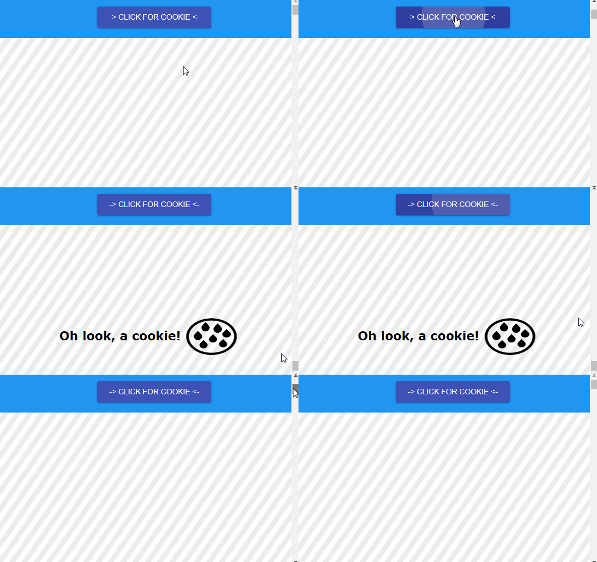
The active prop allows controll of when to scroll to the component. By default, it will attempt to scroll as soon as it is mounted, but you can set this prop to manually control when to trigger the scroll behavior from the parent component.
class Example extends React.PureComponent {
  constructor(props) {
    super(props);
    this.state = { active: false };
  }

  handleScrollToggle = () => this.setState({ active: !this.state.active });

  render() {
    const { active } = this.state;

    return (
      <div>
        <button onClick={this.handleScrollToggle}>Scroll</button>
        <div style={{ paddingTop: 2000 }}>
          <ScrollIntoViewIfNeeded active={active}>
            <div>Hello</div>
          </ScrollIntoViewIfNeeded>
        </div>
      </div>
    );
  }
}
elementType
Type:
string
Default:'div'
Set the wrapper component type. For example, this could also be 'footer', 'button', etc... See the React createElement api.
<ScrollIntoViewIfNeeded elementType="span">
  <div>Hello</div>
</ScrollIntoViewIfNeeded>
className, id, etc
You can also pass normal element attributes like className to the component.
<ScrollIntoViewIfNeeded elementType="span" className={styles.something}>
  <div>Hello</div>
</ScrollIntoViewIfNeeded>


