react-redux-toast
react-redux-toastr is a React toastr message implemented with Redux, primary consists of three things: a reducer, toastr emitter and a React component.
The reducer listens to dispatched actions from the component to maintain the toastr state in Redux.
Implementation Guide
1. Installation
npm install --save react-redux-toastr
2. Add the styles
-
import the scss file into to your project.
@import 'react-redux-toastr/src/styles/index'; -
or import the css file.
import 'react-redux-toastr/lib/css/react-redux-toastr.min.css'
- or include the css file from the demo site (NOTE: This can be change at anytime)
<link href="https://diegoddox.github.io/react-redux-toastr/7.1/react-redux-toastr.min.css" rel="stylesheet" type="text/css">
3. Add the reducer.
import {createStore, combineReducers} from 'redux'
import {reducer as toastrReducer} from 'react-redux-toastr'
const reducers = {
  // ... other reducers ...
  toastr: toastrReducer // <- Mounted at toastr.
}
const reducer = combineReducers(reducers)
const store = createStore(reducer)
NOTE: The default mount point for react-redux-toastr is toastr.
4. Add the component into an app root
import {Provider}  from 'react-redux'
import ReduxToastr from 'react-redux-toastr'

<Provider store={store}>
  <div>
    ... other things like router ...
    // props are not required
    <ReduxToastr
      timeOut={4000}
      newestOnTop={false}
      preventDuplicates
      position="top-left"
      transitionIn="fadeIn"
      transitionOut="fadeOut"
      progressBar
      closeOnToastrClick/>
  </div>
</Provider>
The default configuration is:
{
  timeOut: 5000,
  newestOnTop: true,
  position: 'top-right',
  transitionIn: 'bounceIn',
  transitionOut: 'bounceOut',
  progressBar: false,
  closeOnToastrClick: false,
}
NOTE: transitionIn and transitionOut will affect the confirm animation as well
Here is the full list of available configurations:
-
position:
top-lefttop-centertop-rightbottom-leftbottom-centerandbottom-right -
transitionIn:
bounceInbounceInDownandfadeIn -
transitionOut:
bounceOutbounceOutUpandfadeOut
5. Use the emitter
The toastr method use eventemitter3 to dispatch the actions
import React, {Component}  from 'react'
import {toastr} from 'react-redux-toastr'

export class YourComponent extends Component {
  render() {
    return (
      <div>
        <button
          onClick={() => toastr.success('The title', 'The message')}
          type="button">Toastr Success</button>
      </div>
    )
  }
}
Or you can bind the actions to your component if you prefer.
import {bindActionCreators} from 'redux'
import {actions as toastrActions} from 'react-redux-toastr'
// In your React component
constructor(props) {
  super(props);
  // Bind the react-redux-toastr actions to the component
  this.toastr = bindActionCreators(toastrActions, this.props.dispatch)

  this.toastr.add({
   id: 'mycustomid', // If not provided we will add one.
   type: 'success',
   title: 'your title',
   position: 'top-left', // This will override the global props position.
   attention: true, // This will add a shadow like the confirm method.
   onAttentionClick: (id) => {}, //override default behavior of 'attention' background click.
   message: 'message',
   options: {}
  });

  this.toastr.remove('toastrId');
}
Toastr methods
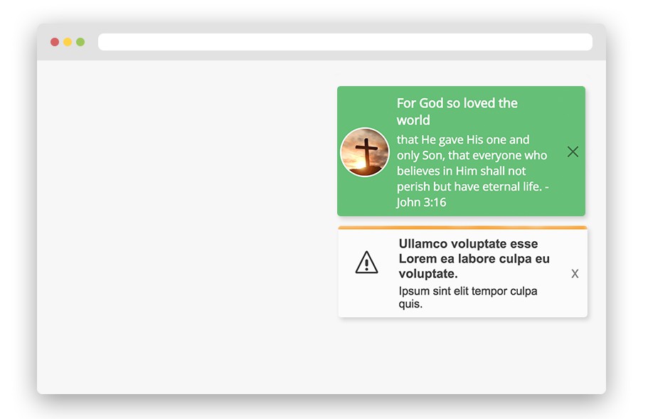
Toastr accepts the following methods: success info warning light error confirm message, remove and removeByType
Toastr: success info warning light error remove and removeByType
Each of these methods can take up to three arguments the title a message and options.
In options you can specify timeOut icon onShowComplete onHideComplete className component removeOnHover,removeOnHoverTimeOut,showCloseButton, onCloseButtonClick, onToastrClick, progressBar, transitionIn, position, attention, onAttentionClick, transitionOut and closeOnToastrClick.
import {toastr} from 'react-redux-toastr'

const toastrOptions = {
  timeOut: 3000, // by setting to 0 it will prevent the auto close
  icon: (<myCustomIconOrAvatar />), // You can add any component you want but note that the width and height are 70px ;)
  onShowComplete: () => console.log('SHOW: animation is done'),
  onHideComplete: () => console.log('HIDE: animation is done'),
  onCloseButtonClick: () => console.log('Close button was clicked'),
  onToastrClick: () => console.log('Toastr was clicked'),
  showCloseButton: false, // true by default
  closeOnToastrClick: true, // false by default, this will close the toastr when user clicks on it
  component: ( // this option will give you a func 'remove' as props
    <MyCustomComponent myProp="myValue">
      <span>Hello, World!</span>
    </MyCustomComponent>
  )
}

toastr.success('Title', 'Message', toastrOptions)
toastr.info('The message', toastrOptions)
toastr.warning('The title', 'The message')
toastr.error('The message')
toastr.removeByType('error') // Remove all toastrs with the type error.
toastr.remove('123') // Removes toastr with id '123'
Toastr methods light
The light method is like the other toastr except that the background-color is white and you can add a top
border on top of the toastr by passing the status option
icon can be one of the following:
'success''info''warning''error'
import {toastr} from 'react-redux-toastr'

const toastrType = 'warning';
const toastrOptions = {
  icon: toastrType,
  status: toastrType
}

toastr.light('The title', 'The message', toastrOptions)
Toastr: message
This one is in case you wanna show a large amount of information, unlike the other methods above this will not close automatically unless you provide a timeout in the message options.
const toastrMessageOptions = {
  timeOut: 3000, // Default value is 0
  onShowComplete: () => console.log('SHOW: animation is done'),
  onHideComplete: () => console.log('HIDE: animation is done'),
  removeOnHover: false, // Default value is false
  removeOnHoverTimeOut: 1000, // Default value is 1000
  component: React.Component
};
toastr.message('Title', toastrMessageOptions)
Toastr: confirm
The confirm method takes two arguments, the first is the message the second is a object where you can specify what will happen when the user clicks on ok and cancel button or by keypress enter/esc
NOTE: You can only have one at a time, right now if you have one confirm and you fire another it will be ignored.
const toastrConfirmOptions = {
  onOk: () => console.log('OK: clicked'),
  onCancel: () => console.log('CANCEL: clicked')
};
toastr.confirm('Are you sure about that!', toastrConfirmOptions);
You can change the ok and cancel text by:
- Passing the
confirmprops to theReduxToastrcomponent
<!-- please define both keys as this will override default okText & cancelText -->
const options = {
  okText: 'confirm text',
  cancelText: 'cancel text'
};
<ReduxToastr confirmOptions={options}/>
- Passing the
okTextandcancelTextprops to thetoasterConfirmOptionsobject:
const toastrConfirmOptions = {
  ...
  okText: 'confirm text',
  cancelText: 'cancel text'
};

toastr.confirm('Are you sure about that!', toastrConfirmOptions);
You can make it so ok is the only button by:
- Passing the
disableCancelprop to thetoasterConfirmOptionsobject:
const toastrConfirmOptions = {
  ...
  disableCancel: true;
};

toastr.confirm('You have timed out! Please log back in.', toastrConfirmOptions);
You can add custom buttons by:
-
Passing the
buttonsprop to thetoasterConfirmOptionsobject.
The buttons are inserted after the OK and the cancel button.Each button config can have a
text,handlerand aclassNameproperty.If you want to move the original OK or cancel button to a different place, just
insert a button config with a boolean flagokorcancelat the desired position
(note that all other properties are ignored in this button config).
The following config leads to 3 buttons in this order:
- "Apply" (original OK button)
- "Do not apply" (our custom button)
- "Cancel" (original cancel button)
const toastrConfirmOptions = {
  ...
  okText: 'Apply',
  buttons: [{
    text: 'Do not apply',
    className: 'do-not-apply-btn',
    handler: () => console.log('do-not-apply clicked')
  }, {
    cancel: true // move the cancel button to the end
  }]
};

toastr.confirm('Your changes are applicable to 5 more records.', toastrConfirmOptions);
You can render your custom message component instead of the simple string message by:
- Passing the
componentprop to thetoasterConfirmOptionsobject:
const toastrConfirmOptions = {
  ...
  component: () => (
    <MyCustomComponent myProp="myValue">
      <span>Hello, World!</span>
    </MyCustomComponent>
  )
};

toastr.confirm(null, toastrConfirmOptions); // pass null for message
Avatar: in case you wanna use the same avatar as the example
Run a local demo
git clone https://github.com/diegoddox/react-redux-toastr.git
cd react-redux-toastr
npm install
npm start
open your browser at http://localhost:3000