React Sortable Tree
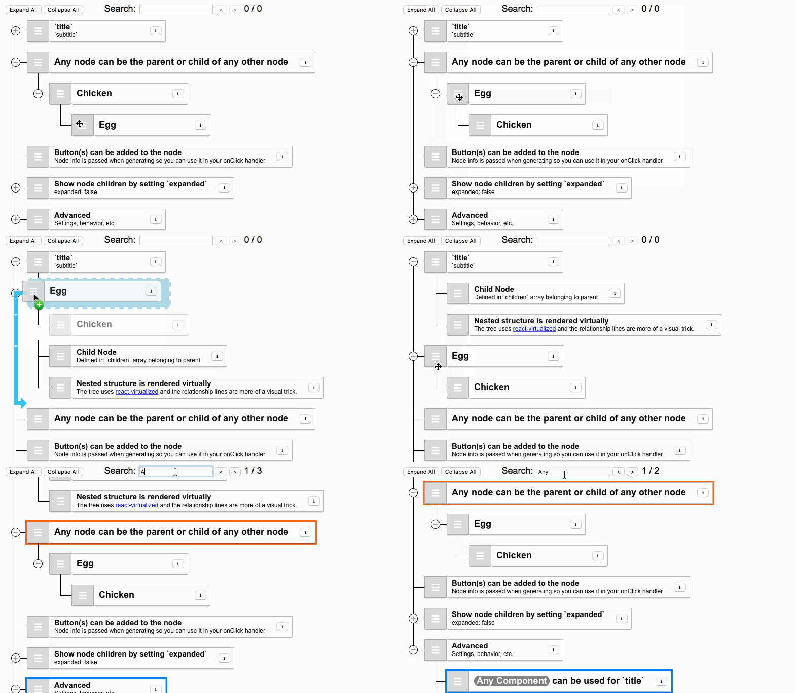
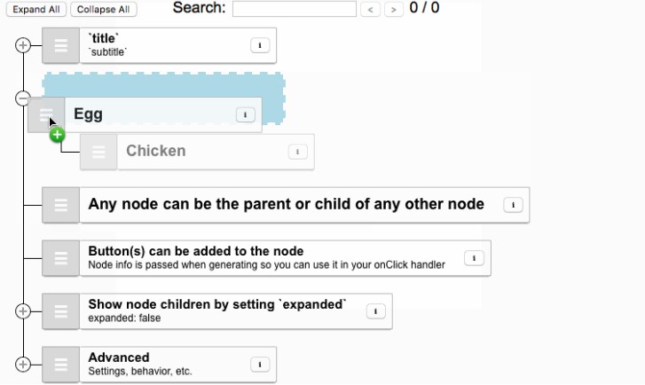
A React component for Drag-and-drop sortable representation of hierarchical data. Checkout the demo for a demonstration of some basic features. Checkout the storybook for advanced usage.
Getting started
Install react-sortable-tree using npm.
# NPM
npm install react-sortable-tree --save

# YARN
yarn add react-sortable-tree
ES6 and CommonJS builds are available with each distribution.
For example:
// This only needs to be done once; probably during your application's bootstrapping process.
import 'react-sortable-tree/style.css';

// You can import the default tree with dnd context
import SortableTree from 'react-sortable-tree';

// Or you can import the tree without the dnd context as a named export. eg
import { SortableTreeWithoutDndContext as SortableTree } from 'react-sortable-tree';

// Importing from cjs (default)
import SortableTree from 'react-sortable-tree/dist/index.cjs.js';
import SortableTree from 'react-sortable-tree';

// Importing from esm
import SortableTree from 'react-sortable-tree/dist/index.esm.js';
Usage
import React, { Component } from 'react';
import SortableTree from 'react-sortable-tree';
import 'react-sortable-tree/style.css'; // This only needs to be imported once in your app

export default class Tree extends Component {
  constructor(props) {
    super(props);

    this.state = {
      treeData: [{ title: 'Chicken', children: [{ title: 'Egg' }] }],
    };
  }

  render() {
    return (
      <div style={{ height: 400 }}>
        <SortableTree
          treeData={this.state.treeData}
          onChange={treeData => this.setState({ treeData })}
        />
      </div>
    );
  }
}
Props
| Prop | Type | Description |
|---|---|---|
| treeData (required) |
object[] | Tree data with the following keys: title is the primary label for the node.subtitle is a secondary label for the node.expanded shows children of the node if true, or hides them if false. Defaults to false.children is an array of child nodes belonging to the node.Example: [{title: 'main', subtitle: 'sub'}, { title: 'value2', expanded: true, children: [{ title: 'value3') }] }] |
| onChange (required) |
func | Called whenever tree data changed. Just like with React input elements, you have to update your own component's data to see the changes reflected.( treeData: object[] ): void |
| getNodeKey (recommended) |
func | Specify the unique key used to identify each node and generate the path array passed in callbacks. With a setting of getNodeKey={({ node }) => node.id}, for example, in callbacks this will let you easily determine that the node with an id of 35 is (or has just become) a child of the node with an id of 12, which is a child of ... and so on. It uses defaultGetNodeKey by default, which returns the index in the tree (omitting hidden nodes).({ node: object, treeIndex: number }): string or number |
| generateNodeProps | func | Generate an object with additional props to be passed to the node renderer. Use this for adding buttons via the buttons key, or additional style / className settings.({ node: object, path: number[] or string[], treeIndex: number, lowerSiblingCounts: number[], isSearchMatch: bool, isSearchFocus: bool }): object |
| onMoveNode | func | Called after node move operation. ({ treeData: object[], node: object, nextParentNode: object, prevPath: number[] or string[], prevTreeIndex: number, nextPath: number[] or string[], nextTreeIndex: number }): void |
| onVisibilityToggle | func | Called after children nodes collapsed or expanded. ({ treeData: object[], node: object, expanded: bool, path: number[] or string[] }): void |
| onDragStateChanged | func | Called when a drag is initiated or ended. ({ isDragging: bool, draggedNode: object }): void |
| maxDepth | number | Maximum depth nodes can be inserted at. Defaults to infinite. |
| rowDirection | string | Adds row direction support if set to 'rtl' Defaults to 'ltr'. |
| canDrag | func or bool | Return false from callback to prevent node from dragging, by hiding the drag handle. Set prop to false to disable dragging on all nodes. Defaults to true. ({ node: object, path: number[] or string[], treeIndex: number, lowerSiblingCounts: number[], isSearchMatch: bool, isSearchFocus: bool }): bool |
| canDrop | func | Return false to prevent node from dropping in the given location. ({ node: object, prevPath: number[] or string[], prevParent: object, prevTreeIndex: number, nextPath: number[] or string[], nextParent: object, nextTreeIndex: number }): bool |
| canNodeHaveChildren | func | Function to determine whether a node can have children, useful for preventing hover preview when you have a canDrop condition. Default is set to a function that returns true. Functions should be of type (node): bool. |
| theme | object | Set an all-in-one packaged appearance for the tree. See the Themes section for more information. |
| searchMethod | func | The method used to search nodes. Defaults to defaultSearchMethod, which uses the searchQuery string to search for nodes with matching title or subtitle values. NOTE: Changing searchMethod will not update the search, but changing the searchQuery will.({ node: object, path: number[] or string[], treeIndex: number, searchQuery: any }): bool |
| searchQuery | string or any | Used by the searchMethod to highlight and scroll to matched nodes. Should be a string for the default searchMethod, but can be anything when using a custom search. Defaults to null. |
| searchFocusOffset | number | Outline the <searchFocusOffset>th node and scroll to it. |
| onlyExpandSearchedNodes | boolean | Only expand the nodes that match searches. Collapses all other nodes. Defaults to false. |
| searchFinishCallback | func | Get the nodes that match the search criteria. Used for counting total matches, etc.(matches: { node: object, path: number[] or string[], treeIndex: number }[]): void |
| dndType | string | String value used by react-dnd (see overview at the link) for dropTargets and dragSources types. If not set explicitly, a default value is applied by react-sortable-tree for you for its internal use. NOTE: Must be explicitly set and the same value used in order for correct functioning of external nodes |
| shouldCopyOnOutsideDrop | func or bool | Return true, or a callback returning true, and dropping nodes to react-dnd drop targets outside of the tree will not remove them from the tree. Defaults to false. ({ node: object, prevPath: number[] or string[], prevTreeIndex: number, }): bool |
| reactVirtualizedListProps | object | Custom properties to hand to the internal react-virtualized List |
| style | object | Style applied to the container wrapping the tree (style defaults to {height: '100%'}) |
| innerStyle | object | Style applied to the inner, scrollable container (for padding, etc.) |
| className | string | Class name for the container wrapping the tree |
| rowHeight | number or func | Used by react-sortable-tree. Defaults to 62. Either a fixed row height (number) or a function that returns the height of a row given its index: ({ treeIndex: number, node: object, path: number[] or string[] }): number |
| slideRegionSize | number | Size in px of the region near the edges that initiates scrolling on dragover. Defaults to 100. |
| scaffoldBlockPxWidth | number | The width of the blocks containing the lines representing the structure of the tree. Defaults to 44. |
| isVirtualized | bool | Set to false to disable virtualization. Defaults to true. NOTE: Auto-scrolling while dragging, and scrolling to the searchFocusOffset will be disabled. |
| nodeContentRenderer | any | Override the default component (NodeRendererDefault) for rendering nodes (but keep the scaffolding generator). This is a last resort for customization - most custom styling should be able to be solved with generateNodeProps, a theme or CSS rules. If you must use it, is best to copy the component in node-renderer-default.js to use as a base, and customize as needed. |
| placeholderRenderer | any | Override the default placeholder component (PlaceholderRendererDefault) which is displayed when the tree is empty. This is an advanced option, and in most cases should probably be solved with a theme or custom CSS instead. |
Data Helper Functions
Need a hand turning your flat data into nested tree data?
Want to perform add/remove operations on the tree data without creating your own recursive function?
Check out the helper functions exported from tree-data-utils.js.
getTreeFromFlatData: Convert flat data (like that from a database) into nested tree data.getFlatDataFromTree: Convert tree data back to flat data.addNodeUnderParent: Add a node under the parent node at the given path.removeNode: For a given path, get the node at that path, treeIndex, and the treeData with that node removed.removeNodeAtPath: For a given path, remove the node and return the treeData.changeNodeAtPath: Modify the node object at the given path.map: Perform a change on every node in the tree.walk: Visit every node in the tree in order.getDescendantCount: Count how many descendants this node has.getVisibleNodeCount: Count how many visible descendants this node has.getVisibleNodeInfoAtIndex: Get theth visible node in the tree data. toggleExpandedForAll: Expand or close every node in the tree.getNodeAtPath: Get the node at the input path.insertNode: Insert the input node at the specified depth and minimumTreeIndex.find: Find nodes matching a search query in the tree.isDescendant: Check if a node is a descendant of another node.getDepth: Get the longest path in the tree.
Themes
Using the theme prop along with an imported theme module, you can easily override the default appearance with another standard one.
Featured themes
 |
 |
 |
|---|---|---|
| File Explorer | Full Node Drag | Minimalistic theme inspired from MATERIAL UI |
| react-sortable-tree-theme-file-explorer | react-sortable-tree-theme-full-node-drag | react-sortable-tree-theme-minimal |
| Github | NPM | Github | NPM | Github | NPM |
Help Wanted - As the themes feature has just been enabled, there are very few (only two at the time of this writing) theme modules available. If you've customized the appearance of your tree to be especially cool or easy to use, I would be happy to feature it in this readme with a link to the Github repo and NPM page if you convert it to a theme. You can use my file explorer theme repo as a template to plug in your own stuff.
Browser Compatibility
| Browser | Works? |
|---|---|
| Chrome | Yes |
| Firefox | Yes |
| Safari | Yes |
| IE 11 | Yes |
Troubleshooting
If it throws "TypeError: fn is not a function" errors in production
This issue may be related to an ongoing incompatibility between UglifyJS and Webpack's behavior. See an explanation at create-react-app#2376.
The simplest way to mitigate this issue is by adding comparisons: false to your Uglify config as seen here: https://github.com/facebookincubator/create-react-app/pull/2379/files
If it doesn't work with other components that use react-dnd
react-dnd only allows for one DragDropContext at a time (see: https://github.com/gaearon/react-dnd/issues/186). To get around this, you can import the context-less tree component via SortableTreeWithoutDndContext.
// before
import SortableTree from 'react-sortable-tree';

// after
import { SortableTreeWithoutDndContext as SortableTree } from 'react-sortable-tree';


