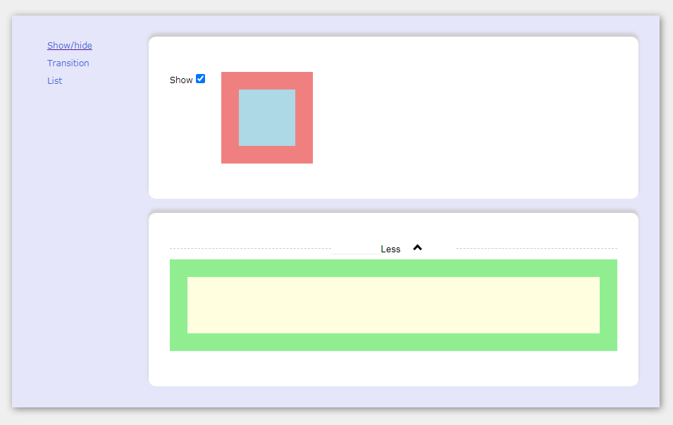
react-component-transition
Easy to use react component to apply animations between component transitions, by using Web Animations API.
Install
npm install react-component-transition --save
NOTE
This package was built using react hooks therefore it requires minimum version 16.8.0 of reactjs.
Typescript
Types are included in the package.
Goal
The main goal is to provide an easy and fast way to apply simple animations when transitioning from one component to another, without loosing too much time testing, adjusting, styling, etc...
With a couple of code lines, it's possible to make any react page much more interactive and user friendly.
Polyfills
- Web Animations API
- Intersection Observer API (only if
lazyprop set totrue) - Promise
If needed, polyfills can be imported individually:
import "react-component-transition/build/polyfill/web-animations-api";
import "react-component-transition/build/polyfill/intersection-observer";
import "react-component-transition/build/polyfill/promise";
or all at once:
import "react-component-transition/build/polyfill";
Usage
ComponentTransition
import { ComponentTransition, AnimationTypes } from "react-component-transition";
const Component = () => {

    // ...

    return (
        <ComponentTransition
            enterAnimation={AnimationTypes.scale.enter}
            exitAnimation={AnimationTypes.fade.exit}
        >
            {showDetails ? <Details /> : <Summary />}
        </ComponentTransition>
    );
};
Presets
Presets are components that have enterAnimation and exitAnimation already set, for an easier and cleaner usage.
import { TransitionFade } from "react-component-transition/presets";
const Component = () => {

    // ...

    return (
        <TransitionFade>
            {show && <Details />}
        </TransitionFade>
    );
};
There's a preset available for each AnimationTypes.
ComponentTransitionList
To be used with lists. Simply return a ComponentTransition or any preset in your map function and wrap it all with a ComponentTransitionList.
import { ComponentTransitionList } from "react-component-transition";
import { TransitionScale } from "react-component-transition/presets";
const Component = () => {

    // ...

    return (
        <ComponentTransitionList>
            {list.map((listItem, index) =>
                <TransitionScale key={index}>
                    <ListItem {...listItem} />
                </TransitionScale>
            )}
        </ComponentTransitionList>
    );
};
With react-router
import { useLocation } from "react-router-dom";
const AppRoutes: React.FC = () => {
    const location = useLocation();
    return (
        <ComponentTransition
            enterAnimation={AnimationTypes.slideUp.enter}
            exitAnimation={AnimationTypes.slideDown.exit}
        >
            <Switch key={location.key} location={location}>
                <Route ... />
                <Route ... />
                <Route ... />
            </Switch>
        </ComponentTransition>
    );
};
import { BrowserRouter } from "react-router-dom";
const App: React.FC = () => (
    <BrowserRouter>
        <AppRoutes />
    </BrowserRouter>
);
Custom animation
import { ComponentTransition, AnimationTypes } from "react-component-transition";
const Component = () => {

    // ...

    return (
        <ComponentTransition
            enterAnimation={[
                AnimationTypes.slideUp.enter,
                AnimationTypes.fade.enter,
            ]}
            exitAnimation={[{
                keyframes: [
                    { transform: "translate3d(0,0,0)" },
                    { transform: "translate3d(0,50%,0)" },
                    { transform: "translate3d(0,80%,0)" },
                    { transform: "translate3d(0,90%,0)" },
                    { transform: "translate3d(0,100%,0)" },
                ],
                options: {
                    duration: 500,
                    easing: "cubic-bezier(0.83, 0, 0.17, 1)",
                }
            },
            {
                keyframes: [
                    { opacity: 1 },
                    { opacity: 0.3 },
                    { opacity: 0.1 },
                    { opacity: 0 },
                ],
                options: {
                    duration: 300,
                }
            }]
            }
        >
            <Details key={selectedTab} />
        </ComponentTransition>
    );
};
API
AnimationTypes
AnimationTypes are a set of animations already defined that can be used in enterAnimation and/or exitAnimation props. Availabe ones are:
collapse.(horizontal|vertical)
expand.(horizontal|vertical)
fade.(enter|exit)
rotate.(enter|exit)
rotateX.(enter|exit)
rotateY.(enter|exit)
scale.(enter|exit)
slideDown.(enter|exit)
slideLeft.(enter|exit)
slideRight.(enter|exit)
slideUp.(enter|exit)
For each type of AnimationTypes there's a respective preset.
props
All presets and the ComponentTransition will wrap their children in a div element. This div is the element that will animate when children are unmounting or mounting and is also referenced here as "container".
| Name | Type | Default | Description |
|---|---|---|---|
| animateContainer | boolean | false |
if true the container will also animate from the exit component size to the enter component size.NOTE: All presets have this prop set to true by default |
| animateContainerDuration | number | 300 | Duration in milliseconds of the container animation |
| animateContainerEasing | string | "ease" | Easing of container animation |
| animateOnMount | boolean | false |
if true, applies enterAnimation when component mounts in the initial render |
| className | string | undefined |
CSS class to set in the container element |
| classNameEnter | string | undefined |
CSS class to set in the container element during enterAnimation |
| classNameExit | string | undefined |
CSS class to set in the container element during exitAnimation |
| disabled | boolean | false |
disable all animations |
| enterAnimation | AnimationSettings | AnimationSettings[] | undefined |
Web Animations API parameters to be applied when new component mounts |
| exitAnimation | AnimationSettings | AnimationSettings[] | undefined |
Web Animations API parameters to be applied when current component will unmount |
| lazy | boolean | false |
Will apply enterAnimation and/or exitAnimation if the component is visible in the viewport by using the Intersection Observer API |
| lazyOptions | IntersectionOptions | undefined |
Intersection Observer options |
| onEnterFinished | () => void | undefined |
Callback when enterAnimation finishes |
| onExitFinished | () => void | undefined |
Callback when exitAnimation finishes |
| style | React.CSSProperties | undefined |
Inline styles to set in the container element |
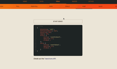
Examples
Clone the repo first and then:
npm install
npm start