iconicicons
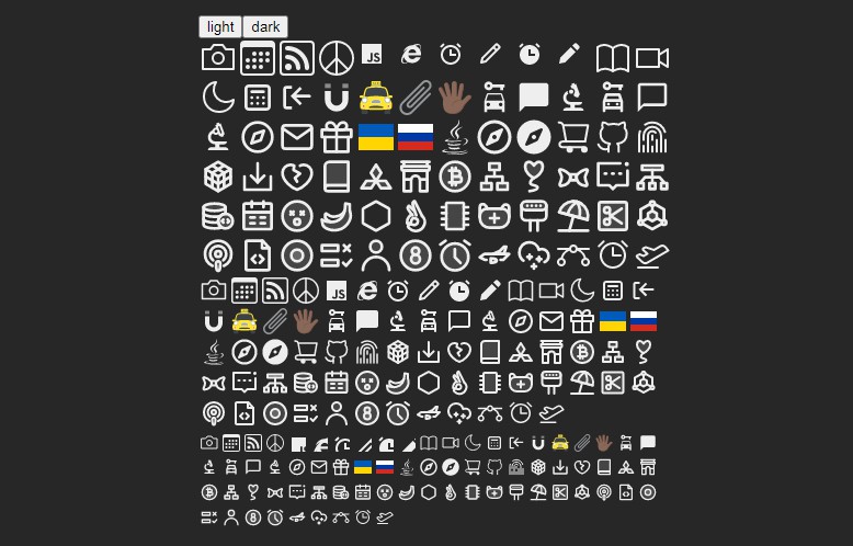
Iconic is a free “do wtf you want with” set of pixel-perfect icons.
Available as basic SVG icons and via first-party React and Vue libraries.
Basic Usage
The quickest way to use these icons is to simply copy the source for the icon you need from iconic.app and inline it directly into your HTML:
<svg width="24" height="24" viewBox="0 0 24 24" fill="none" xmlns="http://www.w3.org/2000/svg">
    <path d="M13.75 6.75L19.25 12L13.75 17.25" stroke="#141414" stroke-width="1.5" stroke-linecap="round" stroke-linejoin="round"></path>
    <path d="M19 12H4.75" stroke="#141414" stroke-width="1.5" stroke-linecap="round" stroke-linejoin="round"></path>
</svg>
React
First, install @iconicicons/react from npm:
npm install @iconicicons/react
Now each icon can be imported individually as a React component:
import { BatteryIcon } from '@iconicicons/react'

function MyComponent() {
  return (
    <div>
      <BatteryIcon />
      <p>...</p>
    </div>
  )
}
Icons use an upper camel case naming convention and are always suffixed with the word Icon.
Vue
First, install @iconicicons/vue or @iconicicons/vue3 from npm:
npm install @iconicicons/vue // for Vue 2
npm install @iconicicons/vue3 // for Vue 3
Now each icon can be imported individually as a Vue component:
<template>
  <div>
    <BatteryIcon />
    <p>...</p>
  </div>
</template>

<script>
import { BatteryIcon } from '@iconicicons/vue'

export default {
  components: { BatteryIcon }
}
</script>
Icons use an upper camel case naming convention and are always suffixed with the word Icon.


