react-gl-transition-image
Lazy load & transition your React images with some WebGL glsl niceness tada. Easy to use, offers 8 different transitions out the box and gives you the ability to easily port any transition from https://gl-transitions.com/
npm install --save react-gl-transition-image
Usage
<ReactGlTransitionImage/> is pretty bare bones by design and does not handle the actual animation or in view detection to offer greater flexibility. In its most simple form it accepts a image src prop and a progress prop, indicating the normalized progress of the animation (a value between 0and 1).
<ReactGlTransitionImage/> will grow to fill the dimensions of the wrapping div and draws the given image using a background-size: cover compatible algorithm. When progress >== 1, it actually returns a div with the image set as background and background-size set to cover, for performance reasons.
See example below with in view detection using react-intersection-observer and animation using the lovely react-spring library.
// App.jsx
import GlFadeInImage from './GlFadeInImage';
const App = () => {
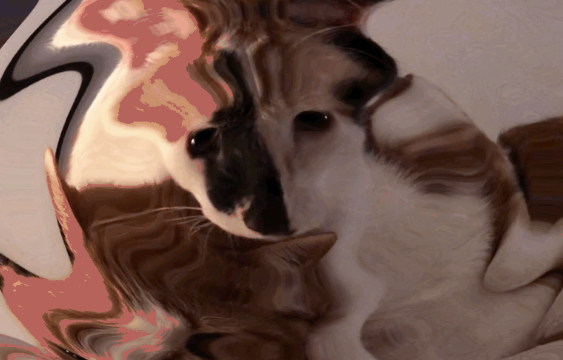
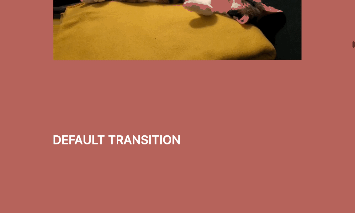
const imgSrc = '/img/cat2.png';
return (
<div style={{width: '400px', height: '300px'}}>
<GlFadeInImage src={imgSrc} />
</div>
);
};
// GlFadeInImage.jsx
import React from 'react';
import ReactGlTransitionImage from 'react-gl-transition-image';
import { useInView } from 'react-intersection-observer';
import { Spring } from 'react-spring/renderprops';
const GlFadeInImage = ({ src }) => {
const [ref, inView] = useInView({
threshold: 0,
triggerOnce: true
});
return (
<Spring
config={{
tension: 180,
friction: 45,
clamp: true
}}
to={{ progress: inView ? 1 : 0 }}
>
{animProps =>
<ReactGlTransitionImage
ref={ref}
src={src}
progress={animProps.progress}
/>
}
</Spring>
);
};
Props
| Prop | Description | Required | Default |
|---|---|---|---|
| src | Image url | yes | |
| progress | Normalized progress of the transition, i.e. a value between 0 and 1. |
yes | |
| transition | GLSL source for the transition effect. | no | Blobby noise transition |
| loadAssetsOn | If supplied, assets will be loaded once this prop equals true. If omitted, assets will be preloaded on mount. See the live demo source in example/ for details. |
no | |
| onAssetsLoaded | Callback fired when all image assets have been loaded (main image, mask & textures) and the image is ready to be transitioned in. The function is called with the argument { width, height }, i.e. an object containing the width and height of the main image. |
no | |
| mask | Mask image url. If this prop is supplied, the image will be used as a mask and the transition will be set (and overridden) accordingly. | no | |
| textures | Array of image urls to be loaded as textures in the transition shader. textures[0] will be available as sampler2D textures[0] in the shader withvec2 textureResolutions[0]` containing the image resolution. |
no | |
| className | CSS class name for the outermost wrapper div. | no | |
| style | CSS inline style object for the outermost wrapper div (useful for animating CSS properties concurrently with the GLSL transition (see live demo)). | no |
Transitions
The following transitions are currently available:
- blobbyTransition (default)
- glitchTransition
- polkaTransition
- noiseSwirlsTransition
- blurTransition
- waterTransition
- randomSquaresTransition
As mentioned, if the mask prop is passed, the mask image will be used to transition in the image, overriding any supplied transition effect.
Using out of the box transitions
import ReactGlTransitionImage, {
    blurTransition
} from 'react-gl-transition-image';

...

<ReactGlTransitionImage
    ref={ref}
    src={src}
    progress={progress}
    transition={blurTransition}
/>
Custom transitions
Writing transitions
react-gl-transition-image adapts the gl-transitions API. This means that the main body of your transition should be written in a transition function declared as:
// the current progress is available in the progress uniform declared as below.
// note: don't declare it manually in your source, it is declared for you.
// uniform float progress;

// the uv argument will contain the current raw normalized pixel coords
vec4 transition (vec2 uv) {
    // your transition code
}
Use getToColor()to get the current pixel for the image you're transitioning in. It accepts raw normalized pixel coords (those passed to transition()) and transforms them to background-size: cover translated coords automatically, returning the current pixel in the image.
vec4 getToColor(vec2 uv);
So, to slide in an image from the left (note that you probably shouldn't be using react-gl-transition-imagefor such a non-fancy effect), you'd write the transition as:
vec4 transition(vec2 uv) {
    vec4 col = vec4(0.);

    float xOffset = (1. - (1./progress));
    vec2 uw = uv - vec2(xOffset, 0.);

    if(uw.x <= 1.) {
        col = getToColor(uw);
    }

    return col;
}
And then using it in React:
import ReactGlTransitionImage from 'react-gl-transition-image';

const transitionSrc = `
    vec4 transition(vec2 uv) {
        vec4 col = vec4(0.);

        float xOffset = (1. - (1./progress));
        vec2 uw = uv - vec2(xOffset, 0.);

        if(uw.x <= 1.) {
            col = getToColor(uw);
        }

        return col;
    }
`;

...

<ReactGlTransitionImage
    ref={ref}
    src={src}
    progress={progress}
    transition={transitionSrc}
/>
Porting transitions from gl-transitions.com
Most transitions can be used without modification, since the API is the same and the getFromColor() function expected by gl-transitions effects is "polyfilled" with the following:
vec4 getFromColor(vec2 st) {
    return vec4(0.);
}
This gives most effects from gl-transitions a transparent image to transition from. Some, however, require a rewrite. Like this water drop effect by Paweł Płóciennik:
Original source
// author: Paweł Płóciennik
// license: MIT

uniform float amplitude; // = 30
uniform float speed; // = 30

vec4 transition(vec2 p) {
    vec2 dir = p - vec2(.5);
    float dist = length(dir);

    if (dist > progress) {
        return mix(getFromColor( p), getToColor( p), progress);
    } else {
        vec2 offset = dir * sin(dist * amplitude - progress * speed);
        return mix(getFromColor( p + offset), getToColor( p), progress);
    }
}
Rewritten adaptation (included as waterTransition)
const float amplitude = 30.;
const float speed = 10.;

vec4 transition(vec2 p) {
    vec2 dir = p - vec2(.5);
    float dist = length(dir);

    if (dist > progress) {
        return vec4(0.);
    } else {
        vec2 offset = dir * sin(dist * amplitude - progress * speed);
        return getToColor( p + (offset * (1. - 1./progress)) );
    }
}