react-chrono
Modern timeline component for react.
⚡ Installation
yarn install react-chrono
? Getting Started
Please make sure you wrap the component in a container that has a width and height. When no mode is specified, the component defaults to HORIZONTAL mode.
Use the items prop to create the timeline. Each Timeline item have the following properties.
title, contentTitle, contentText, contentDetailedText
Here is an example Timeline with minimal settings.
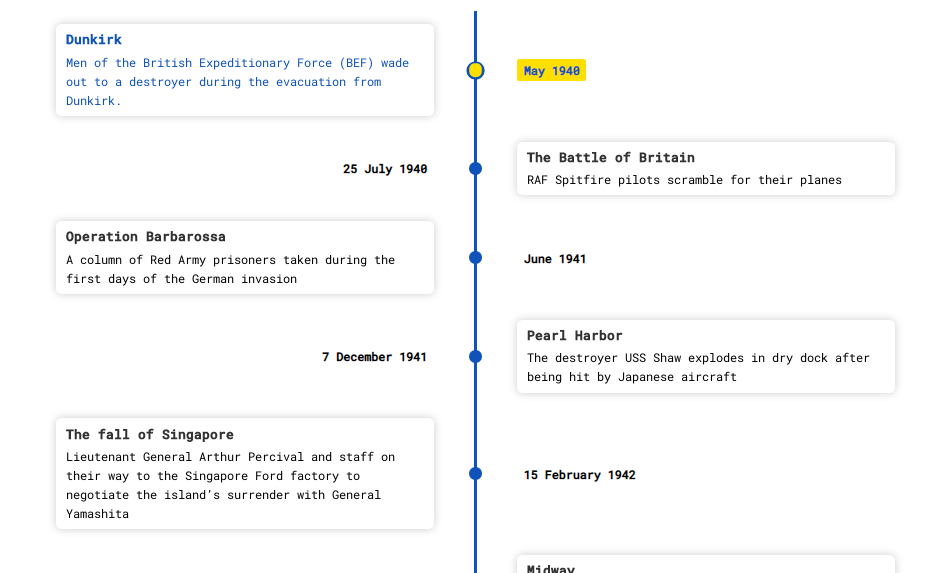
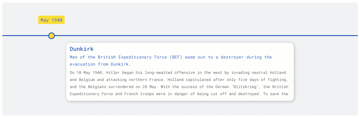
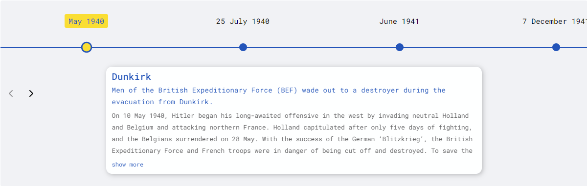
const items = [{
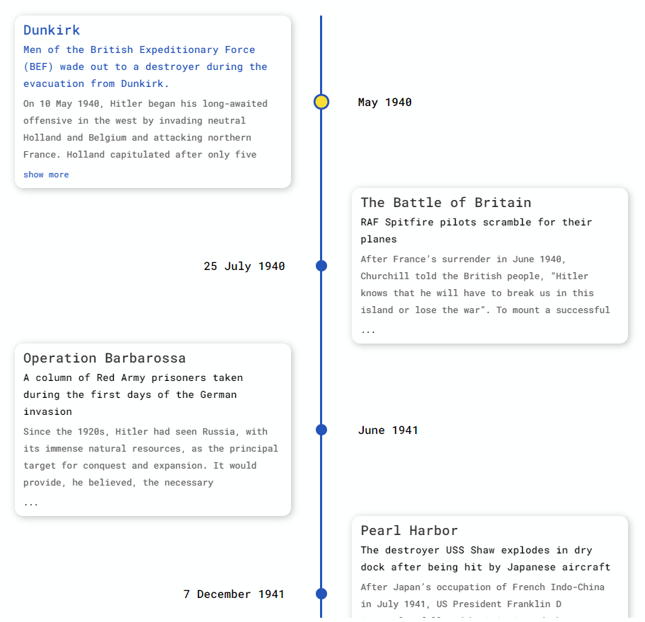
title: "May 1940",
contentTitle: "Dunkirk",
contentText:"Men of the British Expeditionary Force (BEF) wade out to a destroyer during the evacuation from Dunkirk.",
contentDetailedText: "On 10 May 1940, Hitler began his long-awaited offensive in the west...",
}, ...];
<div style={{ width: "500px", height: "400px" }}>
<chrono items={items} />
</div>
Vertical Mode
To render the timeline vertically use the VERTICAL mode
  <div style={{ width: "500px", height: "950px" }}>
    <chrono
      items={items}
      mode="VERTICAL"
    />
  </div>
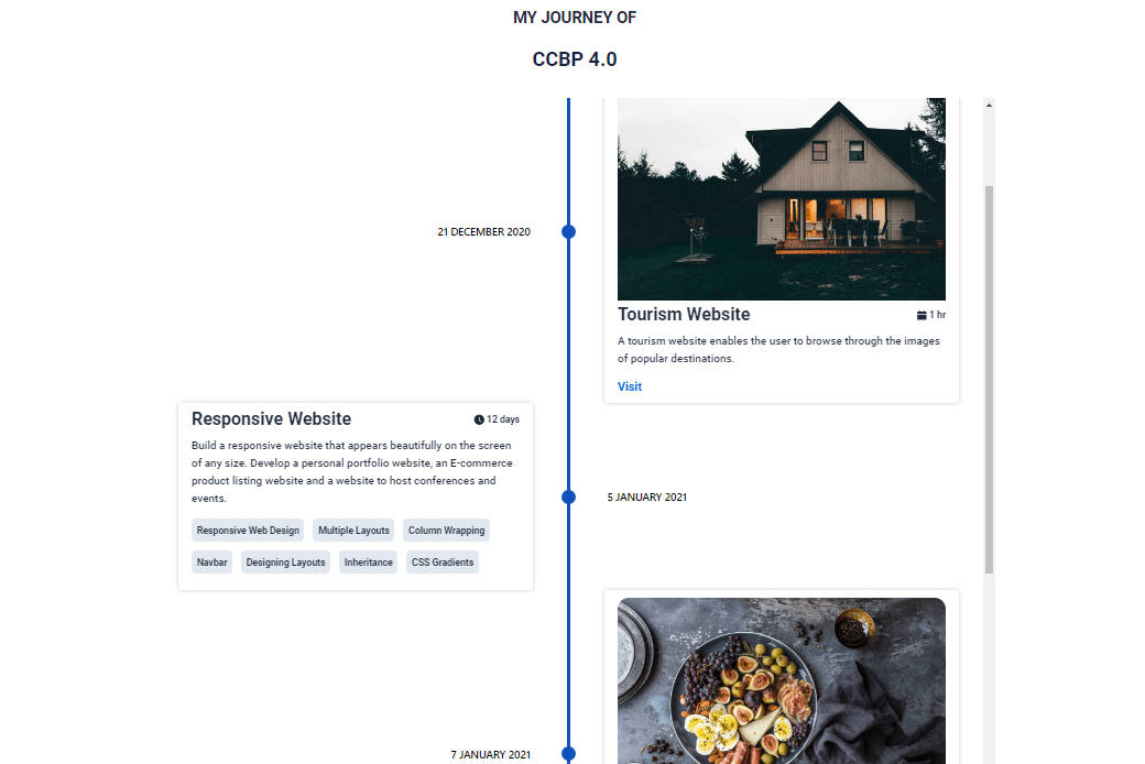
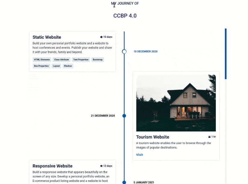
Tree View
In Tree mode the timeline is rendered vertically with cards alternating between left and right sides.
  <div style={{ width: "500px", height: "950px" }}>
    <chrono
      items={items}
      mode="TREE"
    />
  </div>
Slideshow Mode
Play the timeline automatically with the slideShow mode.
  <div style={{ width: "500px", height: "950px" }}>
    <chrono
      items={items}
      slideShow
      mode="TREE"
    />
  </div>

Props
| name | description | default |
|---|---|---|
| mode | sets the layout for the timeline component. can be HORIZONTAL, VERTICAL or TREE |
HORIZONTAL |
| items | collection of timeline items | [] |
| disableNavOnKey | prop to disable keyboard navigation. | false |
| slideShow | starts the timeline in slideshow mode. | false |
| slideItemDuration | The amount of delay in ms for the timeline points in slideshow mode. |
2500 |
| titlePosition | sets the position of the title in HORIZONTAL mode. can be TOP or BOTTOM. |
TOP |
| itemWidth | width of the timeline section in HORIZONTAL mode. |
300 |
| theme | prop to customize the colors. | 300 |
Mode
react-chrono supports three modes HORIZONTAL, VERTICAL and TREE. The mode prop can be used to define the orientation of the cards.
⌨ Keyboard Navigation & Disabling it
The timeline by default can be navigated via keyboard.
- For
HORIZONTALmode use your LEFT RIGHT arrow keys for navigation. - For
VERTICALorTREEmode, the timeline can be navigated via the UP DOWN arrow keys. - To easily jump to the first item or the last item in the timeline, use HOME or END key.
The keyboard navigation can be completely disabled by setting the disableNavOnKey to true.
<chrono items={items} disableNavOnKey />
Slideshow Mode
Slideshow can be enabled by setting the slideShow prop to true. You can also set an optional slideItemDuration that sets the time delay between cards.
<chrono items={items} slideShow slideItemDuration={4500} />
Title Position
This setting only applies for the HORIZONTAL mode. The prop titlePosition sets the position of the individual titles to either TOP or BOTTOM.
<chrono items={items} titlePosition="BOTTOM" />
Item Width
The itemWidth prop can be used to set the width of each individual timeline sections. This setting is applicable only for the HORIZONTAL mode.
? Theme
Customize colors with theme prop.
<chrono items={items} titlePosition="BOTTOM" theme={{primary: "red", secondary: "blue" }} />
?Build Setup
# install dependencies
yarn install

# start dev setup
yarn run start

# run css linting
yarn run lint:css

# package lib
yarn run rollup