React Simple Dropdown
Non-prescriptive React.js dropdown toolkit.
Installation
This module is designed for use with Browserify (but should work with anything CommonJS compatible). You can easily install it with npm:
npm install react-simple-dropdown
How to use
This module provides three React components that you can use as a basis for any kind of dropdown menu:
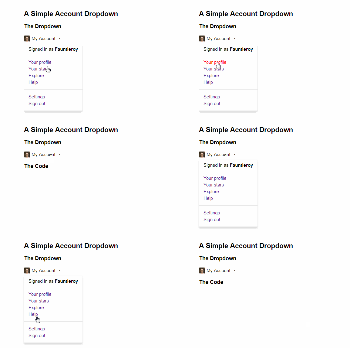
DropdownTrigger: The element that will cause your dropdown to appear when clicked.DropdownContent: Contains the "filling" of your dropdown. Generally, this is a list of links.Dropdown: The base element for your dropdown. This contains both theDropdownTriggerand theDropdownContent, and handles communication between them.
There is also a barebones stylesheet which must be included in order for the component to actually work.
Keep in mind that DropdownTrigger and DropdownContent must be direct children of Dropdown. Here's a quick example:
var React = require('react');
var Dropdown = require('react-simple-dropdown');
var DropdownTrigger = Dropdown.DropdownTrigger;
var DropdownContent = Dropdown.DropdownContent;

var Menu = React.createClass({
    render: function () {
        return (
            <Dropdown>
                <DropdownTrigger>Profile</DropdownTrigger>
                <DropdownContent>
                    <img src="avatar.jpg" /> Username
                    <ul>
                        <li>
                            <a href="/profile">Profile</a>
                        </li>
                        <li>
                            <a href="/favorites">Favorites</a>
                        </li>
                        <li>
                            <a href="/logout">Log Out</a>
                        </li>
                    </ul>
                </DropdownContent>
            </Dropdown>
        )
    }
});
Options
Options can be passed to Dropdown as props. A list of available options can be found below. These must be passed to the containing Dropdown component.
| Property | Type | Description |
|---|---|---|
| active | boolean | Manually show/hide the DropdownContent. Make sure to unset this or the dropdown will stay open. |
| disabled | boolean | Disable toggling of the dropdown by clicking on DropdownTrigger. Toggling with active, show(), and hide() is still possible. |
| removeElement | boolean | Remove the DropdownContent element when inactive (rather than just hide it). |
| onShow | function | Callback for when DropdownContent is shown. |
| onHide | function | Callback for when DropdownContent is hidden. |
Instance
Each instance of Dropdown has some methods developers might find useful.
| Method | Description |
|---|---|
| show | Shows the dropdown. |
| hide | Hides the dropdown. |
| isActive | Returns a boolean indicating whether or not the dropdown is active. |
