React-portal
React component for transportation of modals, lightboxes, loading bars... to document.body
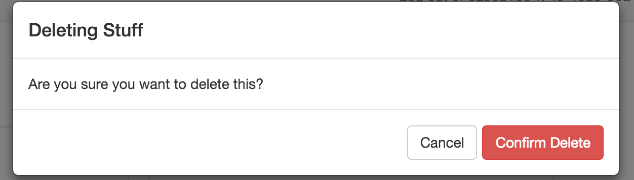
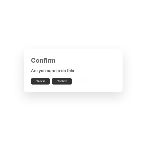
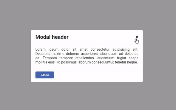
Struggling with modals, lightboxes or loading bars in React? React-portal creates a new top-level React tree and injects its children into it. That's necessary for proper styling (especially positioning).
Features
- uses React v16 and its official API for creating portals
- has a fallback for React v15
- transports its children into a new React Portal which is appended by default to document.body
- can target user specified DOM element
- supports server-side rendering
- supports returning arrays (no wrapper divs needed)
<Portal />and<PortalWithState />so there is no compromise between flexibility and convenience- doesn't produce any DOM mess
- provides close on ESC and close on outside mouse click out of the box
- no dependencies, minimalistic
Installation
yarn add react react-dom react-portal
Usage
Portal
import { Portal } from 'react-portal';

<Portal>
  This text is portaled at the end of document.body!
</Portal>

<Portal node={document && document.getElementById('san-francisco')}>
  This text is portaled into San Francisco!
</Portal>
That's it! Do you want to toggle portal? It's a plain React component, so you can simply do:
{isOpen && <Portal>Sometimes portaled?</Portal>}
This gives you absolute flexibility and control and I would recommend you to use it a basic building block for your components as modals or notifications. This code also works with server-side rendering. If you think about just using official ReactDOM.createPortal(), you would have to check for existence of DOM environment.
React-portal used to come packed with some extra goodies because sometimes you are ok with giving up some flexibility for convenience. For that case, V4 introduces another component that handles its own state for you:
PortalWithState
import { PortalWithState } from 'react-portal';

<PortalWithState closeOnOutsideClick closeOnEsc>
  {({ openPortal, closePortal, isOpen, portal }) => [
    <button key="foo" onClick={openPortal}>
      Open Portal
    </button>,
    portal(
      <p>
        This is more advanced Portal. It handles its own state.{' '}
        <button onClick={closePortal}>Close me!</button>, hit ESC or
        click outside of me.
      </p>
    )
  ]}
</PortalWithState>
Don't let this example to intimidate you! PortalWithState expects one child, a function. This function gets a few parameters (mostly functions) and returns a React component.
There are 4 optional parameters:
- openPortal - function that you can call to open the portal
- closePortal - function that you can call to close the portal
- portal - the part of component that should be portaled needs to be wrapped by this function
- isOpen - boolean, tells you if portal is open/closed
<PortalWithState /> accepts this optional props:
- node - same as
<Portal>, you can target a custom DOM element - closeOnOutsideClick - boolean, portal closes when you click outside of it
- closeOnEsc - boolean, portal closes when the ESC key is hit
- defaultOpen - boolean, the starting state of portal is being open
- onOpen - function, will get triggered after portal is open
- onClose - function, will get triggered after portal is closed
Also notice, that the example returns an array since React v16 supports it! You can also return a single component. In that case, the example would be wrapped by a div as you were used to.
If you start running into limits of <PortalWithState /> (complex animations), you probably want to use <Portal /> instead and build a component tailored to your specific taste.
Run Examples
git clone https://github.com/tajo/react-portal
cd react-portal
yarn install
yarn build:examples
open examples/index.html
Contributions Welcome!
git clone https://github.com/tajo/react-portal
cd react-portal
yarn install
yarn build:examples --watch
open examples/index.html
Run Tests
yarn test