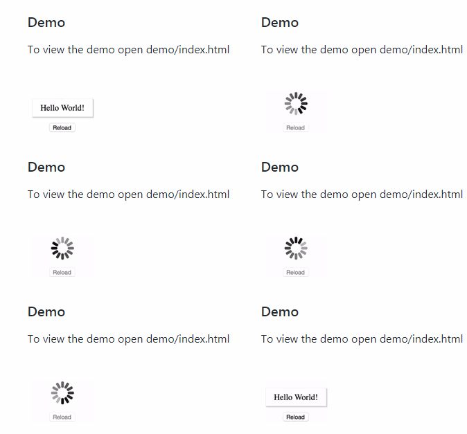
react-loader
react-loader provides your React.js
component a simple mechanism for rendering a loading spinner (via
spin.js) while data is loading, such as an
asynchronous request to load data for a view.
Important Note: The 2.x tagged release is compatible with React 1.4 and higher. If
you're working with an older version of React, please use the 1.x release.
Installation
react-loader is available through both Bower and
npm via:
npm install react-loader
or:
bower install react-loader
Be sure to include the --save option to add this as a dependency in your
application's package.json or bower.json file.
Usage
Wrap the Loader component around your loading content within your React
component's render function.
/** @jsx React.DOM */
var Loader = require('react-loader');

var MyComponent = React.createClass({
  getInitialState: function () {
    return { loaded: false, profile: null };
  },

  componentDidMount: function () {
    new Profile({ id: this.props.id }).fetch({
      success: this.onSuccess,
      error: this.onError
    })
  },

  onSuccess: function (profile) {
    this.setState({ profile: profile, loaded: true });
  },

  onError: function (err) {
    // error handling goes here
  },

  render: function () {
    return (
      <Container>
        <Header>My Profile</Header>
            <Loader loaded={this.state.loaded}>
              <Profile model={this.state.profile} />
            </Loader>
      </Container>
    );
  }
});
Options
Options can be passed to the Loader component as properties. The Loader accepts
a loaded boolean that specified whether the spinner or content should be
displayed, defaulting to false. It also accepts a component property to
specify the DOM node, defaulting to "div". Additionally, all options
available to spin.js are available to this component in two ways.
- First, you can pass each option onto the loader as individual properties:
<Loader loaded={false} lines={13} length={20} width={10} radius={30}
    corners={1} rotate={0} direction={1} color="#000" speed={1}
    trail={60} shadow={false} hwaccel={false} className="spinner"
    zIndex={2e9} top="50%" left="50%" scale={1.00}
    loadedClassName="loadedContent" />
- Alternatively, you can use supply an object using the
optionskey:
var options = {
    lines: 13,
    length: 20,
    width: 10,
    radius: 30,
    scale: 1.00,
    corners: 1,
    color: '#000',
    opacity: 0.25,
    rotate: 0,
    direction: 1,
    speed: 1,
    trail: 60,
    fps: 20,
    zIndex: 2e9,
    top: '50%',
    left: '50%',
    shadow: false,
    hwaccel: false,
    position: 'absolute'
};

<Loader loaded={false} options={options} className="spinner" />
Styling
The loader is rendered inside a DIV element (unless otherwise specified via the
component property mentioned earlier) with class "loader". A simple solution
for rendering the spinner on the center of your screen would be to use some CSS
like the following:
.loader {
  position: fixed;
  top: 0;
  right: 0;
  bottom: 0;
  left: 0;
  background: white;
  z-index: 9999;
}
Once the content is loaded and the spinner is removed, the DOM node is given a
class of "loadedContent" (which is customizable by specifying the
loadedClassName property).
Contributing
To contribute:
- Fork it
- Create your feature branch (
git checkout -b my-new-feature) - Add your changes to the
lib/react-loader.jsxfile along with associated
tests undertest/spec/react-loader-test.js. - Build any JSX changes to JS (
npm run build), and run tests (npm test). - Commit your changes (
git commit -am 'Added some feature') - Push to the branch (
git push origin my-new-feature) - Create new Pull Request
