React Lazylog
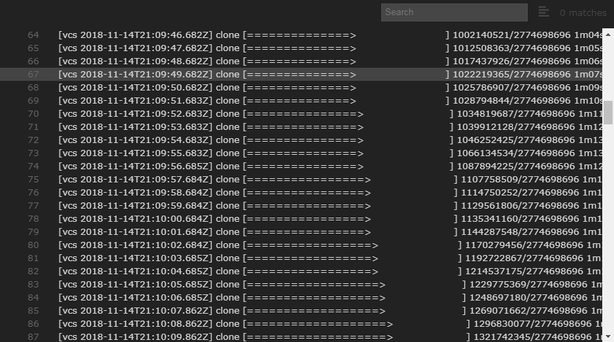
React component that loads and views remote text in the browser lazily and efficiently.
Features
- Efficient scrolling performance thanks to react-virtualized
- Able to load large files upwards of 100MB without crashing the browser
- Parses, colorizes, and styles ANSI escapes within content
- Supports remote text files as well as chunked/streamed responses
- Line highlighting
- Customizable styling
- Searching through log
- Works in latest browser versions, including iOS Safari and Android Chrome
- v3+ requires React 16.3+
Getting started
You can install react-lazylog via Yarn or npm:
# If using Yarn:
yarn add react-lazylog

# If using npm:
npm install --save react-lazylog
The core component from react-lazylog is LazyLog. There is also a higher-order component (HOC) for
following logs until scroll. This module can be required via ES imports, CommonJS require, or UMD.
import { LazyLog } from 'react-lazylog';

// using require
const { LazyLog } = require('react-lazylog');
<LazyLog />
Usage
After importing a component, it can be rendered with the required url prop:
import React from 'react';
import { render } from 'react-dom';
import { LazyLog } from 'react-lazylog';

render((
  <LazyLog url="http://example.log" />
), document.getElementById('root'));
By default the LazyLog will expand to fill its container, so ensure this container has valid dimensions and layout.
If you wish to have fixed dimensions, change the height and width props.
If you are going to be rendering a complete file, or an endpoint which can be downloaded all at once, use the
<LazyLog /> component as-is for better overall performance at the expense of slightly longer upfront load time.
If you are going to be requesting a streaming or chunked response, use the <LazyLog stream /> component with the
stream prop of true for quicker upfront rendering as content can be decoded as it arrives.
See the styleguide for a listing of complete props and a demo.
In addition to the props listed for LazyLog, most of the properties available to
react-virtualized List
can be provided and will be passed through to the component. Here are a few useful props:
| Property | Type | Required? | Description |
|---|---|---|---|
rowHeight |
Number | A fixed row height in pixels. Controls how tall a line is, as well as the lineHeight style of the line's text. Defaults to 19. |
|
overscanRowCount |
Number | Number of rows to render above/below the visible bounds of the list. This can help reduce flickering during scrolling on certain browsers/devices. Defaults to 100. |
|
scrollToAlignment |
String | Controls the alignment of scrolled-to-rows. The default ('auto') scrolls the least amount possible to ensure that the specified row is fully visible. Use 'start' to always align rows to the top of the list and 'end' to align them bottom. Use 'center' to align them in the middle of container. |
|
onScroll |
Function | Callback invoked whenever the scroll offset changes within the inner scrollable region: ({ clientHeight: number, scrollHeight: number, scrollTop: number }): void |
<ScrollFollow />
ScrollFollow is a higher-order component (HOC) that aims to simplify toggling a LazyLog's
"follow" functionality based on user scrolling.
Usage
The ScrollFollow component accepts a render prop function which should return a component to render based on the
function's arguments.
import React from 'react';
import { render } from 'react-dom';
import { LazyLog, ScrollFollow } from 'react-lazylog';

render((
  <ScrollFollow
    startFollowing={true}
    render={({ follow, onScroll }) => (
      <LazyLog url="http://example.log" stream follow={follow} onScroll={onScroll} />
    )}
  />
), document.getElementById('root'));
Styling
All of the components exposed from react-lazylog use CSS modules to contain its styles to each individual component. If
you wish to override these styles, there are a few techniques you can use.
style and containerStyle
For the core container of <LazyLog />, you can pass a style object prop to affect many styles.
For affecting the look or behavior of the scrollable region of these components, use the containerStyle prop with a
styling object.
defaultProps.style
For many react-logviewer components, continually passing varied styling objects is tedious. To make this simpler, you can
override the defaultProps.style of any desired component to override styles of that component. For example:
import Line from 'react-lazylog/build/Line';

// Use defaultProps.style to set the style for an internal component
Line.defaultProps.style = {
  color: 'green'
};
Note: overriding the ANSI colors and styles is currently undocumented, and will probably need some source-diving to
figure out. I would gladly accept a pull request that could improve the styling API.
CSS stylesheets
If you are using CSS stylesheets, you can target the main virtual LazyList component with the react-lazylog
class name. From there you can target the individual div lines, a line numbers, or span line content.
Sub-components
react-lazylog uses a number of sub-components internally to render individual parts of the log-viewing component:
<Line />
A single row of content, containing both the line number and any text content within the line.
<LineNumber />
The line number of a single line. The anchor contained within is interactive, and will highlight the entire line upon
selection.
<LineContent />
The container of all the individual pieces of content that is on a single line. May contain one or more LineParts
depending on ANSI parsing.
<LinePart />
An individual segment of text within a line. When the text content is ANSI-parsed, each boundary is placed within its
own LinePart and styled separately (colors, text formatting, etc.) from the rest of the line's content.


