react-modal
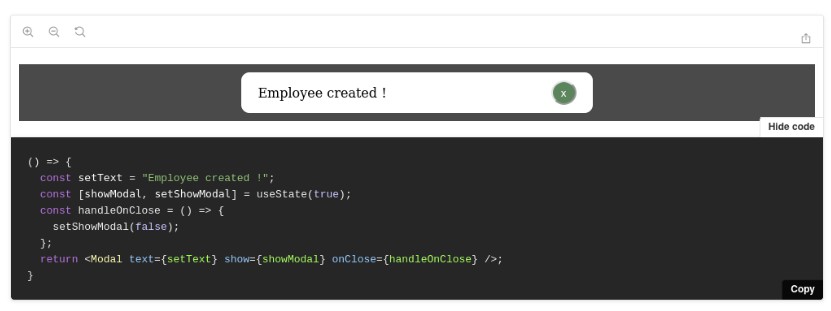
Modal dialogs are used to get a response from a user before other features can be assessed from the main page.
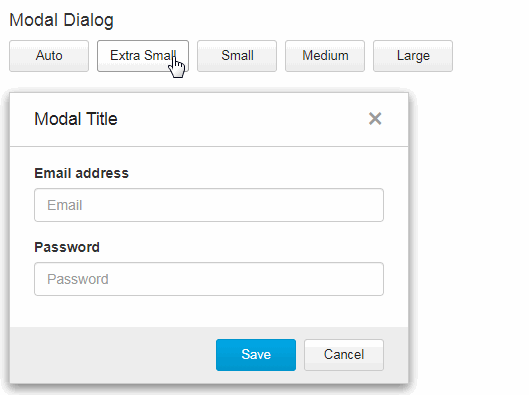
Use one of these 4 modal sizes depending on your needs and requirements:
| Auto | 400px (minimum width) |
| Extra Small | 400px (fixed width) x 240 px (minimum height) |
| Small | 544px (fixed width) x 304 px (minimum height) |
| Medium | 688px (fixed width) x 304 px (minimum height) |
| Large | 928px (fixed width) x 304 px (minimum height) |
Installation
- Install the latest version of react and react-modal:
npm install --save react @trendmicro/react-modal
- At this point you can import
@trendmicro/react-modaland its styles in your application as follows:
import Modal from '@trendmicro/react-modal';

// Be sure to include styles at some point, probably during your bootstraping
import '@trendmicro/react-modal/dist/react-modal.css';
Recommended Setup
Create a common components directory including both Buttons and Modal components, as shown below:
components/
  Buttons/
    index.js
  Modal/
    index.js
components/Buttons/index.js
import '@trendmicro/react-buttons/dist/react-buttons.css';

export { Button, ButtonGroup, ButtonToolbar } from '@trendmicro/react-buttons';
components/Modal/index.js
import '@trendmicro/react-modal/dist/react-modal.css';
import Modal from '@trendmicro/react-modal';

export default Modal;
Then, import Modal component in your code:
import Modal from './components/Modal';
Usage
import React from 'react';
import { Button } from './components/Buttons';
import Modal from './components/Modal';
export default ({ size = 'sm', closeModal, ...props }) => (
<Modal {...props} size={size} onClose={closeModal}>
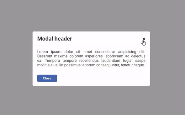
<Modal.Header>
<Modal.Title>
Modal Title
</Modal.Title>
</Modal.Header>
<Modal.Body padding>
Modal Body
</Modal.Body>
<Modal.Footer>
<Button
btnStyle="primary"
onClick={closeModal}
>
Save
</Button>
<Button
btnStyle="default"
onClick={closeModal}
>
Close
</Button>
</Modal.Footer>
</Modal>
);
Examples
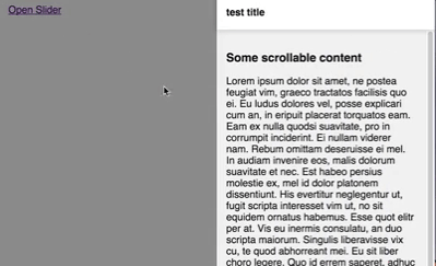
Prevent Body From Scrolling
You can create a ModalWrapper component that changes the body style on open and close.
import React, { PureComponent } from 'react';
import Modal from './components/Modal';

let bodyStyle = null;

class ModalWrapper extends PureComponent {
    static propTypes = {
        ...Modal.propTypes
    };
    static defaultProps = {
        ...Modal.defaultProps
    };

    componentWillReceiveProps(nextProps) {
        if (nextProps.show !== this.props.show) {
            if (nextProps.show) {
                this.changeBodyStyle();
            } else {
                this.restoreBodyStyle();
            }
        }
    }
    componentDidMount() {
        this.changeBodyStyle();
    }
    componentWillUnmount() {
        this.restoreBodyStyle();
    }
    changeBodyStyle() {
        if (bodyStyle) {
            return;
        }
        // Prevent body from scrolling when a modal is opened
        const body = document.querySelector('body');
        bodyStyle = {
            overflowY: body.style.overflowY
        };
        body.style.overflowY = 'hidden';
    }
    restoreBodyStyle() {
        if (bodyStyle) {
            const body = document.querySelector('body');
            body.style.overflowY = bodyStyle.overflowY;
            bodyStyle = null;
        }
    }
    render() {
        const { onClose, ...props } = this.props;

        return (
            <Modal
                {...props}
                onClose={() => {
                    this.restoreBodyStyle();
                    onClose();
                }}
            />
        );
    }
}

ModalWrapper.Overlay = Modal.Overlay;
ModalWrapper.Content = Modal.Content;
ModalWrapper.Header = Modal.Header;
ModalWrapper.Title = Modal.Title;
ModalWrapper.Body = Modal.Body;
ModalWrapper.Footer = Modal.Footer;

export default ModalWrapper;
API
Properties
| Name | Type | Default | Description |
|---|---|---|---|
| onClose | Function | A callback fired on clicking the overlay or the close button (x). | |
| show | Boolean | true | Whether the modal is visible. |
| showCloseButton | Boolean | true | Whether the close button (x) is visible. |
| showOverlay | Boolean | true | Display an overlay in the background. Defaults to true. |
| disableOverlay | Boolean | false | Don't close the modal on clicking the overlay. Defaults to false. |
| overlayClassName | String | className to assign to modal overlay. | |
| overlayStyle | Object | style to assign to modal overlay. | |
| size | String | '' | One of: 'xs', 'sm', 'md', 'lg', 'extra-small', 'small', 'medium', 'large', or an empty string. Defaults to empty string that will automatically resize to fit contents. |
Size
| Size | Dimension |
|---|---|
| Auto | 400px (minimum width) |
| Extra Small | 400px (fixed width) x 240 px (minimum height) |
| Small | 544px (fixed width) x 304 px (minimum height) |
| Medium | 688px (fixed width) x 304 px (minimum height) |
| Large | 928px (fixed width) x 304 px (minimum height) |