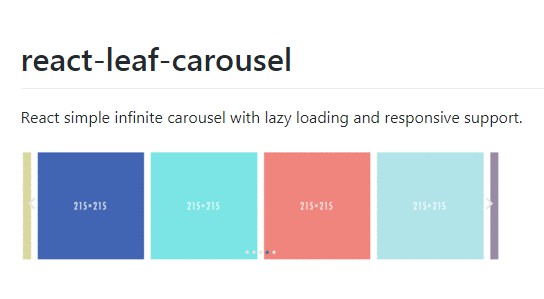
react-leaf-carousel
React simple infinite carousel with lazy loading and responsive support.
Installation
npm install react-leaf-carousel
Example
import React from 'react';
import ReactDOM from 'react-dom';

import InfiniteCarousel from 'react-leaf-carousel';

ReactDOM.render(
  <InfiniteCarousel
    breakpoints={[
      {
        breakpoint: 500,
        settings: {
          slidesToShow: 2,
          slidesToScroll: 2,
        },
      },
      {
        breakpoint: 768,
        settings: {
          slidesToShow: 3,
          slidesToScroll: 3,
        },
      },
    ]}
    dots={true}
    showSides={true}
    sidesOpacity={.5}
    sideSize={.1}
    slidesToScroll={4}
    slidesToShow={4}
    scrollOnDevice={true}
  >
    <div>
      <img
        alt=''
        src='https://placeholdit.imgix.net/~text?txtsize=20&bg=55b64e&txtclr=ffffff&txt=215%C3%97215&w=215&h=215'
      />
    </div>
    <div>
      <img
        alt=''
        src='https://placeholdit.imgix.net/~text?txtsize=20&bg=904098&txtclr=ffffff&txt=215%C3%97215&w=215&h=215'
      />
    </div>
    <div>
      <img
        alt=''
        src='https://placeholdit.imgix.net/~text?txtsize=20&bg=ef4d9c&txtclr=ffffff&txt=215%C3%97215&w=215&h=215'
      />
    </div>
    <div>
      <img
        alt=''
        src='https://placeholdit.imgix.net/~text?txtsize=20&bg=00f3d1&txtclr=ffffff&txt=215%C3%97215&w=215&h=215'
      />
    </div>
    <div>
      <img
        alt=''
        src='https://placeholdit.imgix.net/~text?txtsize=20&bg=00ffff&txtclr=ffffff&txt=215%C3%97215&w=215&h=215'
      />
    </div>
    <div>
      <img
        alt=''
        src='https://placeholdit.imgix.net/~text?txtsize=20&bg=ee1f34&txtclr=ffffff&txt=215%C3%97215&w=215&h=215'
      />
    </div>
    <div>
      <img
        alt=''
        src='https://placeholdit.imgix.net/~text?txtsize=20&bg=91b4c0&txtclr=ffffff&txt=215%C3%97215&w=215&h=215'
      />
    </div>
    <div>
      <img
        alt=''
        src='https://placeholdit.imgix.net/~text?txtsize=20&bg=ff6347&txtclr=ffffff&txt=215%C3%97215&w=215&h=215'
      />
    </div>
    <div>
      <img
        alt=''
        src='https://placeholdit.imgix.net/~text?txtsize=20&bg=ebbfbf&txtclr=ffffff&txt=215%C3%97215&w=215&h=215'
      />
    </div>
    <div>
      <img
        alt=''
        src='https://placeholdit.imgix.net/~text?txtsize=20&bg=def1f9&txtclr=ffffff&txt=215%C3%97215&w=215&h=215'
      />
    </div>
    <div>
      <img
        alt=''
        src='https://placeholdit.imgix.net/~text?txtsize=20&bg=cdf2c6&txtclr=ffffff&txt=215%C3%97215&w=215&h=215'
      />
    </div>
    <div>
      <img
        alt=''
        src='https://placeholdit.imgix.net/~text?txtsize=20&bg=9fa616&txtclr=ffffff&txt=215%C3%97215&w=215&h=215'
      />
    </div>
    <div>
      <img
        alt=''
        src='https://placeholdit.imgix.net/~text?txtsize=20&bg=2c4caa&txtclr=ffffff&txt=215%C3%97215&w=215&h=215'
      />
    </div>
    <div>
      <img
        alt=''
        src='https://placeholdit.imgix.net/~text?txtsize=20&bg=44e3e1&txtclr=ffffff&txt=215%C3%97215&w=215&h=215'
      />
    </div>
    <div>
      <img
        alt=''
        src='https://placeholdit.imgix.net/~text?txtsize=20&bg=ff6666&txtclr=ffffff&txt=215%C3%97215&w=215&h=215'
      />
    </div>
    <div>
      <img
        alt=''
        src='https://placeholdit.imgix.net/~text?txtsize=20&bg=94e1e3&txtclr=ffffff&txt=215%C3%97215&w=215&h=215'
      />
    </div>
    <div>
      <img
        alt=''
        src='https://placeholdit.imgix.net/~text?txtsize=20&bg=29083c&txtclr=ffffff&txt=215%C3%97215&w=215&h=215'
      />
    </div>
    <div>
      <img
        alt=''
        src='https://placeholdit.imgix.net/~text?txtsize=20&bg=ffff99&txtclr=ffffff&txt=215%C3%97215&w=215&h=215'
      />
    </div>
    <div>
      <img
        alt=''
        src='https://placeholdit.imgix.net/~text?txtsize=20&bg=616161&txtclr=ffffff&txt=215%C3%97215&w=215&h=215'
      />
    </div>
    <div>
      <img
        alt=''
        src='https://placeholdit.imgix.net/~text?txtsize=20&bg=ed7ebe&txtclr=ffffff&txt=215%C3%97215&w=215&h=215'
      />
    </div>
  </InfiniteCarousel>
,
document.getElementById('root'));
Properties
| Property | Type | Description | Default |
|---|---|---|---|
| arrows | bool | Enables tabbing and arrow key navigation | true |
| dots | bool | Enable dot pagination | false |
| lazyLoad | bool | Lazy load slides that are not visible at first load | true |
| swipe | bool | Add swipe event to scroll between slide pages | true |
| animationDuration | int | Slide animation duration | 500 |
| slidesToShow | int | Number of slides to display | 1 |
| slidesToScroll | int | Number of slides to scroll | 1 |
| slidesSpacing | int | Margin between slides | 10 |
| autoCycle | bool | Enables autocycle between slide pages | false |
| cycleInterval | bool | Autocycle interval duration | 5000 |
| pauseOnHover | bool | Pauses autocycle | true |
| responsive | bool | Enables breakpoints | true |
| breakpoints | array | Array of objects in the form of { breakpoint: int, settings: { ... } } |
[] |
| placeholderImageSrc | string | placeholder image source | base64 gif image 1x1 |
| nextArrow | React element | Optional custom arrow | null |
| prevArrow | React element | Optional custom arrow | null |
| scrollOnDevice | bool | Adds scroll functionality on touch devices instead of normal swipe, this disables lazy-loading, infinite navigation, arrows and dots | false |
| showSides | bool | Show outer prev/next slides of the current slide page | false |
| sidesOpacity | int | Side slides opacity amount | 1 |
| sideSize | int | Fraction visible of prev/next slides, when showSides is enabled |
.5 |
| incrementalSides | bool | Dynamic sideSize depending on the browser's width and responsive breakpoints. Increments or decrements from max size 50% to min size 0% when expanding or narrowing the browser. |
false |