React SimpleMDE Markdown Editor
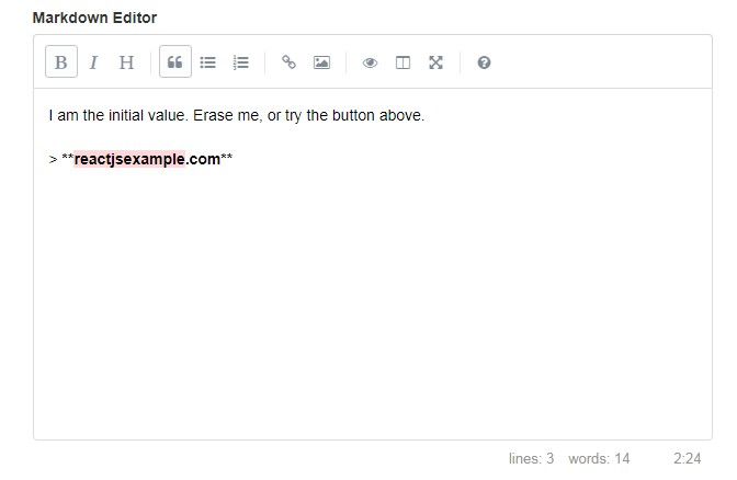
React component wrapper for SimpleMDE.
Only two dependencies, React and SimpleMDE.
New in v3
- The
initialValueprop has been removed and replaced with avalueprop, allowing direct changes to the value to be made after the component mounts. - v3.6.8 if rendering server-side, you can set static ids to avoid errors in rendering synchronization.
- v3.6.17 TypeScript typings added.
- v3.6.19 All props will be passed to the wrapper now (except a id, onChange and few others that are ignored)
- v3.6.21 React 17 support (UNSAFE methods are no longer used)
New in v2
Version 1.0 did not have SimpleMDE options configured well, this readme reflects the changes made to better include options.
This is still a very new project. Testing, feedback and PRs are welcome and appreciated.
Install
npm install --save react-simplemde-editor
or view it locally:
git clone https://github.com/RIP21/react-simplemde-editor.git
cd react-simplemde-editor
yarn install
yarn demo
open browser with localhost:3000
Usage
View the demo code for a full example.
Not required, but useless without it, the onChange callback is the only option you need to set.
import React  from 'react';
import SimpleMDE from 'react-simplemde-editor';
import "simplemde/dist/simplemde.min.css";

<SimpleMDE
  onChange={this.handleChange}
/>
The data from SimpleMDE is passed to the handleChange function and you do not need to reference the event.
handleChange = value => {
  this.setState({ mdeValue: value });
};
Options
Set additional SimpleMDE options with an options prop.
Note - while SimpleMDE options has an initialValue option, this component only takes a value prop which is set as the initialValue on first render.
Note - if you don't specify a custom id it will automatically generate an id for you.
import React  from 'react';
import SimpleMDE from 'react-simplemde-editor';
import "simplemde/dist/simplemde.min.css";

<SimpleMDE
  id="your-custom-id"
  label="Your label"
  onChange={this.handleChange}
  value={this.state.textValue}
  options={{
    autofocus: true,
    spellChecker: false,
    // etc.
  }}
/>
You can include key maps using the extraKeys prop.
Read more at https://codemirror.net/doc/manual.html#option_extraKeys
extraKeys = {
  Up: function(cm) {
    cm.replaceSelection(" surprise. ");
  },
  Down: function(cm) {
    cm.replaceSelection(" surprise again! ");
  }
};

<SimpleMDE
  value={this.state.textValue}
  onChange={this.handleChange}
  extraKeys={extraKeys}
/>
Custom preview rendering example
import ReactDOMServer from "react-dom/server";

<SimpleMDE
    value={this.state.text}
    onChange={this.setText}
      options={{
        previewRender (text) {
          return ReactDOMServer.renderToString(<ReactMarkdown
            source={text}
            renderers={{
              CodeBlock: CodeRenderer,
              Code: CodeRenderer
            }}
          />)
        }
      }}
    />
Additional listeners for events of CodeMirror
See full list of events: https://codemirror.net/doc/manual.html#events
<SimpleMDE
  value={this.state.text}
  onChange={this.handleChange}
  events={
    'blur': (e) => {},
    'focus': (e) => {},
    //... Add any codeMirror events
  }
/>
Autosaving example
import React, { Component } from "react";
import SimpleMDEReact from "react-simplemde-editor";

class Autosaving extends Component {
  defaultProps = {
    delay: 1000,
    value: ''
  }

  state = {
    value: localStorage.getItem(`smde_${this.props.id}`) || this.props.value
  };

  render() {
    const { options, delay, id, ...rest } = this.props;
    return (
      <SimpleMDEReact
        {...rest}
        id={id}
        value={this.state.value}
        options={{
          autosave: {
            enabled: true,
            uniqueId: id,
            delay
          },
          ...options
        }}
      />
    );
  }
}
Retrieve simplemde instance to be able to manipulate it.
<SimpleMDE
  getMdeInstance= { this.getInsance } // <-- set callback prop
  value={this.state.text}
  onChange={this.handleChange}
  }
/>
getIntance = (instance) => {
  // You can now store and manipulate the simplemde instance.
  instance.togglePreview();
}
