React Loading
Accessible and Simple Loading indicators in React.
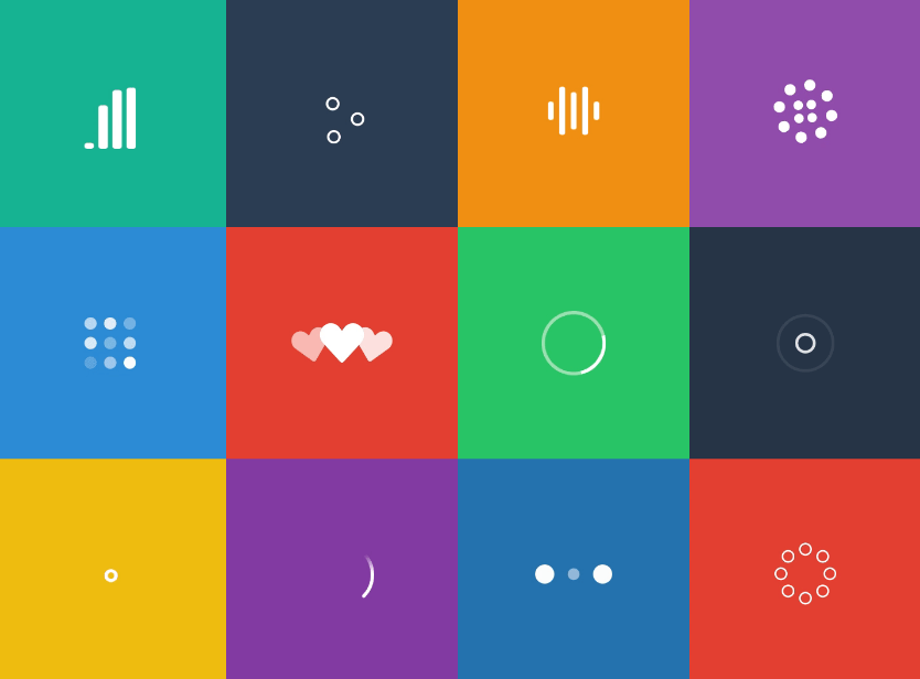
Comes bundled with React components of Sam Herbert's animated SVG loaders in a tree shakeable package.
Installation
npm i @agney/react-loading
# OR
yarn add @agney/react-loading
Features
-
Small Size
The whole library is about 20kB minified. But you would never need the whole bundle.
The library is build to be treeshakeable that when you use one or two of the bundled loaders, you would have less than 1kB in your bundle.
No dependencies either ?
-
Accessibility
Provides accessibility attributes on your loading components and containers.
aria-busyis set totrueon container on loading and progress indicators haverole=progressbar. -
Specify a Global loader
You probably don't want loader components mixed everywhere, so you can specify a
LoaderContextthat can be overridden later if necessary. -
Bring your own loader
If you decide to bring your own loading indicator, library would support that as well, keeping all your logic the same.
-
TypeScript support. Zero extra CSS.
Usage
import { useLoading, Audio } from '@agney/react-loading';

function Content() {
  const { containerProps, indicatorEl } = useLoading({
    loading: true,
    indicator: <Audio width="50" />,
  });

  return (
    {/* Accessibility props injected to container */}
    <section {...containerProps}>
      {indicatorEl} {/* renders only while loading */}
    </section>
  );
}
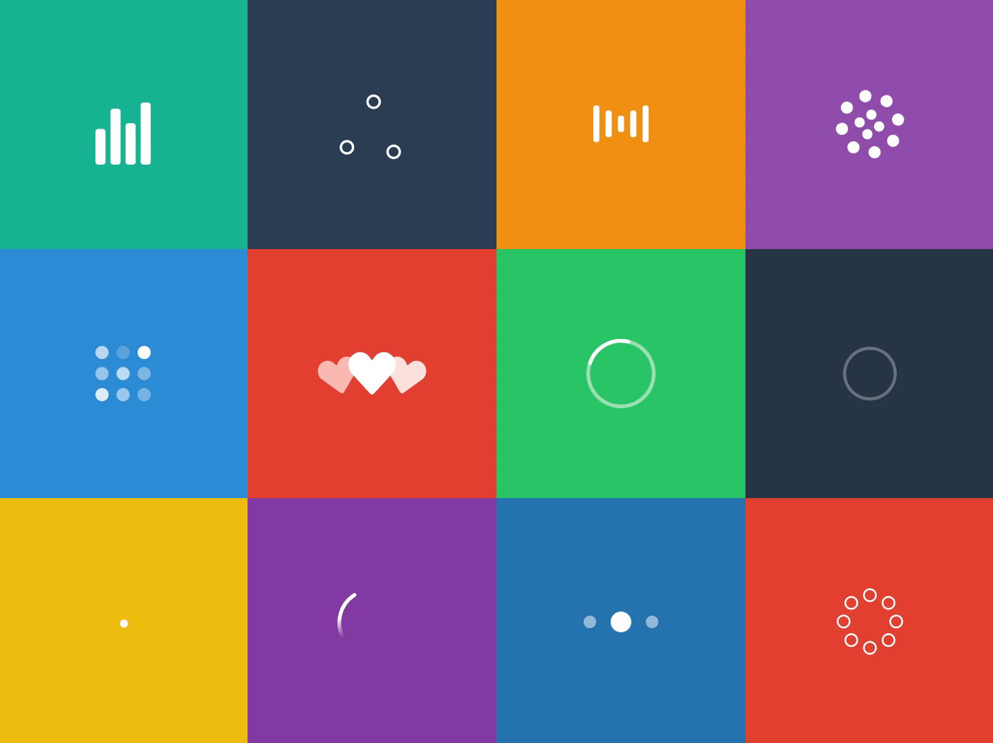
Loaders
This library comes bundled with React components of Sam Herbert's animated SVG loaders in a tree shakeable package.
Each loader is an SVG and all props passed shall be applied to the top SVG element. All SVGs are set to inherit currentColor from it's parents for fill/stroke.
Available loaders are:
import {
  Audio,
  BallTriangle,
  Bars,
  Circles,
  Grid,
  Hearts,
  Oval,
  Puff,
  Rings,
  SpinningCircles,
  TailSpin,
  ThreeDots,
} from '@agney/react-loading';
Only the ones you use will be included in your bundle when you use a bundler like Webpack/Rollup.
Context
You can specify a single loading indicator reused across hooks with the LoaderProvider.
import { LoaderProvider, useLoading, BallTriangle } from '@agney/react-loading';

function App() {
  const { containerProps, indicatorEl } = useLoading({
    loading: true,
  });
  return <section {...containerProps}>{indicatorEl}</section>;
}

ReactDOM.render(
  <LoaderProvider indicator={<BallTriangle width="50" />}>
    <App />
  </LoaderProvider>
);
You can use as many LoaderProvider provider elements as you like and React will pick the one closest to the hook you are rendering.
Extra Props on Loader
If you want to provide specific props on a loader specifically when you use the hook:
useLoading({
  loading: true,
  loaderProps: {
    // Any props here would be spread on to the indicator element.
    style: {{ margin: '0 auto' }}
  }
});
We also a provide a special key for valueText, that will be used as description for indicator:
useLoading({
  loading: true,
  loaderProps: {
    valueText: 'Fetching video from the Great Internet',
  },
});

// now this will generate:
/* <svg role="progressbar" aria-valuetext="Fetching video from the Great Internet"></svg>*/
aria-valuetext will be read by screenreaders.
You could also provide aria-valuenow for indicators that display progress (but the prebundled ones are best for indeterminate progress indicators)
MDN for Reference on progressbar
Bring your own loader
Just switch the import to your own loading indicator (just make sure that it accepts props)
import { LoaderProvider, useLoading } from '@agney/react-loading';

const Loader = ({ ...rest }) => <p {...rest}>Loading...</p>;

function App() {
  const { containerProps, indicatorEl } = useLoading({
    loading: true,
  });
  return <section {...containerProps}>{indicatorEl}</section>;
}

ReactDOM.render(
  <LoaderProvider indicator={<Loader />}>
    <App />
  </LoaderProvider>
);
Contributing
All PRs welcome.
Development
We use tsdx for generating boilerplate.
Install:
# Library
npm i

# Example
cd example && npm i
Development:
# Running library dev
npm start

# Running example
cd example && npm start
Testing:
Testing with react-testing-library and jest
npm test
Commands are available in detail on tsdx repository.