seapig
Sea pig stands for (Children Props Internal Getter), except the C is spelled phonetically.
What does Seapig do?
seapig.seapig. Does whatever aseapigdoes!
seapig is here to help you compose your React Components in a consistent and flexible manner. It provides a mechanism to organize components that form into a single idea without limiting the types of components you can use.
“A way to give rendering back to the user”
seapig eliminates configuration in favor of composition.
It abstracts component composition for you, allowing you to decouple how components are combined from which components they are. It enables you to generalize (and optionally enforce) the structure and behavior of a group of components but leaves out any restrictions on which exact components you must use.
<Header>
  <h1 right> ??</h1>
  <h1 left>Seapig</h1>
</Header>
Would render something like (play with the example):

seapig shines the most when used to create components whose state is too complex to be held in a single component yet not global enough to be represented at the application level.
Using this pattern in React allows us to have the rendering control with the minimal api surface area without the need for configuration props for all state and data variations that our component can have.
This is where compound components come to the rescue.
A compound component encloses the state and behavior for a group of components but still gives the rendering control for its variable parts back to the external user. When using it, you only need to worry about the actual parts that are different.
A concrete example of a compound component on the Web today is the <select> element. It allows us to externally specify its rendering structure with <option> and <optiongroup> elements but hides away all the complexity of rendering those in a certain way or handling/delegating events.
If you're interested in more examples of compound components, Ryan Florence has a great talk on this topic.
Good ol' seapig twists the concept of compound components a bit by using designated props to determine distinct parts of our component group, rather than enforcing usage of specific components. Furthermore, it can restrict a consistent shape of our structure by enforcing Rendering Order and Child Presence using a schema object.
Imagine if <select> allowed you to pass anything as its option but still handled all the logic and things like event propagation?
Wouldn't this be cool?
<select>
  <span option>Option 1</span>
  <h3 option>Option 2</span>
  <div option className="capitalize">Option 3</div>
</select>
Rendering Order
Components that use seapig render their children into special placeholders determined by the schema. This means that the rendering shape can be enforced internally, allowing us to pass the children into a seapig component in any order.
/* `MyCoolSidebar` and `Content` are always rendered in the same order no matter what order they are passed in */

/* This one would render the same */
<Main>
  <MyCoolSidebar sidebar />
  <Content content>
    <h2>Hello `seapig`!</h2>
  </Content>
</Main>

/* as this one */
<Main>
  <Content content>
    <h2>Hello `seapig`!</h2>
  </Content>
  <MyCoolSidebar sidebar />
</Main>

/* Corresponding seapig component example */
import seapig, { OPTIONAL, REQUIRED } from 'seapig'

const Main = props => {
  const {
    sidebarChildren, // array of children with the `sidebar` prop
    contentChildren  // array of children with the `content` prop
  } = seapig(props.children, { // schema object
    sidebar: OPTIONAL, // sidebar is optional
    content: REQUIRED  // content is required
  })

  // rendering order is always the same
  return (
    <div>
      {sidebarChildren.length && <aside>{sidebarChildren}</aside>}
      <section>{content}</section>
    </div>
  )
}
Child presence
A seapig component ensures that all children match the provided schema.
To reuse <Main> from above as an example, if we didn't pass any children with the 'content' prop, seapig would throw:
// The code below would throw a "Must have at least 1 `content` element" error
<Main>
  <MyCoolSidebar sidebar />
</Main>
The seapig also accumulates any unidentified children into the rest array.
import seapig, { OPTIONAL, REQUIRED } from 'seapig'

const Main = props => {
  const {
    sidebarChildren,
    contentChildren,
    rest, // all children not matching `sidebar` and `content` are in this array
  } = seapig(props.children, {
    sidebar: OPTIONAL,
    content: REQUIRED
  })

  return (
    <div>
      {sidebarChildren.length && <aside>{sidebarChildren}</aside>}
      <section>{content}</section>
      {rest} {/* passing rest of the children */}
    </div>
  )
}

/* `rest` would contain the bottom section */
<Main>
  <Content content>
    <h2>Hello `seapig`!</h2>
  </Content>
  <MyCoolSidebar sidebar />
  <section>I would be in the `rest` array</section>
</Main>
In fact, OPTIONAL and REQUIRED, along with their plural counterparts OPTIONALS and REQUIREDS, are just helpful schema constants:
const OPTIONAL = { // can have one
  min: 0,
  max: 1
}
const OPTIONALS = { // can have any
  min: 0
}
const REQUIRED = { // must have one
  min: 1,
  max: 1
}
const REQUIREDS = { // must have at least one
  min: 1
}
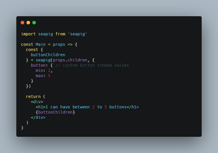
seapig allows us to pass custom min and max, both inclusive, values as well:
import seapig from 'seapig'

const Main = props => {
  const {
    buttonChildren
  } = seapig(props.children, {
    button: { // custom button schema values
      min: 2,
      max: 5
    }
  })

  return (
    <div>
      <h1>I can have between 2 to 5 buttons</h1>
      {buttonChildren}
    </div>
  )
}

/* Now we must have between 2 and 5 buttons */
<Main>
  <Button button>First</Button>
  <a button>Second</a>
  <div button>Third</div>
</Main>
Install
npm install seapig --save

# or

yarn add seapig
Example
seapig button with a required label and an optional icon:
import React, { Component } from 'react'
import seapig, { OPTIONAL, REQUIRED } from 'seapig'

/* Button with a required label and an optional icon */
class Button extends Component {
  render() {
    const {
      iconChildren,
      labelChildren
    } = seapig(this.props.children, {
      icon: OPTIONAL,
      label: REQUIRED
    })

    return (
      <button>
        {iconChildren.length && <span className="pull-left">{iconChildren}</span>}
        {labelChildren}
      </button>
    )
  }
}

/* usage of the seapig Button */
import React, { Component } from 'react'
import Button from './Button'

class Form extends Component {
  render() {
    return (
      <form>
        {/* other form components */}
        <Button>
          <i icon className="fa fa-upload" />
          <span label>Submit</span>
        </Button>
      </form>
    )
  }
}
Walkthrough
To demonstrate the problem that seapig solves, let's see how we can design the API of a header component.
Let's say we came up with an initial idea that the header will show a brand image to the left and a menu right after it.
const Header = () => (
  <header>
    <img className="brand" src="www.mycoolsite.com/static/brand.jpg" />
    <ul className="menu">
      <li>Home</li>
      <li>About</li>
    </ul>
  </header>
)
Ok simple enough. Now let's consider a few potential updates we might need to make this component.
Let's imagine a requirement comes in that each page has to render a custom menu item that is unique to it, maybe some icon designated for that portion of our site that may or may not be an anchor as well.
Sure, not a problem, instead of us worrying about element types and icons for each page, let's just allow them to pass that in. Of course we don't want to render blank items if nothing is provided:
const Header = ({ PageIcon }) => (
  <header>
    <img className="brand" src="www.mycoolsite.com/static/brand.jpg" />
    <ul className="menu">
      <li>Home</li>
      <li>About</li>
      {PageIcon && <li>{PageIcon}</li>}
    </ul>
  </header>
)
Now let's use it:
<Header PageIcon={<FontAwesome name="star" />} />
{/* or */}
<Header PageIcon={<a href="/settings"><FontAwesome name="cog" /></a>} />
Alright, things are getting a bit messy but still manageable.
Headers usually show user info, assuming the user is authenticated.
const Header = ({ PageIcon, authenticated }) => (
  <header>
    <img className="brand" src="www.mycoolsite.com/static/brand.jpg" />
    <ul className="menu">
      <li>Home</li>
      <li>About</li>
      {PageIcon && <li>{PageIcon}</li>}
    </ul>
    {authenticated && <UserInfo />}
  </header>
)
Feels somewhat clunky but not terrible.
<Header
  PageIcon={<FontAwesome name="star" />}
  authenticated={user.isLoggedIn && user.hasPermission}
/>
Phew, done. A few days go by and users now start complaining about having to navigate to /search to explore your site and want a search bar directly in the header. Ok, we can add another flag. Additionally there isn't a point to storing this search state within the header when other parts of the app will need it so let's take that into account as well.
const Header = ({ PageIcon, authenticated, showSearch, searchTerm, onSearch }) => (
  <header>
    <img className="brand" src="www.mycoolsite.com/static/brand.jpg" />
    <ul className="menu">
      <li>Home</li>
      <li>About</li>
      {PageIcon && <li>{PageIcon}</li>}
    </ul>
    {authenticated && <UserInfo />}
    {showSearch && (
      <input type="search" value={searchTerm} onChange={onSearch} />
    )}
  </header>
)
Did that mess things up?
<Header
  PageIcon={<FontAwesome name="star" />}
  authenticated={user.isLoggedIn && user.hasPermission}
  showSearch
  searchTerm={this.state.searchTerm}
  onSearch={this.handleSearch}
/>
You can see where this is going.
- What if we want the menu to sometimes be an
olrather than anul? Theoretically, this header could be used in multiple sites. Surely we'll need to figure out how to generalize the hardcoded menu item texts for each site. Maybe a string array of items? - What if those other sites behave the same but will never need special icons?
- What if the
<input>is sometimes only a numeric search? Pass a prop? - What if in the future we want other pages to customize the order of the internal components of
<Header>, maybe show theinputbefore theulmenu?
This is where seapig comes in.
Let's look at how a seapig Header API would look like in each of these case, we'll deal with implementation later.
<Header>
  <img brand className="brand" src="www.mycoolsite.com/static/brand.jpg" />
  <ul menu className="menu">
    <li>Home</li>
    <li>About</li>
  </ul>
</Header>
That's it. We mark our img and ul as the brand and menu and this satisfies all the requirements of our header for this particular page.
What about the custom icon per page? We can just render it on each page directly:
<Header>
  <img brand className="brand" src="www.mycoolsite.com/static/brand.jpg" />
  <ul menu className="menu">
    <li>Home</li>
    <li>About</li>
    <li><FontAwesome name="star" /></li>
  </ul>
</Header>
Ok, what about auth data? Well we could just mark those as well. We also want to pass the authenticated flag to the header so it knows which items to show or not depending on the authentication state.
<Header authenticated={authenticated}>
  <img brand className="brand" src="www.mycoolsite.com/static/brand.jpg" />
  <ul menu className="menu">
    <li>Home</li>
    <li>About</li>
    <li><FontAwesome name="star" /></li>
  </ul>
  <UserInfo auth> {/* Mark restricted menu items */} </UserInfo>
</Header>
What about search?
<Header authenticated={authenticated}>
  <img brand className="brand" src="www.mycoolsite.com/static/brand.jpg" />
  <ul menu className="menu">
    <li>Home</li>
    <li>About</li>
    <li><FontAwesome name="star" /></li>
  </ul>
  <UserInfo auth />
  <input search type="search" value={this.state.searchTerm} onChange={this.handleSearch} />
</Header>
Wanna disable the search input? Just do it.
<Header authenticated={authenticated}>
  <img brand className="brand" src="www.mycoolsite.com/static/brand.jpg" />
  <ul menu className="menu">
    <li>Home</li>
    <li>About</li>
    <li><FontAwesome name="star" /></li>
  </ul>
  <UserInfo auth />
  <input search type="search" disabled={this.state.isSearching} value={this.state.searchTerm} onChange={this.handleSearch} />
</Header>
What if the <input> is sometimes only a numeric search? We can update the type property.
<Header authenticated={authenticated}>
  <img brand className="brand" src="www.mycoolsite.com/static/brand.jpg" />
  <ul menu className="menu">
    <li>Home</li>
    <li>About</li>
    <li><FontAwesome name="star" /></li>
  </ul>
  <UserInfo auth />
  <input search type="number" disabled={this.state.isSearching} value={this.state.searchTerm} onChange={this.handleSearch} />
</Header>
What if the menu is an ol? We can change the tag.
<Header authenticated={authenticated}>
  <img brand className="brand" src="www.mycoolsite.com/static/brand.jpg" />
  <ol menu className="menu">
    <li>Home</li>
    <li>About</li>
    <li><FontAwesome name="star" /></li>
  </ol>
  <UserInfo auth />
  <input search type="search" disabled={this.state.isSearching} value={this.state.searchTerm} onChange={this.handleSearch} />
</Header>
Change what the items say?
<Header authenticated={authenticated}>
  <img brand className="brand" src="www.mycoolsite.com/static/brand.jpg" />
  <ul menu className="menu">
    <li>?</li>
    <li>ℹ️</li>
    <li><FontAwesome name="star" /></li>
  </ul>
  <UserInfo auth />
  <input search type="search" disabled={this.state.isSearching} value={this.state.searchTerm} onChange={this.handleSearch} />
</Header>
Any specific rendering change we need to make to one of its children doesn't need to affect the <Header> component itself. seapig allows you to use whatever component you want.
Once you determine a consistent set of logic for your site or groups of pages, you can wrap that logic into a specific seapig header component and be done with it. Any future requirements to any other system that uses the header won't affect you and you won't affect them.
So how does the actual implementation of Header look like?
const Header = ({ children, authenticated }) => {
  const {
    brandChildren,
    menuChildren,
    authChildren
    searchChildren,
  } = seapig(children, {
    brand: REQUIRED,
    menu: REQUIRED,
    auth: OPTIONAL
    search: OPTIONAL,
  });

  return (
    <header>
      {brandChildren}
      {menuChildren}
      {authenticated && authChildren}
      {searchChildren}
    </header>
  )
}
For a more advanced use case, seapig works great with React.cloneElement.
Let's say we want to have all auth children add a class 'authenticated-item' when present in the header.
const Header = ({ children, authenticated }) => {
  const {
    brandChildren,
    menuChildren,
    authChildren
    searchChildren,
  } = seapig(children, {
    brand: REQUIRED,
    menu: REQUIRED,
    auth: OPTIONAL
    search: OPTIONAL,
  });

  return (
    <header>
      {brandChildren}
      {menuChildren}
      {authenticated && authChildren.map(
        child => React.cloneElement(child, {
          className: `${child.props.className} authenticated-item`
        })
      )}
      {searchChildren}
    </header>
  )
}
API
const {
  iconChildren,
  iconsChildren,
  labelChildren,
  labelsChildren,
  imageChildren,
  rest, // array of children not matching any of the schema props
} = seapig(children, {
  icon: OPTIONAL, // use OPTIONAL to specify only one optional child prop
  icons: OPTIONALS, // use OPTIONALS to specify any amount of optional child props
  label: REQUIRED, // use REQUIRED to specify only one required child prop,
  labels: REQUIREDS, // use REQUIREDS to specify at least one required child prop,
  image: { // pass an object with `min` and/or `max`
    min: 1, // default is `0` if only `max` is specified
    max: 2  // default is `Infinity` if only `min` is specified
  }
})
License
MIT


