3D Room materials displayer
Once again hellow there code enthusiasts, this one was a hard one, a lot of stoppers and not so much time anyway let’s dive in
liveDemo.mp4
What is this ?
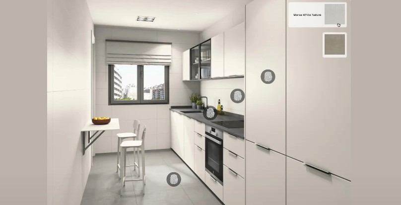
A kitchen furniture customizer-visualizer, here you can pick some items like the floor, worktop and furniture and customize the material to see which one looks better.
Live website: https://3d-room-material-showcase.vercel.app/
What stack did you use ?
That’s a very good question dear reader, usually I just wanna go with me most simple and lightweight stack possible when developing.
For code quality
- Standard.js as lintern made me appreciate a lot more eslint , AirBnB rules and prettier, I know it’s a solution to avoid useless discussions but it makes development a lot slower.
- SonarQube another static code analysis that finds all kind of code smells and gives the neccesary feedback to have a clean code
- Jest this is the go to for unitary and integration testing , very handy with react-testing-library, or at least that’s what I would say if I could make it work, the SWC rust based compiler didn’t wanted to transform the node_modules/firebase to common.js for my firebase mocks to work, so now i only have a smoke test of a button lul
- TypeScript all the power of strong typing in JavaScript , no more words needed
- LightHouse Even with smalls project it can help you find accesibility problems with the colors you use, great tool.
Main stack
- Next .js with his wonderfull image optimization and the amazing server side rendering
- Tailwind This is by far the best tool I used for styling, you have an utility class for any css property , inline css so you don’t have to worry about extra css files, speeds up the workflow and you have consistent units to create a cohesive design with tailored style for components.
- TypeScript Since I use Typescript I reduced my chrome devtools debugging by a lot, it simply makes life easier.
- Firebase with fireStore, pretty great solution for a noBackend app but no so much for testing with an old Next.js version mixed all together
- Framer Motion for magic and animation SIUUUUU
Are you happy with the result ?
Actually… yes, it was a pretty clever and tricky challenge that remembers me the importance of planning before coding. I did some drawing about how to structure the state, how to fix the responsiveness of the displayer and how to map the selectors in any screen overall I am confident with my code and how I structured components, state, usability, accesibility, best practices and seo (Props to lighthouse for helping me with most of that metrics haha).
I mean I got rid of all the sonarQube codesmells and I think all it’s left is a good performant code with emphasys in redability.
Made with patience by Emiliano Polanco
