vercel/gauge
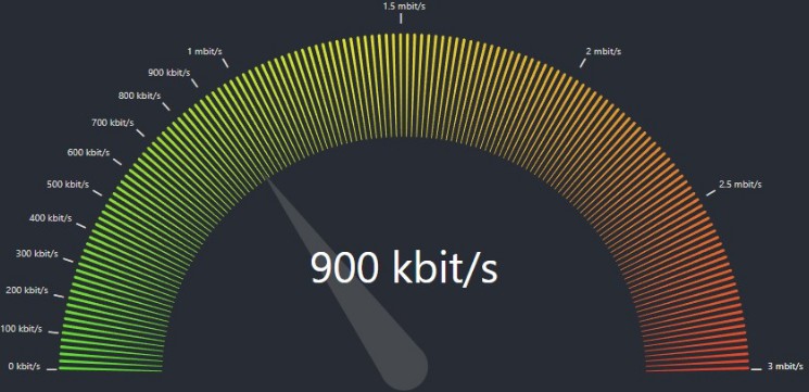
This is the open-source Tailwindcss version of Vercel’s beautiful Gauge React component to indicate a status.

Demo
View the demo here: https://gauge-demo.vercel.app
View the original Vercel design system here: Gauge
Installation
Requirements
tailwindcsstailwindcss-animate
It’s pretty easy to install. I made it a standalone component that you can copy in your codebase.
-
Copy the
gaugecomponentcp ./app/gauge.tsx your-project/components/gauge.tsx
or go directly to it here: gauge.tsx
-
Add keyframes and animation to your
tailwind.config.tsimport type { Config } from 'tailwindcss' const config: Config = { content: [ "./pages/**/*.{js,ts,jsx,tsx,mdx}", "./components/**/*.{js,ts,jsx,tsx,mdx}", "./app/**/*.{js,ts,jsx,tsx,mdx}", ], theme: { extend: { keyframes: { gauge_fadeIn: { from: { opacity: "0" }, to: { opacity: "1" }, }, gauge_fill: { from: { "stroke-dashoffset": "332", opacity: "0" }, to: { opacity: "1" }, }, }, animation: { gauge_fadeIn: "gauge_fadeIn 1s ease forwards", gauge_fill: "gauge_fill 1s ease forwards", }, }, }, plugins: [require("tailwindcss-animate")], }; export default config
-
Import into your page
import { Gauge } from "@/components/gauge";

export default function Home() {
  return (
   <>
     // ...
     <Gauge value={80} size="small" showValue={true} />
     // ...
   </>
  )
}
API
The Gauge component takes three props: value, size, showValue.
value: a number from0to100size: a string (“small”, “medium”, “large”). Defaults to:"small"showValue: a boolean to show the number inside the gauge or not. Defaults to:true
Inspiration
- Thanks to the @vercel design team for the awesome component.
- Thanks to @shadcn who gave me a new joy for UI design.


