react-gauge-component
React Gauge component for data visualization.
Demo
https://antoniolago.github.io/react-gauge-component/
Usage
Install it by running npm install react-gauge-component --save or yarn add react-gauge-component. Then to use it:
import GaugeComponent from 'react-gauge-component'

//Component with default values
<GaugeComponent id="gauge-component1" />
Examples
Simple Gauge.

Show Simple Gauge code
Simple Gauge
<GaugeComponent
  id="simple-gauge"
  value={currentValue}
  labels={{
    markLabel: {
      marks: [
        { value: 20 },
        { value: 50 },
        { value: 80 },
        { value: 100 }
      ]
    }
  }}
  needle={{
    elastic: true
  }}
/>
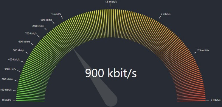
Custom Bandwidth Gauge.

Show Bandwidth Gauge code
Bandwidth Gauge
const kbitsToMbits = (value) => {
  if (value >= 1000) {
    value = value / 1000;
    if (Number.isInteger(value)) {
      return value.toFixed(0) + ' mbit/s';
    } else {
      return value.toFixed(1) + ' mbit/s';
    }
  } else {
    return value.toFixed(0) + ' kbit/s';
  }
}
<GaugeComponent
  id="bandwidth-gauge"
  arc={{
    nbSubArcs: 30,
    colorArray: ['#5BE12C', '#F5CD19', '#EA4228'],
    width: 0.3,
  }}
  labels={{
    valueLabel: {
      fontSize: 40,
      formatTextValue: kbitsToMbits
    },
    markLabel: {
      marks: [
        { value: 100 },
        { value: 200 },
        { value: 300 },
        { value: 400 },
        { value: 500 },
        { value: 600 },
        { value: 700 },
        { value: 800 },
        { value: 900 },
        { value: 1000 },
        { value: 1500 },
        { value: 2000 },
        { value: 2500 },
        { value: 3000 },
      ],
      valueConfig: {
        formatTextValue: kbitsToMbits
      }
    }
  }}
  value={900}
  maxValue={3000}
/>
Custom Temperature Gauge

Show Temperature Gauge code
Temperature Gauge
<GaugeComponent
  id="temperature-gauge"
  arc={{
    width: 0.2,
    padding: 0.01,
    subArcs: [
      {
        limit: 15,
        color: '#EA4228',
        showMark: true ,
        tooltip: { text: 'Too low temperature!' }
      },
      {
        limit: 17,
        color: '#F5CD19',
        showMark: true,
        tooltip: { text: 'Low temperature!' }
      },
      {
        limit: 28,
        color: '#5BE12C',
        showMark: true,
        tooltip: { text: 'OK temperature!' }
      },
      {
        limit: 30,
        color: '#F5CD19',
        showMark: true,
        tooltip: { text: 'High temperature!' }
      },
      {
        color: '#EA4228',
        tooltip: { text: 'Too high temperature!' }
      }
    ]
  }}
  needle={{
    color: '#345243',
    length: 0.90,
    width: 15,
    animDelay: 200,
  }}
  labels={{
    valueLabel: { formatTextValue: value => value + 'ºC' },
    markLabel: {
      valueConfig: { formatTextValue: value => value + 'ºC', fontSize: 10 },
      marks: [
        { value: 13 },
        { value: 22.5 },
        { value: 32 }
      ],
    }
  }}
  value={22.5}
  minValue={10}
  maxValue={35}
/>
API
Warning: Do not use the same id for multiple charts, as it will put multiple charts in the same container
Props:
id: string: A unique identifier for the div surrounding the chart. Default:undefined.className: string: Adds aclassNameto the div container. Default:undefined.style: React.CSSProperties: Adds a style object to the div container. Default:{width: 100}.marginInPercent: number: Sets the margin for the chart inside the containing SVG element. Default:0.05.value: number: The value of the gauge. Default:0.minValue: number: The minimum value of the gauge. Default:0.maxValue: number: The maximum value of the gauge. Default:100.arc: object: The arc of the gauge.cornerRadius: number: The corner radius of the arc. Default:7.padding: number: The padding between subArcs, in rad. Default:0.05.width: number: The width of the arc given in percent of the radius. Default:0.2.nbSubArcs: number: The number of subArcs. This overridessubArcs. Default:undefinedcolorArray: Array<string>: The colors of the arcs. This overridessubArcscolors. Default:undefinedsubArcs: Array<object>: The subArcs of the gauge.limit: number: The subArc limit value. When no limits are defined in the next subArcs in the list, it’s optional and will auto-calculate remaining arcs limits. Example:[{limit: 70}, {}, {}, {}]. In a defaultminValue/maxValue, the values will be equal to[{limit: 70}, {limit: 80}, {limit: 90}, {limit: 100}]. But[{},{limit: 100}]will not work properly as the not defined subArc limit has a subArc with limit defined ahead in the array.color: string: The subArc color. When not provided, it will use default subArc’s colors and interpolate first and last colors when subArcs number is greater thancolorArray.showMark: boolean: Whether or not to show the mark. Default:false.tooltip: object: Tooltip object.text: stringtext that will be displayed in the tooltip when hovering the subArc.style: React.CSSProperties: Overrides tooltip styles.
subArcs default value:
          [
            { limit: 33, color: "#5BE12C"},
            { limit: 66, color: "#F5CD19"},
            { color: "#EA4228"},
          ]
needle: object: The needle of the gauge.color: string: The color of the needle. Default:#464A4FbaseColor: string: The color of the base of the needle. Default:#464A4Flength: number: The length of the needle 0-1, 1 being the outer radius length. Default:0.70animate: boolean: Whether or not to animate the needle. Default:trueelastic: boolean: Whether or not to use elastic needle. Default:falseanimationDuration: number: The duration of the needle animation. Default:3000animationDelay: number: The delay of the needle animation. Default:100width: number: The width of the needle. Default:15
labels: object: The labels of the gauge.valueLabel: object: The center value label of the gauge.formatTextValue: (value: any) => string: The format of the value label. Default:undefined.fontSize: number: The font size of the value label. Default:35.fontColor: string: The font color of the value label. Default:"#fff".hide: boolean: Whether or not to hide the value label. Default:false.
markLabel: objectThe markLabel of the gauge.type: string: This makes the marks"inner"or"outer"the radius. Default:"outer"hideMinMax: boolean: Whether or not to hide the min and max labels. Default:falsemarks: Array<object>: The marks of the gauge. When not provided, it will use default gauge marks with five values.value: number: The value of the mark.valueConfig: object: The config of the mark’s value label. When not provided, it will use default config.markerConfig: object: The config of the mark’s char. When not provided, it will use default config.
valueConfig: object: The default config of the mark’s value label.formatTextValue: (value: any) => string: The format of the mark’s value label. Default:undefinedfontSize: number: The font size of the mark’s value label. Default:15fontColor: string: The font color of the mark’s value label. Default:#464A4Fhide: boolean: Whether or not to hide the mark’s value label. Default:false
markerConfig: object: The default config of the mark’s char.char: string: The char of the mark. Default:'_'charSize: number: The font size of the mark’s char. Default:30charColor: string: The font color of the mark’s char. Default:#464A4Fhide: boolean: Whether or not to hide the mark’s char. Default:false
##### Colors for the chart
The colors could either be specified as an array of hex color values, such as ["#FF0000", "#00FF00", "#0000FF"] where
each arc would a color in the array (colors are assigned from left to right). If that is the case, then the length of the array
must match the number of levels in the arc.
If the number of colors does not match the number of levels, then the first and the last color from the colors array will
be selected and the arcs will get colors that are interpolated between those. The interpolation is done using d3.interpolateHsl.
This is forked from @Martin36/react-gauge-chart 0b24a45.