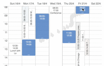
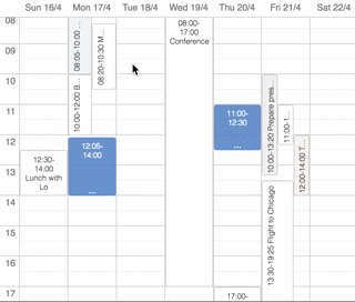
React Available Times
A React component that allows a user to select time-slots in a calendar-like UI.
Installation
npm install --save react-available-times
Usage
import AvailableTimes from 'react-available-times';

<AvailableTimes
  weekStartsOn="monday"
  calendars={[
    {
      id: 'work',
      title: 'Work',
      foregroundColor: '#ff00ff',
      backgroundColor: '#f0f0f0',
      selected: true,
    },
    {
      id: 'private',
      title: 'My private cal',
      foregroundColor: '#666',
      backgroundColor: '#f3f3f3',
    },
  ]}
  onChange={(selections) => {
    selections.forEach(({ start, end }) => {
      console.log('Start:', start, 'End:', end);
    })
  }}
  onEventsRequested={({ calendarId, start, end, callback }) => {
    loadMoreEvents(calendarId, start, end).then(callback);
  }}
  initialSelections={[
    { start: aDateObject, end: anotherDateObject }
  ]}
  height={400}
  recurring={false}
  availableDays={['monday', 'tuesday', 'wednesday', 'thursday', 'friday']}
  availableHourRange={{ start: 9, end: 19 }}
/>
Props
None of the props are required.
weekStartsOn: a string (either"monday"or"sunday") specifying what
day of the week should come first.calendars: a list of calendars displayed in the dropdown at the top right.onChange: a function called whenever a selection is made. Receives an array
of objects, each with astartand anenddate.onEventsRequested: a function called when new weeks are loaded. Hook in to
this function to continuously feed events to the calendar view. Thecallback
provided should be called when you have fetched events for the particular
calendarId. Call the callback with an array of objects, where each object
has astartand anenddate, plus atitleproperty. Can have a
calendarIdproperty tying them to a calendar, inheriting the foreground and
background color. Can also have aallDayproperty, in which case they are
rendered at the top.initialSelections: an array of pre-filled selections. Each object in the
array needs astartand anenddate.height: a string or a number controlling theheightof the component.
E.g.'100%',350,'100vh'. If left out, the full height of the screen
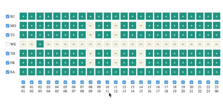
will be used.recurring: set totrueto turn the view into a selector for recurring
availability. No dates are then shown, and theonChangecallback is called
with events that have a start and end expressed in number of minutes since
the start of the week. TheweekStartsOnprop is taken into account here, so
the0minute is either monday at 00:00 or sunday at 00:00.availableDays: an array of strings ("monday","tuesday"...) specifying
what days of the week are available to be used. It is set to every day by default.availableHourRange: an object withstartandendnumbers, ranging from 0 to 24
inclusive. Defaults to the entire day by default.