react-swipeable-list
A configurable react component to render list with swipeable items.

React Swipeable List component
A react component to render list with swipeable items. Items can have one or more actions on left (leading) and right (trailing) swipe and different behavior depending on props. See examples
This repository contains new version of sandstreamdev/react-swipeable-list/. Whole component was reimplemented to support buttons in revealed content and different swipe behaviors. More information can be found in this issue: Clarify relationship with @sandstreamdev/react-swipeable-list
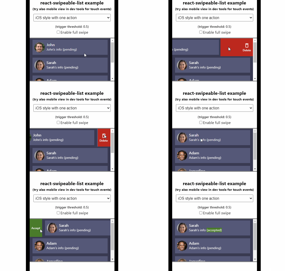
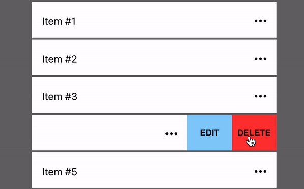
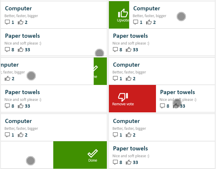
Demo
Installation
npm install react-swipeable-list
# or via yarn
yarn add react-swipeable-list
Usage
import {
  LeadingActions,
  SwipeableList,
  SwipeableListItem,
  SwipeAction,
  TrailingActions,
} from 'react-swipeable-list';
import 'react-swipeable-list/dist/styles.css';

const leadingActions = () => (
  <LeadingActions>
    <SwipeAction onClick={() => console.info('swipe action triggered')}>
      Action name
    </SwipeAction>
  </LeadingActions>
);

const trailingActions = () => (
  <TrailingActions>
    <SwipeAction
      destructive={true}
      onClick={() => console.info('swipe action triggered')}
    >
      Delete
    </SwipeAction>
  </TrailingActions>
);

<SwipeableList>
  <SwipeableListItem
    leadingActions={leadingActions()}
    trailingActions={trailingActions()}
  >
    Item content
  </SwipeableListItem>
</SwipeableList>;
SwipeableList Props
fullSwipe
Type: boolean (optional, default: false)
Changes behavior of IOS list type.
When true and swipe is done beyond threshold and released the action is triggered.

When set to false actions are only opened and they need to be clicked to trigger action.

destructiveCallbackDelay
Type: milliseconds (optional, default: 1000)
Time in milliseconds after which swipe action should be called for destructive swipe action (item deletion).
It can be set for the whole list or for every item. See destructiveCallbackDelay for SwipeableListItem. Value from the SwipeableListItem takes precedence.
style
Type: object (optional, default: undefined)
Additional styles for list tag.
type
Type: ListType (ANDROID | IOS | MS) (optional, default: ANDROID)
Changes behavior of swipeable items.
ANDROID

IOS

MS

Tag
Type: string (optional, default: div)
HTML tag that is used to create this component.
scrollStartThreshold
Type: number (optional, default: 10)
How far in pixels scroll needs to be done to block swiping. After scrolling is started and goes beyond the threshold, swiping is blocked.
It can be set for the whole list or for every item. See scrollStartThreshold for SwipeableListItem. Value from the SwipeableListItem takes precedence.
swipeStartThreshold
Type: number (optional, default: 10)
How far in pixels swipe needs to be done to start swiping on list item. After a swipe is started and goes beyond the threshold, scrolling is blocked.
It can be set for the whole list or for every item. See swipeStartThreshold for SwipeableListItem. Value from the SwipeableListItem takes precedence.
threshold
Type: number (optional, default: 0.5)
How far swipe needs to be done to trigger attached action. 0.5 means that item needs to be swiped to half of its width, 0.25 - one-quarter of width.
It can be set for the whole list or for every item. See threshold for SwipeableListItem. Value from the SwipeableListItem takes precedence.
SwipeableListItem Props
blockSwipe
Type: boolean (optional, default: false)
If set to true all defined swipe actions are blocked.
destructiveCallbackDelay
Type: milliseconds (optional, default: 1000)
Time in milliseconds after which swipe action should be called for destructive swipe action (item deletion).
It can be set for the whole list or for every item. See destructiveCallbackDelay for SwipeableList. Value from the SwipeableListItem takes precedence.
leadingActions
Type: LeadingActions component
Container component that sets up correct props in SwipeAction. See examples for usage.
onSwipeStart
Type: () => void
Fired after swipe has started (after drag gesture passes the swipeStartThreshold distance in pixels).
onSwipeEnd
Type: () => void
Fired after swipe has ended.
onSwipeProgress
Type: (progress: number) => void
Fired every time swipe progress changes. The reported progress value is always an integer in range 0 to 100 inclusive.
scrollStartThreshold
Type: number (default: 10)
How far in pixels scroll needs to be done to block swiping. After scrolling is started and goes beyond the threshold, swiping is blocked.
It can be set for the whole list or for every item. See scrollStartThreshold for SwipeableList. Value from the SwipeableListItem takes precedence.
swipeStartThreshold
Type: number (default: 10)
How far in pixels swipe needs to be done to start swiping on list item. After a swipe is started and goes beyond the threshold, scrolling is blocked.
It can be set for the whole list or for every item. See swipeStartThreshold for SwipeableList. Value from the SwipeableListItem takes precedence.
threshold
Type: number (default: 0.5)
How far swipe needs to be done to trigger action. 0.5 means that item needs to be swiped to half of its width, 0.25 - one-quarter of width.
It can be set for the whole list or for every item. See threshold for SwipeableList. Value from the SwipeableListItem takes precedence.
trailingActions
Type: TrailingActions component
Container component that sets up correct props in SwipeAction. See examples for usage.
SwipeAction Props
destructive
Type: boolean (optional, default: false)
If set to true then remove animation is played and callback is called after destructiveCallbackDelay.
onClick
Type: function (required)
Callback function that should be call after swipe action is triggered.
Tag
Type: string (optional, default: span)
HTML tag that is used to create this component.
