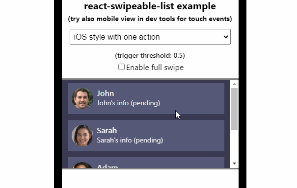
react-swipeable-list
Swipeable list component for React.
React Swipeable List component
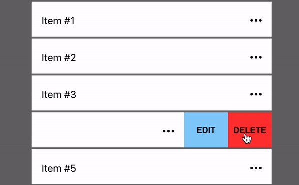
A control to render list with swipeable items. Items can have action on left and right swipe. Swipe action triggering can be configured.
Installation
npm install sandstreamdev/react-swipeable-list
# or via yarn
yarn add sandstreamdev/react-swipeable-list
Usage
<SwipeableList>
  <SwipeableListItem
    swipeLeft={{
      content: <div>Revealed content during swipe</div>,
      action: () => console.info('swipe action triggered')
    }}
    swipeRight={{
      content: <div>Revealed content during swipe</div>,
      action: () => console.info('swipe action triggered')
    }}
  >
    <div>Item name</div>
  </SwipeableListItem>
</SwipeableList>
NOTE: SwipeableListItem can be used without SwipeableList but swipe blocking on scroll needs to be handled.
SwipeableList Props
threshold
Type: number
How far swipe needs to be done to trigger attached action. 0.5 means that item needs to be swiped to half of its width, 0.25 - one-quarter of width.
SwipeableListItem Props
blockSwipe
Type: boolean (default: false)
If set to true all defined swipe actions are blocked. This is done by SwipeableList during scroll to prevent mouse move events to cause accidental swiping acitions.
swipeLeft
Type: Object
Data for defining left swipe action and rendering content after item is swiped. The object requires following structure:
{
  action,  // required: swipe action (function)
  content, // required: HTML or React component
}
swipeRight
Type: Object
Same as swipeLeft but to right. :wink:
threshold
Type: number (default: 0.5)
Can be set for whole list or for every item. See threshold for SwipeableList.